|
|
|
Showing 1171 - 1180 of ~2097 |
| Image |
Comment |
| 11/03/2005 09:34:46 PM | Thoughtfulby srugoloComment: Hello from the Critique Club!
I have been studying your image for a while now, leaving it on the screen and coming back to it now and again and just looking at all the aspects and qualities. First - I love the image. It is simply a beautiful portrait. Nice job - very well done!
Perspective/composition - I like that this was taken on her eye level. It gives it a feel as though you - the viewer - is her brother/sister standing next to her. I don't mind the elbow being out of the picture, but would have liked it if the top of her head was also in the picture. The crop seems a little tight on the right side as well. Perhaps this was done to keep her feom being too centerd in the shot. However, I don't think it would have hurt this image in the least.
Lighting - well done. Her eyes are clear and not showing any bright reflections either from your lighting or ambient lighting. The face shows clear definition of all features without any glare as well. Her shirt seems a little bright on the shoulder area and along the front of the bicep. You can see the tops of the waves in the fabric but they begin to get lost as you move down and to the left just above the elbow. Her left cheek is a little bright, however the grain helps to negate the effect and keeps it from being a distraction or detractor.
Color - the overall tonality of the image is very nice. The sepia shades are well done and certainly not overdone. In my opinion this was the perfect choice for the shot. It helps bring out the overall mood and set of the scene while not adding dark shadows that hide detail. The skin tone remaining is just enough.
Challenge requirements - there is no doubt your addition of grain/noise meets the challenge. I think you added just enough to let it help the feel of your image and not too much to hide the rest of your processing or become a negative aspect.
Overall/my opinion - this is an excellent demonstration of many techniques both with the camera and with the post processing. Your subject could not have been better - she is a very cute little girl - lucky you! The combination of your chosen title and the image is an extremely well made connection and also adds to the overall quality of the image. Very well done! |  Photographer found comment helpful. Photographer found comment helpful. |
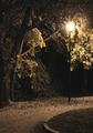
| 11/03/2005 03:06:05 PM | Evening's Last Lightby cools98Comment: Hello from the Critique Club!
The composition/perspective of this image is very nice. The single light offset is a nice technique you accomplished very nicely. I agree with you about the walkway. It does serve as a nice leading line and I really like the fact that at no point does it dominate the photo. The curve was the perfect location for this shot as well. It adds an element of geometry that really sweeps you through. It helps that near the light it is covered with leaves as well. The perspective of the shot makes you feel almost as though you - the viewer - is on the path approaching this very lamp.
Lighting - obviously the source is the street lamp. But your control of flare and washout was done very well. The effect it has on the trees really helps set the mood for the shot. It also lets just enough color show that it appears as though the leaves are actually absorbing the light in protest.
The limited color in the image works very nicely with the light. They complement each other quite well. I think if you had gone to true black and white the shot would lose the nice feel and mood you have captured. Nothing stands out as a distraction to me.
Challenge requirements - the challenge was to have image grain as an integral part of your photo. Although I can see some grain/noise in the photo, in my opinion there could be a lot more and still not hurt the image at all. Again it is a strong composition and culd very easily have taken on the challenge with a lot more grain.
Overall I think you have a nice photo here with a strong emotive force. well done!
| | Photographer found comment helpful. |
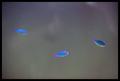
| 11/03/2005 11:37:05 AM | Out of the Murky Waterby cloudsmeComment: Hello from the Critique Club!
I have been studying your image and find a few elements I like and a few I don't. First, I think this image has a lot of potential. Your idea/concept (based on the image and title combination) is well presented. But I find some elements distracting.
Lighting - well done - no flares or glares to distract and it is not harsh or too dark either. It works well with the subject matter.
Color - the contrast of the colors of the fish and the general background is very good. It makes the fish instantly pop out. However, in the background (or perhaps the foregound in reality) there seems to be a reflection. This element I find distracting. It seems you can almost make out a person (you??) taking the picture, but not quite. Plus the color variations on those few spots distract a bit (between the left two fish, above the right fish in the top corner). I think a tighter crop on the top would have helped this by eliminating the white spot there as well as some of that reflection.
Composition/perspective - I like the amount of negative space in the image. This works here quite nicely. It also is a plus that you cannot readily discern the direction of movement of the fish by their angle of placement in the water. I know you cannot control this so your timing was quite good. One appears to actually be swimming up and coupled with your title really does give the impression the fish are swimming up to you as if you were above. With more or less fish in the shot I don't think this effect would be as strong.
Challenge requirements - I think the gradient application of the noise really makes your concept work. The shot really does make you think they are rising from the depths. However, I would have liked to see a bit more on the right. As it is is still good and unique though.
Overall I think this is a pleasing image and a very well done concept. You achieved the effect you were after. Nice job! |
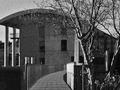
| 11/03/2005 11:12:06 AM | Grainy Imageby sigrun_thComment: Hello from the Critique Club!
This is an interesting image in many respects - the grain in an image of a modern building, the visual detachment the walkway creates, the time of day/natural lighting choice.
Composition/perspective - the distance from the main subject is good and the balance between the subject and its surroundings adds to the feeling of detachment mentioned above. The walkway is only slightly off center which is ok since the slight bend on the walkway makes it work quite nicely. The angle of approach is good, but in my opinion a slightly different approach would have helped. By that I mean everything seems one sided and straight on. Moving a little farther back and slightly to the left you could still have the walkway in the current placement but the small portion of the roof in the upper left would not be cut off. Different on the other side since there are trees and such to fill the shot. It is just that the columns are supporting the roof and it would have been nice to let it show the corner and emphasize that aspect. I think this also would help eliminate the minor distraction of the building behind the columns. Your focus would remain in the foreground and not drift to the background. The slightly different placement would also allow the tree in the foreground to not block as much of the view of the building. It is not really a distraction, but it blocks the nice slope line of the roof.
Black and white was a good choice. It allows the building to appear strong without revealing the detail of the materials used in the construction - stone/concrete?? This also allows the grain to add to the image and not detract from it.
Challenge requirements - your application of noise/grain was done very well. It helps tone down the sunlight as well as add an element of wonder - a grainy image of a modern building. I think it works, though, that you did not go for an older subject to try and mimic an older photo. It helps that it has been applied in a uniform amount over the whole image. Again, well done.
Overall I think this image presents a serene setting in what appears to be a busy area - the closeness of the buildings, the walkway with no pedestrians, the lack of lights in the windows. It makes me think this was either shot at the beginning or the end of a workday or perhaps early morning while people are still sleeping. It sets a nice mood.
The only negative I can find is the small white patch on the left side of the railing. Not sure what it is - a bird or reflection in the window?? As I review the image I find myself looking to try and determine what it is. it is only a minor distraction, but it could have been removed.
Overall nice capture and good post processing. | | Photographer found comment helpful. |
| 11/03/2005 07:26:43 AM | Bad-2-The-Boneby anthonyczajaComment: Hello from the Critique Club!
This is a very interesting capture. Obviously your lighting is natural and it is in full sunlight, but you have positioned yourself very well to avoid the dark shadows that hide features as well as the bright flares and reflections, especially off the chrome handlebars, that can create false focal points. The amount of deatil that remains in the background is nice as well. Well done.
The overall composition/perspective is good. Although the trike is centered, the subject is not. Being low, at his eye level, also really works nicely here. It puts you in his space which helps put the focus and emphasis on his face and expression as opposed to him as a whole. This really goes great with the title you chose. The tight crop also adds to the power of the shot.
You captured his expression quite nicely. He appears very photogenic and you have created a very nice portrait of him. The mood that emanates from his expression together with the scene he is in really go well together. At first I was thinking the arm on the left was perhaps a minor distraction, but he grows on you and I see the arm more as holding him back from just taking off. Sort of like the control element to his 'badness'. And having just the small portion of the arm in the shot adds to this impression.
As far as the challenge requirements...the grain in this shot, in my opinion, adds to the overall quality of the image and works quite well. It is not overdone or underdone. Coupled with the black and white, a wise choice for this shot, it creates the impression that you are looking at a photo from the mid sixties and not 2005.
Bottom line - very well done portrait with post processing that really takes the shot up the scale. Well done! | | Photographer found comment helpful. |
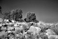
| 11/03/2005 12:20:37 AM | Up and Beyondby KitaComment: Hello from the Critique Club!
I have viewed your image at a few different resolutions and on two different monitors. First off, I like the image and the scene it presents. The grain in the sky definitely helps this image and would make the image a lot stronger if the same amount of grain was evident in the whole image. But that is for the challenge requirements.
Composition/perspective - the shot seems to be balanced between sky and hillside almost to the center line. In my opinion it would be stronger if the crop was tighter on the bottom and the tree to the left of the pic was cropped so the trunk that is cut off of the pic was cropped at the division between the leaves of the two parts of the tree. Your angle of approach is quite good though. I like the upward view and think that the processing in black and white helps this perspective quite a bit.
Lighting - obviously natural light, but well controlled. There are no blown out reflections on the rocks and the sky looks to be well within a controllable range - well done. Especially since this appears to have been shot in full daylight. Not sure, but a polarizer seems to have been used based on the gradient tone in the sky which is ok and does not detract from the image at all, rather it adds to it quite nicely.
The focus and detail are excellent. The scene is long in nature so some detail should be expected to be lost, the grass in the foreground and clear definition of the rocks makes up for that. Perhaps a little more sharpening after resizing would compensate and help bring out more details in the trees on the horizon line.
Challenge requirements - your application of grain seems to be lost in the foreground and only evident in the sky. This could either be in the post processing or the in camera processing. Either way, if it was more evident in the foreground it would be much stronger for the challenge. I don't think it would have hurt the detail in the rocks or grass. In fact I think it would have added to it...given it an 'old west' kind of feel. As it is I can see myself sitting on a horse looking at this hill and thinking 'I should find another way' and that is a good thing. Pictures that make you think, even if the thoughts are different than the photographers, are always stronger in my book.
Overall, well done image. Very nice perspective and composition. Perhaps a tad more grain in the foreground would make it stronger for the challenge, but as it it is a very nice capture! Slight adjustments in contrast and levels would bring out more of the rock detail, but that would be more a matter of taste. | | Photographer found comment helpful. |
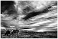
| 11/02/2005 10:35:34 PM | Change of weatherby BrinComment: Hello from the Critique Club!
From the start - very nice image! Your composition and perspective on this shot are excellent. The placement of the horses as the subject adds greatly to the overall appeal of the image. Having them appear a minor part (by size) is a nice technique not often seen as well done as this. The buildings in the background really enhance that quality very nicely.
Having this image in black and white was also a wise choice. In my opinion this image would not be as strong, even without the grain, if it were in color. The whole mood and emotive force is really emphasized by the shades of gray that flow across the image, especially in the sky. This also helps the vast expanse the image covers. Color would not give you that same 'expansive' feeling. It just appears to go on forever to the horizon.
The horses themselves...I like the fact that they are clearly there, but distinct detail, as in eyes, mane detail, etc. are not present. Gives it a sort of elusive quality. Makes me want to move into the picture and hear them as they graze. Well done!
Pertaining to the challenge - the grain definitely adds to this image quite nicely. All the other good qualities are emphasized by the grain and in no way does it detract. The balance between clarity and grainy is very well done. Just enough grain to help the mood of the shot but not too much that it makes you turn away from the scene. Just another aspect very well done in concert with the rest.
Overall this is an excellent image and very well done both in capture and post processing. | | Photographer found comment helpful. |
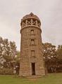
| 11/02/2005 10:15:32 PM | Historyby A ShrubberyComment: Hi from the Critique Club!
I viewed this image at a few different resolutions and have some observations to share. First, I think this is a great subject. There is a lot of detail and texture just waiting to be brought out in the image. I think this image has a lot of potential with a few processing changes. I actually downloaded the image and applied a few and was amazed at how good this really is.
First, composition/perspective - the subject sits right in the middle of the shot with the only thing to offest the balance being the small sign (?) on the left. I will assume this is not a full size crop and my first suggestion would be to off center the subject just a bit. Apply the rule of thirds. A tighter crop of the top - less sky - would also help this image. But your placement is great - it makes the tower appear taller than it really is. Nice job on that.
Lighting - all natural obviously. But it appears flat. The sky is a little bland compared to the rest of the image. Again a tighter crop on top would have eliminated that and made your subject stand out even more.
Color - the stones in the tower have a lot of natural variation that would stand out more with some processing (below). But the balance is good. Not too much green, but enough to make the browns of the stone give a good contrast.
Processing - when I said it appears flat I was referring to the processing mainly. This image has a lot of good tonal qualities that just have not been brought out. A look at the histogram for this image as you have submitted shows a nice bell curve with only a few abberrations. Moving the black and white levels to be within the slopes of the curves brings out so much more detail and color alone. With the tighter crop this would have made it 'pop'. After the levels, a slight adjustment of the contrast would emphasize the tonal differences in the stone that would make your subject really stand out. Going even further and applying a slight adjustment to the saturation would really make it stand out. Some sharpening to emphasize the stone detail and you have a fantastic image.
As for the challenge...I think after the processing you could think about adding the image grain. This could be done in a number of ways - adding noise, adding film grain (not available in all editors), using any number of filters/actions for PhotoShop or other processors. But if the processing is done first, the grain would add to the image as it already appears 'old'. Another idea to try would be processing it in black and white or even sepia tones.
Overall a nice image that just lacked the post processing that would make it pop. You seem to have a good eye for the capture and subject matter.
This image has a lot of potential and you should in no way be discouraged by its performance in the challenge. | | Photographer found comment helpful. |
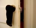
| 11/02/2005 04:44:51 PM | Getting Busy...by holleratrobComment: I am confused by this shot a bit. Not sure what your meaning or application to the challenge is. Beside that the whole image appears fuzzy or out of focus. If intentional, in my opinion, it detracts from the image. Also, I am not sure what I should be drawn to - the sock? on the door or the calendar on the wall. Neither makes much sense to me. |
| 11/02/2005 12:41:39 PM | Portrait of an Artistby NeilComment: Hi from the Critique Club!
This image has a lot going for it. First the pose...it just doesn't look it. The subject looks natural in the setting and appears as if deep in contemplation. Very emotive expression on his face that can lead in many directions depending on your mood when viewing. He appears relaxed and unaware he is being photographed.
The lighting is very well done. There are no glares or dark spots and the lack of strong shadows really helps set the mood of the shot. Even with the processing to fit the challenge there is a lot of detail left to see. Makes you almost feel as if you, the viewer, are right there with him.
Another of the strong features is the color palette the shot is comprised of. Excellent choices for shirt and background. They go well with the skin and hair tones. Nothing harsh or drastic which adds greatly to the composition.
Composition/perspective is was very well chosen. The profile really works here. In my opinion a head on shot of this just would not be as strong. Excellent choice. I like the tight crop here as well. Really helps bring out the strength of the pose and keeps you focused and wondering what he may be focusing on. I get the feeling, even without the title - strictly from the shot - that he is an artist looking over the last few details of paint just added to a canvas.
Forgeting the challenge requirements for a moment and looking at the processing...the grain definitely adds to the picture. It gives it a feel and texture, that along with the other qualities, just draws you in. Some areas look like they have more added than others but the mix works.
Overall very well done portrait. I honestly cannot find an aspect I don't appreciate. Very nice work! | | Photographer found comment helpful. |
|
Showing 1171 - 1180 of ~2097 |
Home -
Challenges -
Community -
League -
Photos -
Cameras -
Lenses -
Learn -
Help -
Terms of Use -
Privacy -
Top ^
DPChallenge, and website content and design, Copyright © 2001-2026 Challenging Technologies, LLC.
All digital photo copyrights belong to the photographers and may not be used without permission.
Current Server Time: 07/24/2026 08:36:57 PM EDT.
|