|
|
|
Showing 1161 - 1170 of ~2097 |
| Image |
Comment |
| 11/04/2005 02:08:09 PM | Life containerby marvinComment: Hello from the Critique Club!
I have studied your image and offer the following:
Composition/perspective - the apparent distance of the background with the subject matter right up front I think is a dramatic effect you did quite well. Having it off center is the perfect choice as well. The background appears a bit distracting due to the variation in color from top to bottom, but it is not a major distraction. A more solid or single looking background in color may cause it to lose the above mentioned effect. The fingers almost overwhelm the egg, but it is good that just the fingers show and not more of the hand.
Lighting - this appears to have been taken with natural light. The problem I see with this is that you have shadows on both sides of the egg - one side by your hand and the other by the absence of light. The fingers appear dark compared to the egg and the surroundings. Perhaps even a low light from the front or at a 45 to your subject from the right would help and also let more the the texture of the egg shell show. Even just a slightly different angle of your hand to the camera would eliminate the shadows caused by it.
Color - obviously black and white so color is not present. But with your post processing you have let all the shades of gray remain. This gives it a nice overall appeal and keeps it from appearing as a flat image. Again, the hands are a bit dark, but not overwhelming.
Challenge requirements - eggs are definitely a delicate object, but on their own not necessarily indicative of delicacy. A lot of things could have been done to enhance the delicate quality of the egg while not detracting from the image - one example which immediately comes to mind would be a white cotton glove on the hand. Your hand in the image as it is to me indicates more strength than delicacy. Just my opinion.
Overall/my opinion - I like the image and overall I think you presented the subject well and with originality. I am not sure about the blue tone you applied, that may be contributing to the darkenss in the few shadows that are seen, especially on the right side of the egg. |  Photographer found comment helpful. Photographer found comment helpful. |
| 11/04/2005 01:31:31 PM | America's Favorite Pastimeby Tommy 2 ToneComment: Hello from the Critique Club!
Composition/perspective - good ratio between your subjects and the overall size of the image. The slight down angle to the subjects works quite well here. Lower or higher would have made it hard to look at and still be pleasing to the eye. The DoF really works on this one. If all three were in focus it would lose it spacial relationships. Well done!
Lighting - the shadows are not too dark, yet they help define the individual space each ball occupies. No glares or bright spots to distract from the continuity of the white/white concept except for a small spot on the right most ball. You start to lose definition on the very right hand edge where it begins to blend into the background. However, it appears more than one light source was used which helps to keep the balls isolated and not blend into each other.
Color - the red laces as the only color is good. Kind of like 'a splash' of color. The balls and background are almost the same exact white so the laces really do their job here. The two balls in the background appear a little dirty which I find a slight distraction. The 'light' is so well done and separated from the 'white' that the dirt spots really stand out. I realize with basic editing they cannot be removed, however, washing, bleaching, showing a different side may have helped remove these. Even shoe polish could have been used.
Challenge requirements - there is no question that this image meets the challenge. Your choice of subjects was good and your control over placement demonstrates a good grasp of not only what was needed, but how to present it as well. [Suggestion: if you care, try to align the balls so the laces form their own continuity]
Overall/my opinion - I like the image and feel you did a great job for a difficult challenge. White on white is not easy to do. My strongest criticism would be the dirt spots on the balls as well as the word(s) 'China.' Both could have either been placed so they were not visible or covered with white-out or shoe polish. | | Photographer found comment helpful. |
| 11/04/2005 01:11:35 PM | A fragile message from the natureby sz1_Comment: Hello from the Critique Club!
First - since I just critiqued one of your photos, if you would prefer to have someone else critique this, contact me after and I will arrange for another member of the club to also critique it.
Composition/perspective - The use of negative space here is one of the strong elements that helps to make this image stand out. When I first saw this image I had a feeling it was flipped - something about the reflections. Your comments confirmed this. Excellent technique and perfect image to apply it to. Placement of the subjects is well done and the minimal content lets all the other elemnts come though.
Lighting - natural light obviously, but no hint of source. In other words, excellent control of the reflections, glare, bright spots in the image. I suspect this has a lot to do with time of day so good timing! The overall luminosicity of the shot is quite efffective.
Color - this image contains a nice palette of complementary and contrasting colors that never seem to collide. Despite the low levels of some of them, the tints are enough. The processing performed seems to have added greatly to the overall balance of this element - bringing out one side of the spectrum, subduing another while maintaining a overall tonal quality that is very pleasing to the eye.
Processing - the image is crisp and clear. A lot due to excellent camera control, but the processing did not upset that at all. The cloud definition through the many layers remains intact which is a very nice quality giving the image a sense of depth/height depending on which side you want to look at.
Challenge requirements - minimalism has certainly been your friend here. The lack of an overbearing subject coupled with the relative size in the image as whole certainly expresses the concept of Delicate quite nicely.
Overall/my opinion - very well done image with a lot of subtle qualities that a quick glance just will not reveal. This is a fantastic image that is extremely pleasing to look at and very well presented. I am usually not a fan of borders, but the thin blue works here as it helps define the area instead of enclosing it. Very well done! Message edited by author 2005-11-05 00:55:00. | | Photographer found comment helpful. |
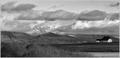
| 11/04/2005 12:47:19 PM | Wide Viewby sigrun_thComment: Hello from the Critique Club!
First - this is a stunning image! How can I critique something so beautiful!
Composition/perspective - the distance relationship, front to back, in this image is excellent. The small hint of higher mountains in the background is real nice and adds to the overall expansive feeling of the shot. The grasses in the forground, to me, almost act as a leading line drawing you to the horizon on the left which then sweeps you right across the image to the object I see as your subject - the house. Placement of the house and it being the only one in the shot help to create the mood of the shot quite nicely. Your timing of the shot was quite good - the clouds almost seem as though you placed them there on purpose. The image is crisp and very clean. Black and white was the perfect choice for this although I think it could be just as strong if in color. The crop also adds to the quality of the image.
Color - well, it is b/w. However, you have processed it to maximize the various shades of gray quite nicely. For a black and white image this has a very rich palette.
Lighting - natural of course...the sky is where I would look for problems here and I see none. Even all the way to the back where you would expect more blending, you got the exposure just right to allow all the elements and details stay in the image.
Challenge requirements - the crop helps to add to the 'wide angle' aspect of the shot, but even a taller crop would not have hurt it. Following the horizon across the image in either direction you can feel yourself travelling the distance. It definitely meets the challenge requirements.
Overall/my opinion - I was a little intimidated by critiquing this shot. It is exactly the kind of shot I strive to be able to produce. Your talented eye is very apparent in this image and your control of the conditions around you with your camera is clearly evident. VERY WELL DONE! Message edited by author 2005-11-05 09:00:54. | | Photographer found comment helpful. |
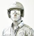
| 11/04/2005 11:12:59 AM | Silver Guyby Pug-HComment: Hello from the Critique Club!
I have been studying your image but it did not take long to get a feel for this composition.
Composition/perspective - the subject fills the entire image with very little negative space except for that bit on the left. Perhaps a bit more negative space on the left to offset the subjects 'centeredness' or emilinate it all together and crop tighter to the medals on the jacket. The straight on shot and only showing from the chest up is one of the strong points of this image.
Lighting - control of the lighting on most of the subject is very good. Some areas appear blown out where you lose definition of your subject in the background. Not sure if this is an actual lighting effect or a processing effect. About the only weakness I see in the image is this effect though - top left of the helmut, top of the left shoulder. The definition is not completely lost, but they do appear much brighter than the rest of the image.
Color - light on white is not easy and this accomplishes the topic very nicely. Outside of the areas mentioned above, your subject remains well defined against the background. The silver is a very nice touch and unique in this challenge. Excellent eye for the opportunity!
Challenge requirements - there is no doubt that this meets the challenge and very nicely as well. Your subject's expression helps set a mood for the shot which adds to it greatly and helps to keep you focused on him. I think this would be a strong image no matter what color the background was.
Overall/my opinion - this is an excellent image that demonstrates quite effectively the challenge topic, your eye for the shot and composition, and really captures you from first glance. Very well done image! | | Photographer found comment helpful. |
| 11/04/2005 10:48:15 AM | loveby erainmanComment: Hello from the Critique Club!
After studying your image I can say that I think the idea and execution of that idea are in conflict.
Composition/perspective - the heart is very centered in the image which takes away from the potential it has. Also it is very straight, as in the safety pin and beads are at a nice angle but the heart is just flat. A slight angle to the heart would help here as well as placintg the subject off to one side weighting the negative space. By flat I mean that the heart just seems to be lying/hanging there. Perhaps angling your camera to offset that would help - 80 degrees to the subject or so. This would give the heart some depth. The focus is off. Nothing seems to be the center of focus or attention of the camera. Again, the subject is just there.
Lighting - with no distinct reflections on the image it gives me the appearance that it is backlit. The background seems a little too bright. There are some streaks in the background as well. Not sure if the lighting caused this or post processing. But they do present some distraction. The edges of the heart also seem to flare a bit, again giving me the impression of backlighting (which is a good technique) but just a bit too bright.
Color - the red of the heart is a bit dark for this challenge. A softer pink may have worked better. In a different challenge this would be good - it is a nice rich color that is strong and could be used quite effectively. The white background is not all white. There are streaks of red and yellow across the image that should have been removed.
Challenge requirements - light on white is not an easy topic. It is very difficult under optimum conditions. However, here I think the red is just too strong. The beads and pin are ok since they are on top and the heart dominates the space. The background also takes away from conformance since it is not all white, but streaked as stated above.
Overall/my opinion - the concept you have here is a good one. I think it fails in the composition though. With slightly different lighting and a better focus this would be a stronger image. With slightly different coloring in the heart definitely would have helped. Your creativity shows with this image and I think you are demonstrating your potential. A little more work on composition and execution and you will have it down. | | Photographer found comment helpful. |
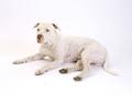
| 11/04/2005 09:52:52 AM | Maxxby angela_packardComment: Hello from the Critique Club!
Composition/perspective - your angle of approach to this shot is very good. Low, but not too low that the dog appears flat. Your subject is very centered, perhaps placing him off to one side or more towards a corner would make it a stronger image. The subject itself is strong enough that applying the rule of thirds would not have hurt the image. The negative space also would not have hurt if it was weighted to one side. The face appears a bit soft and the paws appear slighty fuzzy. Perhaps application of USM or a different focus would eliminate that.
Lighting - overall the lighting is well done. A few areas seem a bit blown out - from the top of the head to the middle of the back for example. You start to lose the definition of his back in the brightness and there azre areas where the subject is indistinguishable from the background. Control of the shadows is well done. Enough to keep the subject well defined in most areas, not too much to give dark spots.
Color - light on white obviously by definition does not contain a lot of color variation. The skin tone and spots showing on the subject really help to keep the white coat from getting totally lost in the background.
Challenge requirements - you obviously have met the challenge very well. You have a strong subject who seems to not mind posing for you.
Overall/my opinion - this is a very pleasing portrait. It could be a stronger image if composed slightly differently. But overall you did a very nice job both with your image and meeting the challenge.
| | Photographer found comment helpful. |
| 11/04/2005 07:25:05 AM | Delicate Balance of Natureby shepherdtrainerComment: Hello from the Critique Club!
Composition/perspective...the overall size of the image, as in how much of the landscape is contained in the image is nice. The sun is not too big to dominate the picture but also not too small as to be just a spot on the horizon. The image is very centered, offsetting the sun on the horizon would make it a stronger image as ther is nothing in the foreground to get the viewers attention other than the reflection on the water. The image is slightly tilted which usually would not make that much difference except here the relfection in the water seems to emphasize it. Although slight, it just gets pronounced more with the reflection.
Lighting - obviously the sun, but you have controlled flare and extreme glare nicely with your exposure time. It does not appear totally washed out. The halo around the sun is a nice effect as well. The center section of the reflection is a bit bright. There may have been enough color there that it could have been brought down a bit.
Color - very nice subdued colors in this shot. The pallete gives the image a nice soft feel and a very serene atmosphere. Brighter pinks/reds would be too hot. Also they are across the whole image which is nice as well - keeps it from seeming isolated. The dark trees are a nice offset to this while they also give some definition to the horizon.
Challenge requirements - without the title I am not sure I would make a connection between this image and delicate. Although the image is a quiet one presenting a very serene scene and pretty sunset, this does not immediately speak to being delicate. If there was some element in the shot that also spoke to this...perhaps a bird in the water or something like that I think it would have been a much stronger entry.
Overall/opinion - you have a real nice sunset shot here that contains a lot of good elements. A few distractions, yes, but nothing that could not be fixed with some slightly different post processing. Don't be discouraged by its performance in the challenge. I think the image has potential and certainly you have the eye for the capture. | | Photographer found comment helpful. |
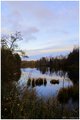
| 11/03/2005 10:26:34 PM | The memories from a pond (color)by sz1_Comment: I must say I like this version of this image much better. The color is fantastic and the small branches that I found distracting in the b/w version are not as much of a distraction in this one. Also in this version the bottom that appears busy in the b/w version does not appear that way here. This is a beautiful image and you did a superb job with the capture. Very well done! | | Photographer found comment helpful. |
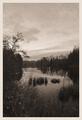
| 11/03/2005 10:23:02 PM | The Memories From A Pondby sz1_Comment: Hello from the Critique Club!
Ok..have been studying this image for a while now...I have some likes and dislikes, but overall it is a nice capture.
Composition/perspective - your location is nice. It appears you are just above the water level which works well for the composition. The pond almost acts as a leading line drawing you into the shot. Not being a straight on shot down the pond also works quite well. I find the thin branches on the left foreground to be a bit if a distraction (the ones that appear over the water by the grassy islands, not the tree above them). The bottom of the picture is a bit busy and perhaps with a tighter crop on the bottom would eliminate this. With the negative space on the top I feel the image would still be strong.
Color - the black and white is nice, but some areas appear a bit dark. There is more detail in some of the reflections than there is in the trees themselves. The tighter crop on the bottom would also remove some of the darkness found there.
Challenge requirements - the grain in this image helps it out as opposed to hurting it. However, with the dark areas some of the grain effect is lost. The application is uniform though which helps it out a lot.
The border - to be honest I am not a big fan of borders on a lot of images. This border is just a bit too wide for the image. It pushes the perspective back just a bit adding a sense of distance that is not really there. (look at the color version and this one alternately and you will see what I mean)
Overall/my opinion - This is a strong image but I do feel it could be lighter in some areas and I just get distracted by those thin branches in this version. I like the negative space on the top which I think would support a tighter crop on the bottom. Well done! | | Photographer found comment helpful. |
|
Showing 1161 - 1170 of ~2097 |
Home -
Challenges -
Community -
League -
Photos -
Cameras -
Lenses -
Learn -
Help -
Terms of Use -
Privacy -
Top ^
DPChallenge, and website content and design, Copyright © 2001-2026 Challenging Technologies, LLC.
All digital photo copyrights belong to the photographers and may not be used without permission.
Current Server Time: 07/24/2026 06:26:04 PM EDT.
|