|
|
|
Showing 1151 - 1160 of ~2097 |
| Image |
Comment |
| 11/05/2005 07:14:15 PM | wire and lightby swagarComment: Hello from the Critique Club!
I have studied your image and have the following to offer:
Composition/perspective - this is an interesting composition and clearly shows a creative process was behind its creation. Some of the frame is in focus but the right side and top of the image are not. This is a little bit of a distraction. The focus seems to be only on the light source. Your angel to the subject is good which allows it to be off the wall and floor at the same time - not flat.
Lighting - I think this is the weakest aspect of this image. It seems you have a grasp of the concept of white on light, but did not use the lighting necessary to create the same photograph as you saw in your minds eye. A brighter and more direct light on the background to fill the background would have helped as well as light directly at your subject to brighten that as well. As it is here, the image is very dark despite both the subject and wall being white due to the single light source embedded in your subject.
Color - in a challenge such as this I would not expect to see an abundance of color in an image, but I would expect to see a lot of white and lighter shaded areas. This image is very dark due to shadows which takes away from any light element you may have had.
Challenge requirements - if this was lit differently this could have been a strong image for the challenge. As it is here, it really kind of fails to meet the challenge. More of the image is dark - grays and even black - than is light or white.
Overall/my opinion - if you had better lighting and took a little more time in thinking about the set-up and afterwards really thinking about your image, you could have done much better. This image shows a very creative side which just did not translate well into the challenge. Please do not be discouraged by this critique. You certainly have potential and the eye for the unique shot/perspective. I look forward to seeing your future work. |
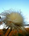
| 11/05/2005 06:07:41 PM | Blooming thistleby nagymelisComment: Hello from the Critique Club!
I have studied your image and have the following to offer:
Composition/perspective - your distance from your subject and the balance between subject and negative space is good. It may have been nicer to have the background a single color, but it is not really a distraction as it is. The subject leaves the frame on both sides and bottom which is good - one side would have weighted the image to appear unbalanced, two sides would have appeared sloppy. You are close enough that this works since the bulk and meat of the subject you were going for are large. That said, the center of the subject is too centered left to right I think as well as a bit too much top to bottom. Although there is negative space above the image, the main 'sunburst' of your subject is almost exactly dead center.
Lighting - obviously natural or at least appears as all natural. It also appears as though it is the cusp of evening and the sun is creating a shadow on the lower part of your background. Nice choice and good timing. A little earlier and it would have been too bright and later too dark. A photographers nightmare.
Color - this image has a very rich palette of strong colors and tones that really hold their own in the combination. The rich autumn tones of the hillside in the background are a nice contrast to the soft powder blue of the sky above. The tans and faded greens in the subject are a nice contrast to both halves of your background.
Challenge requirements - I look at the center of your subject and I am reminded of soft fur and warmth - petting my dog(s) or past cats. Sound funny? You have captured the delicate element quite well. I think your single biggest detractor is the focus. You may try being a little farther away from your subject, zooming for some of the distance, then cropping to pull your subject to the front. This way you may be able to achieve a better focus and still appear extremely close.
Overall/my opinion - you have a good eye for the shot. So many people would walk right on past a scene/image like this just because they 'can't be bothered.' It shows a creative side and an interest in getting the image the way you see it. If your focus was better I really think this would be a much stronger image. |  Photographer found comment helpful. Photographer found comment helpful. |
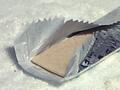
| 11/05/2005 05:20:55 PM | spearmintby wavelengthComment: Hello from the Critique Club!
I have studied your image and have the following to offer:
Composition/perspective - your angle to the subject is good and your height is not too high that it appears flat. The subject occupies a lot of space which, in my opinion, takes away from the ability to meet the challenge well (more below). On the other side of that though, by being so close it allows you to get the detail you have here to be so clean and crisp. Your focus is good which allows the whole image to have the same 'feel.' But there is no real mood or force in the shot. The background has a lot of texture - it appears as though you have this laying on sugar or a similar substance. If it was more uniform it may have helped, but rough and bumpy I find to be a bit of a distraction. Plus I am always drifting to the reflections around your subject. Perhaps a flat white background would be worth a try.
Lighting - the lighting used here is very well done. You have two reflective surfaces and you were able to shoot with no flares/glares or any real blown out areas. Nice job!
Color - in a light on white I would not expect to see a lot of color and the use of foil in your subject would have been enough without exposing the gum stick at all. OR...eliminate the wrapper completely and just have the gum itself on the background. I think the creative concept here was lost on most viewers though (see below).
Challenge requirements - this does meet the challenge requirements. In fact, you have an interesting effect here - what I will call the 'layered' look. The gum on the inside of the wrapper is light on white while the wrapper itself is also light on white. I think this concept was not picked up by the viewers. Based on my impressions, I would assume people were put off by ratio of subject to background and never quite got the 'layered' aspect. This, I think, is an excellent creative element. Perhaps if you were farther away from the subject and just a tad higher above it (not too much to make it look flat) the impression would have been stronger and the background less distracting.
Overall/my opinion - technically you have a very clean image here. As stated above I just think the subject is too big in the scene to grab peoples attention long enough to look at the details and see the creative elements in the shot. The background choice was not the best either. There is a distinct black spot in the shot as well which serves as a minor distraction since it is the only really dark object in the shot. Thus, it really stands out. I think you have demonstrated a good creative thought process and a good execution of that thought process overall, it just didn't grab people as it should have. | | Photographer found comment helpful. |
| 11/05/2005 01:52:44 PM | Delicate Music of the Bellsby newtune3Comment: Hello from the Critique Club!
I have studied your image and have the following to offer:
Composition/perspective - there are a lot of elements in this picture that by themselves could carry the image. It is very busy and somewhat distracting when viewing due to the odd angle of the shot and all that is going on with the wires. A tighter crop on just the bells would have made a good subject; a different perspective to eliminate all the cables perhaps; a different angle of the camera to 'straighten' the slant that appears to be part of the structure as opposed to your actual positioning. The image appears to be slightly out of focus which causes the eye to wander looking for a sharp part and there is none. The blank space above the frame is a distraction as well.
Lighting - this appears to be natural lighting only and that part of the structure is exposed to more light than the rest (left side) making the frame on the left very dark. Cropping that out may have helped. There are no strong reflections or flares/glares in the bells so you had good control on that aspect.
Color - there is a limited palette and that itself is very narrow. A boost in contrast may have helped to bring out the natural variances that exist in some of the bells as well as letting some of the textures on the bell tops to come through.
Challenge requirements - without the title I honestly would make no connection to 'Delicate' in this shot. All the elements of your subjects are hard surfaces and it is hard to make that soft/delicate. If we could hear the music perhaps, but we cannot. Also, the connection with your title, bells are by nature very hard and dynamic sounding. Especially ones meant to be heard from a distance.
Overall/my opinion - I honestly feel that a better effort could have been made here. The focus is the biggest distraction in the shot. The subject matter could have been presented in a much more pleasing fashion. The angle and busyness just make it difficult to 'relax' while viewing. (I have viewed your portfolio and can see that you are capable of a much better photograph...perhaps you were having a bad day.) | | Photographer found comment helpful. |
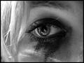
| 11/04/2005 07:51:33 PM | Brokenby gatchouComment: Hello from the Critique Club!
I have studied your image and have the following to offer:
Composition/perspective - the close up is well done and the DoF well controlled. The subject being the whole frame adds power to the image. I would love to see this as a larger than 640 x X image. I think it would have much more impact. Straight on is about the only way to present this type of image, but there are certain elements that need to be considered when doing that. Reflection in the eye for one. Unfortunately this was an Open challenge so spot editing is not allowed, but as an after challenge whim, you should try and remove the reflection in the pupil. The relfection in the iris is not/would not be as distracting if the pupil was solid black. If you ever get the notion to do that, let me know, I would love to see the difference.
Color - obviously this is black and white...however, your control of the shades of gray is well done. You have solid black that is not shaded and also solid white that is not grayed. There exists a nice balance between the lights and darks.
Lighting - there appears to be only one light source to the left of the eye. For most of the image this is ok. But the upper left corner appears brigt and some of the streaks in the hair are a little bright to the point where definition is lost. Not much, but some.
Challenge requirements - at first look I do not get 'Delicate' from this. Despite the title, it still is a hard image. By hard I mean the makeup is very defined and not 'streaky' at all which I would have expected from the theme and title. The make up does not suggest a black eye, rather it suggests a crying eye. If there was a bit more 'streakiness' to it or a more 'fluid' look to it it would have worked much better. It is a good concept, just not 'wet' enough to carry it through to completion.
Overall/my opinion - this could be a very strong image that could fit any number of themes with a little more attention to the makeup. I know, no one expects you to be a make up artist as well as a photographer, but attention to detail in any endeavor makes or breaks it. You have a good eye and obviously can be very expressive, but the details are key. I like the image and would like to view any edits you apply. Message edited by author 2005-11-04 21:39:51. |
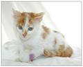
| 11/04/2005 07:00:52 PM | So, that's a bird?by XileboComment: Hello from the Critique Club!
I have studied your image and have the following to offer:
Composition/perspective - you have kept the focus of your subject out of the center - good application of the rule of thirds. Being on eye level with your subject is a big plus in my opinion. The crop works well here keeping the negative space to a minimum while allowing the subject to fit in the frame. The expression is priceless and I think coupled with your title, lets the prop bird fit in nicely. The small bits of color the prop add to (purple and red) and don't hurt the image. Their contribution is insignificant compared to the image as a whole. The image is crisp and clean, well focused and not overdone. Perhaps the sheet/cloth that is draped could occupy more space to the right (that area appears a bit bright) to help tone that area down a bit - the brightest part of the image.
Lighting - it appears as though multiple light sources were used - background and foregound. Nice balance. Although the upper right corner - the negative space - appears somewhat bright, it is not blown out and distracting. The detail in the cat is clear and consistent and there are no bright spots or flares anywhere. Well done!
Color - the colors, although minimal, in this shot are really nice. There is just enough to keep it from being a boring white picture but not too much that makes you wonder why it was submitted. There is enough white from the cat in contact with the white background to keep the cat inline with the theme, but separate it from the background so it is not lost. Excellent mix...an aspect that was enhanced by your control of the lighting.
Challenge requirements - definitely meets the challenge requirements. Although not totally white, the subject doesn't have to be. The shade of red in the coat is just light enough that it mixes and blends very well. The small amounts of color added by the prop are ok as well. Adds to the direction of focus I think - small enough to be insignificant, yet colorful enough to at least let you notice. Not a distraction at all.
Overall/my opinion - this is an extremely crisp image with a lot of great qualities. Your subject is just cute and very expressive in the face. The sheet/cloth that is draped is an excellent feature. It keeps the background from being flat and absorbing. Perhaps a little wider than just the drape behind the cat - more to the right - but it is not a detractor. Very nice image and very well done! Message edited by author 2005-11-05 01:01:05. | | Photographer found comment helpful. |
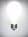
| 11/04/2005 06:22:40 PM | A Light On Whiteby seebrownComment: Hello from the Critque Club!
First - I don't know if I should feel honored to critique your first challenge entry or if I should chalk it up to bad luck of the draw. But I have studied your image and have the following to offer:
Composition/perspective - the amount of space in your image that your subject occupies is great. Really puts the focus on the subject. The shot is straight on though so it appears a little flat. If the shot had been cropped so the bulb was tilted or off center or the camera angle was like at 45 degrees, it would help the bulb pop out of the shot and give it a little more of a natural look. It is hard to make a lit bulb show its shape. The contact part of the bulb (the metal) has clear 'round' definition. But the bulb part (the glass) appears flat.
Color - obviously it is b/w. But you have some shades of gray that appear around the edges. Your image almost appears to be the opposite of the challenge requirements - white on light. This is not necessarily bad, but it should be consistent. A low light behind your background may have helped this. You would have kept the 'light' while also keeping the white. This may be more difficult since you may then lose definition of the bulb shape, but lowering the subject wattage or using a softer light bulb could overcome this.
Lighting - ha...obviously the bulb. You did a very nice job maintaining definition of the shape of the bulb while at the same time not blowing out the center portion where it is brightest - well done! It is a bit bright, yes. But does not apper to be blown out at all. You can clearly see the entire bulb shape. The above comment in color pertaining to the background and this one would be the hardest part of the image to control. As it is you did a nice job.
Challenge requirements - meets the chalenge very nicely. You definitely have an imagination and are creative and this will always help you.
Overall/my opinion - this is an excellent example of control and you have pulled it off nicely. You took a concept and produced and image that is reflective of that which is very apparent. You obviously thought about this before shooting and it shows. It is a clean shot with clear definition. I just would have liked to have seen it a little less staged and more haphazard. Overall you did a very nice job on a not so cooperative subject. Well done! Message edited by author 2005-11-05 01:03:51. | | Photographer found comment helpful. |
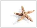
| 11/04/2005 05:48:49 PM | Sea Starby RikkiComment: Hello from the Critique Club!
I have studied your image and have the following to offer:
Composition/perspective - very nice application of the rule of thirds. The negative space is balanced nicely with the subject and does not hurt the image in the least. It appears you are at about a 45 to the subject which is a good angle to work with and allows a nice smooth perspective in this shot and keeps the starfish from appearing flat. Well done!
Lighting - kind of hard on this one...there is enough brown in the starfish to offset the apparent glare and give it a very nice texture. However, some of the white areas appear blown out. The brown helps to tone this down a bit. Not sure if this was due to lighting or processing though.
Color - again, the brown of the starfish is a really nice offset to the stark white of the rest of the shot. The gray of the shadow helps to keep the starfish well defined in the edge areas where they meet. Where there is no shadow the edges seem to blend a bit on the white leaving some brown specs 'floating.' But this is minimal.
Challenge requirements - certainly well met. Your choices of subject and background with the shadow effect is a real nice combination. A little bright but that doesn't hurt it overall in my opinion.
Processing - my biggest problem area. Almost your whole background was removed. I realize this had to be done to achieve the effect you wanted, but seems borderline to me. Not my cause here though. I think you applied a very creative technique extremely well. Your choice of glass shows a creative thinking process that you were able to execute nicely. I usually am not a big fan of borders, but this one works ok. It could be a tad narrower in my opinion and would not hurt the strength of the image at all.
Overall/my opinion - to be honest, at first glance during the challenge I didn't know what to make of it. I knew it was a good image, but was torn with the processing. The image quality won though. On the whole this is a very well executed concept that met the challenge in great fashion. The starfish is a much stronger subject than I would have thought at first. A little too bright, but the other strengths make up for it. Well done! | | Photographer found comment helpful. |
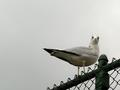
| 11/04/2005 03:37:54 PM | Yeah, so I pooped on your car. Wanna make something of it?by xuan768Comment: Hello from the Critique Club!
I have studied your image and have the following to offer:
Composition/perspective - the overall use of negative space and the amount of space your subject occupies is a good ratio. Looking up at the subject actually works nicely here as it allows you to use the sky as your 'white.' The rule of thirds is applied here nicely as well.
Lighting - this is obviously natural light. Coupled with your choice of perspective it works well though as there are no harsh spots or dark shadows. There is a little brightness on the right hand side, but it does not distract or lessen the shot. This may have something to do with the weather or time of day. Either way, good timing for capturing the shot.
Color - there are some great variations in the bird you have brought out very well. The sky also seems to carry on mostly a uniform coloring(except as noted above). It is the dark green/gray of the fence that is out of place.
Challenge requirements - the challenge was light on white. I think you have the light part ok. The white part is not exactly white. It would be a stronger image if the sky was less gray, in my opinion. This may have been helped if your perspective was different so that incorporation of more of the whiter shade to the right was used as the background. I understand though that a bird is not necessarily going to cooperate with you on that. But I feel it may have hurt you some. A different perspective may also have helped - if you were on the other side of the fence so that the main portion of the bird showing was the chest, which is white, was against the uniform gray sky. It would have reversed it to white on light, but that may have worked. The fence doesn't help at all. It is distinctly dark and could have been removed - cropped out. Again, a perspective change may have helped this. Obviously I was not where you were so I have no idea what the surroundings were and the availablity of any of those chages.
Overall/my opinion - you have a very crisp, clear, well composed shot. Your focus is excellent and your subject is well placed. Perhaps in a different competition it would have performed better. You obviously have the eye for the shot and creative writing skill/imagination(the title). You should not be disappointed with its performance in the challenge. Message edited by author 2005-11-05 00:36:28. | | Photographer found comment helpful. |
| 11/04/2005 02:34:34 PM | Innocent eyes?by chipucComment: Hello from the Critique Club!
I have studied your image and offer the following:
Composition/perspective - the angle of approach (whether done in processing or actual angle of camera)is good. it compliments the facial expression quite nicely. Placement of the subject in the image is also quite nice. The face is strong enough that the negative space does not hurt it at all.
Lighting - it appears that the light is coming from the left/upper left. That is where I see the problems. The cat is indistinguishable from the background on that side and all definition of fur is lost. Actually in the eye it appears as though there are three bulbs??? If not, the one is very strong. If it is multiple bulbs, perhaps moving one of them down some would take the harshness and blown out look of the one spot on the cat down a bit. For the rest of the subject, the lighting is good - enough detail in the fur to keep it defined against the background.
Color - white on white...not easy to do and keep it all white. Except for the lighting effect, the shadows in the fur give enough gray to help with the definition. The color in the eyes is spectacular and the slight pink in the nose and ears is just enough to offset the complete white of the shot and help define the face and head. If you could achieve the same grays in the fur on the left side of the cat it would keep it separate from the background.
Challenge requirements - definitely meets the challenge requirements.
Overall/my opinion - I like your chosen subject and can see you took the time to set the shot up to your liking. How you got the cat to pose for you I will never know. Your focus is good and for the most part your processing doesn't seem to be overbearing or detracting from the image. Again, my only real criticism is the lighting/blending of the cat into the background. | | Photographer found comment helpful. |
|
Showing 1151 - 1160 of ~2097 |
Home -
Challenges -
Community -
League -
Photos -
Cameras -
Lenses -
Learn -
Help -
Terms of Use -
Privacy -
Top ^
DPChallenge, and website content and design, Copyright © 2001-2026 Challenging Technologies, LLC.
All digital photo copyrights belong to the photographers and may not be used without permission.
Current Server Time: 07/25/2026 11:16:23 PM EDT.
|