|
|
|
Showing 1141 - 1150 of ~2097 |
| Image |
Comment |
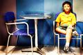
| 11/07/2005 12:29:45 PM | fragile worldby francis1426Comment: Hello from the Critique Club!
I have studied your image and have the following to offer:
Composition/perspective - I think this is the strongest element of this image. Rule of thirds is applied well with the main subject even though the table and chairs are centered. The subject weights it to one side offsetting this nicely. Being on his eye level really makes a strong impression. This is amplified by his gaze appearng to be off to one side. The shot is not too busy and the subject is strong enough to have been placed alone in the shot (minus the extra chair and table).
Color - The colors seem very saturated. Your processing steps don't list use of this so I have to assume it is from the dodging. Possibly a bit much. There exists a nice contrast between the yellow and blue that is emphasized by the changing of the background colors.
Lighting - This looks to be natural indoor light which also appears very bright. The reflection off the table is a distraction and there appears to be some specks floating around the table/walls with some distracting flares of reflection. Again, not sure if this is caused by natural relfection or processing, but they add to the overall overbright feeling in the shot. The base stem of the table is slightly blown out as well as the yellow of the shirt, the hand on his leg.
Challenge requirements - I do not immediately get delicate from this photograph without the title. This may be one area where it failed with the viewers/voters. The subject's expression is good and perhaps a tighter zoom on the subject with a tighter crop would have helped this apsect.
Processing - this does appear to be over-processed. The disparity in the facial tones, the blown out yellow of the shirt, the artificial color of the skin in the face and legs. A little less would have made it stronger. The focus seems to be off a bit as well in the subject. This fuzzy appearance may be due to the processing as the rest of the image does not appear to be as fuzzy. This was a basic editing challenge and as such, selective editing is not allowed.
Overall/my opinion - with less processing and more atention to the lighting this would have been a stronger challenge entry. Although far away and fuzzy, his expression really makes the shot. A closer/tighter image may have helped some. Message edited by author 2005-11-07 22:09:22. |  Photographer found comment helpful. Photographer found comment helpful. |
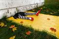
| 11/07/2005 12:11:23 PM | End of the Road in Oz by scalvertComment: One of the truly original shots in this challenge in my opinion. Very well composed and shot. Focus is spot on and colors are great. PLacement of the subject is very nice as well. I hope this ribbons! Well done! | | Photographer found comment helpful. |
| 11/07/2005 11:24:05 AM | Shellsby viljoendaleComment: Hello from the Critique Club!
I have studied your image and have the following to offer:
Composition/perspective - in my opinion you would have been just as strong with only the larger of the two shells in the image. The smaller one is sort of a distraction since the larger one dominates the image. It appears as though you were directly above the subject with only a slight angle ot the shot. This could be improved by slightly lowering your angle to the subject. A few things would have resulted - the flash reflection would be more distributed and not so harsh and the shadows would be a lot softer. As is, the hard dark shadows take away from the presentation. Your focus is exceptional though allowing so much of the textures and details of the shell surfaces come through.
Color - in a light on white I would not expect to see a lot of color. The small splashes of color in the large subject are just enough and well defined. The background tends to fade into gray, another aspect that would have been helped with different camera placement.
Lighting - I think this is the weakest aspect of the image. It is very harsh and bright. Especially bottom center. This appears to be fulll reflection of the flash. Perhaps using an off camera light source lower to the subject and maybe at a 45 and bouncing your flash to light the background would have worked better. Portions of the shell appear on the verge of being blown out and in a couple small areas you have lost all detail.
Challenge requirements - this meets the light on white requirements nicely. I think where it fails is in the lighting as stated above. This turns your background gray and makes your subject appear overbearing.
Overall/my opinion - with only the larger shell in the frame it would have been just as strong an image...in other words, you did not need the smaller shell. The larger one has a nice shape, lots of texture and offers the only color making the smaller one redundant. Better control of lighting and camera placement to the subject would have helped a lot. The shot does demonstrate a good creative thought process, a little work on the set-up and presentation and it moves right up the scale. | | Photographer found comment helpful. |
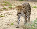
| 11/07/2005 11:04:56 AM | Critically Endageredby FleximusComment: Hello from the Critique Club!
I have studied your image and have the following to offer:
Composition/perspective - I find this photo to be well composed and free of distractions. The small bushes in the front right don't hurt it at all. The photo is clean and sharp and well focused. You did not list what lense you used so it is hard to tell distance from subject, but the perspective is really nice - low, almost eye level and not much behind it to draw you away. The subject to space ration is very well done. The relatively empty setting gives it an open feel and allows you to focus on your subject. The leopard is looking right at you which also helps the image. Well done!
Color - the palette here is rich and full although only in a short range. The bits of green stand out against the browns and tans while not over doing it. The colors in the cat are well separated and the overall tonal quality allows it to stand out against the tans of the soil. I think you added just the right amount of contrast. Any more and in my opinion, the cat would have appeared 'painted' or 'stuffed.' As is it looks entirely natural.
Lighting - obviously natural light. Your control over your placement and relationship to the cat is very well done - no hard shadows to contend with. This may have to do with the weather. But even absent direct sunlight you would expect more shadow from the cat without good control. Again, this helps the cat stand out. The lack of a busy backgbround also helps here. You stated this was in a zoo, distracting backgrounds are always present and in zoos usually offer only dark shadows.
Challenge requirements - this may be where this image fell short. I do not immediately get delicate from this image. The teeth showing make it appear more menacing or threatening than delicate. Yes, their plight in the real world may be hinged upon a delicate balance between man and nature, unfortunately this doesn't come through in this image. Especially when most viewers/voters are not going to take the time to study the image and only go for the immediate impression.
Overall/my opinion - very well composed and processed image. The cat is a very strong element and application of the rule of thirds is very well done here. Technically it is hard to beat this image. As stated above, I think it fell short in the delicate aspect. Maybe a different pose of the cat - sitting/laying, no teeth showing...many possibilities. They may not have exactly shown delicate either, but it may have been 'softer.' | | Photographer found comment helpful. |
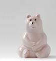
| 11/06/2005 05:17:37 PM | In a friendly wayby janskuComment: Hello from the Critique Club!
I have studied your image and offer the following:
Composition/perspective - very nice application of rule of thirds. Your subject is the right size for the shot as well (subject to negative space ratio). Getting to 'eye' level with your subject was exactly the right perspective for this shot as well. At first I thought this looked sort of statice and flat, but when you really look at it you can see a lot more definition of shape in the bear than first appears. Just a suggestion, try turning the bear slightly to the left (since it is on the right) to add more shape and depth to the bear. This would allow more of the curve around to the back to show.
Color - the subtle color of the bear is well captured while your white background is still white. Post processing was not too harsh so as to remove the speckles in the coloring. With a light on white I would not expect to see a lot of color anyway.
Lighting - overall your lighting is done well. It appears as though one light source was used - to the left. My only dislike is the glares (as you pointed out). However, the only one that is any kind of a distraction is the one on the arm. Perhaps if you had used a faster shutter speed it would not have gotten so bright and any loss in intensisty of the rest of the image could have been brought back with a levels adjustment. I just don't think you gaind much by a 3 second shutter speed and infact it may have been the culprit to the glares being so bright.
Challenge requirements - this has certainly met the requirements of the challenge. Your subject is definitely light and your lighting is good that it has not caused any dark shadows. A small bounce to the background may have brightened that up a bit while not sacrificing anything in the foreground.
Overall/my opinion - I think this got lost on the viewers. As stated above, maybe a slightly different angle to the subject may have made it pop out of the background more and not appear flat. Again, a faster shutter speed may also yhave helped with the glares on the arm. | | Photographer found comment helpful. |
| 11/06/2005 04:48:58 PM | Dresden Laceby rjpatComment: Hello from the Critique Club!
I have studied your image and have the following to offer:
Composition/perspective - the subject to background ratio here is very good. Not being a straight on shot and shooting at level with the subject also are good techniques you pulled off very nicely. The biggest detractor to the image I think is the choice of backgrounds. A solid color is nice, but I think the color is what turned people off. It almost looks painted in. I think if you had gone with something a little more subdued, the concept of delicate may have projected better. Your focus/DoF is done well. The plane from the hand in the foreground, across the face to the hand in the background is very clear. Well done!
Color - the colors in your subject are very delicate and soft. The sublte shades all come through (a tribute to your lighting). The contrast to the background color is a little harsh. A softer color there would have helped this image greatly.
Lighting - very well done. There are a lot of reflective surfaces in your subject and only the one small glare on the forehead which doesn't hurt the image much at all. It appears as though multiple sources of light were used. Your placement was done well. No dark shadows and no blown out areas.
Challenge requirements - there are many elements of this image that say delicate - the lace of the dress, the ceramic, the fingers, etc. It meets the challenge requirements well and certainly expresses delicate.
Overall/my opinion - this image meets the challenge and is well done. Your overall control of the exposure and composition are exhibited quite nicely. Where this image fails I really think is inthe background. A softer color more in line with the subject would have worked much better in my opinion...a soft pink or pale red, maybe even white. The purple is just too strong for the subject and detracts from the delicate aspects.
|
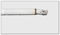
| 11/06/2005 03:28:48 PM | light(en) ?by gocComment: Hello from the Critique Club!
I have studied your image and have the following to offer:
Composition/perspective - you really nailed this aspect of the shot. Application of rule of thirds is done quite nicely in two direction/focal planes. Your use of negative space is well done and there is not so much that your subject is lost. Not sure if you removed it through processing or it just didn't show but the lack of smoke is a big plus in my opinion. I also like how the cigarette is not perfect, but not too wrinkled either. The only thing I may have done here is to crop the left side to remove the filter paper portion so the subject had a uniform appearance from end to end..well except for the lit part of course.
Color - I don't expect much color in a light on white, and this holds true here. The grays and browns on the lit end offer a nice contrast to the rest of the image.
Lighting - lighting is well done. Not too bright to cause blown out areas or shadows, but bright enough to allow full detail of the cigarette to show through. I can clearly see all the mm band on the paper. Well done!
Challenge requirements - this meets the requirements of the challenge very well. The small band of dark brown on the lit end is not enough to have an impact at all. The gray ash also meets the requirements so no problem there. Well done!
Overall/my opinion - this is a very interesting idea and very well executed. Not sure why it didn't do better in the challenge. It is a well focused, clean, crisp image that demonstrates excellent control of lighting and composition. | | Photographer found comment helpful. |
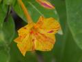
| 11/06/2005 02:59:35 PM | Delicate flowerby CamManComment: Hello from the Critique Club!
I have studied your image and have the following to offer:
Composition/perspective - this image has a lot of appeal and could be a much stronger entry with a few changes perhaps. The flower, although not dead center, could be a little more to the left to really nail down application of the rule of thirds. If the crop was a little different to either get the full bud at the top in the shot or remove it completely would also have helped. Your angle to the subject is very good and the ratio between subject and background is very nice. If the main subject was in focus the DoF would work very nicely.
Color - wow! This image has a very strong palette with vibrant and alive colors. The contrasts between in flower colors and flower to background works very nicely. A small boost in contrast may have brought them out a bit more even without hurting the image at all.
Lighting - it appears only natural light was used. The only choice here. You have no bright spots and everything appears to be fairly uniform. Well done.
Challenge requirements - this meets the challenge requirements quite well. Showing just enough of the inside of the flower without pointing directly into it really helps.
Overall/my opinion - where this image falls down is the focus. Applying some sharpening and/or USM may have helped to make it look not so fuzzy. The background is ok, it is the flower that should be clear. If this had been, I think this would have fared much better in the challenge. |
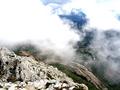
| 11/06/2005 02:41:53 PM | float pastby messerschmittComment: Hello from the Critique Club!
I have studied your image and have the following to offer:
Composition/perspective - this is a very nice photograph with a good balance between your intended subject and the landscape beneath them. The perspective of looking what appears to be straight down is excellent. Really gives the feeling of height and depth as well as being 'on the edge.' The hint of the distant fields is also a nice aspect. The slope acts as a leading line and draws you through your image. Well done!
Color - there is a real nice palette presented in this photo with some good contrast as well as some nice synergy between textures. The grays, browns and greens work very nicely together. The problem I see is with the whites of the coulds. Particularly the top right. The clouds are very blown out and appear very bright which offsets the quality of the rest. It draws you away from the slope and the image loses its strength and appeal. Just my opinion, but I feel a lot of that side of the photo could have been cropped out, eliminating the severly blown out clouds, while allowing for a larger overall image when resized. This would allow your height/depth to still be very evident.
Lighting - obviously natural. Control is very good on all parts of the image except as noted above.
Challenge requirements - at first glance I was distracted by the clouds and tried to compensate by looking more towards the rocks, missing completely the 'delicate' aspect of the shot. After studying it for a while, I can clearly see the elements required for the challenge. Especially since not all the clouds are solid.
Overall/my opinion - I am disappointed in the blown out sky. This is a very appealing image otherwise and certainly a unique perspective. You have a solid concept which except for the areas pointed out above was executed nicely. | | Photographer found comment helpful. |
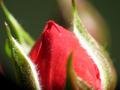
| 11/06/2005 10:07:55 AM | Roseby zumba666Comment: Hello from the Critique Club!
I have studied your image and have the following to offer:
Composition/perspective - this is interesting since you chose to use a bud as oppposed to an open flower. There is just as much beauty here as there would have been if you had. The subject is not straight on although it is a little centered left to right. I think your perspective helps to offset this some. I find the leaf in the foreground a little distracting since it is on the big side, but not too overwhelming. The center of focus seems to be the leaf on the left and not exactly the bud itself. It may have helped to adjust your DoF a bit and concentrate on the top of the bud as there it already seems to be part of the backgound. The bright spot in the background is a distraction as well. A more solid looking background would have been a plus.
Lighting - this appears to be a single light source...on the right hand side of the bud the white 'fuzz' is a little too bright and blown out. The left side also appears a bit bright , but the detail is still there. A softer light or a different angle may have helpd this. The red is strong enough that it would have come through quite well with softer light.
Color - your colors are quite strong and present a nice contrast. The balance between the amount of red and green is nicely done. With the darker portions of the background the colors stand out nicely. Again, the white spot on the right only emphasizes the OOF leaf and the brighter white/blown out portion and the colors start to get lost in the haze.
Challenge requirements - this does meet the challenge requirements. There are a few elements that express delicate to me - the bud itself as a whole, the 'fuzz' on the inner sides of the leaf, and the fact that not even the whole bud is in the shot.
Overall/my opinion - with a little different light and a little more attention to the details of your subject this could have been a much stronger entry. Perhaps removing the leaf in the foregound completely would have helped the focus/DoF problems I see here. It appears you have the 'eye' for the shot, just need to work on the little things. |
|
Showing 1141 - 1150 of ~2097 |
Home -
Challenges -
Community -
League -
Photos -
Cameras -
Lenses -
Learn -
Help -
Terms of Use -
Privacy -
Top ^
DPChallenge, and website content and design, Copyright © 2001-2026 Challenging Technologies, LLC.
All digital photo copyrights belong to the photographers and may not be used without permission.
Current Server Time: 07/24/2026 10:29:04 PM EDT.
|