|
|
|
Showing 1041 - 1050 of ~2097 |
| Image |
Comment |
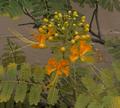
| 11/08/2005 11:12:36 AM | Delicate is Our Fragile Ecosystemby laugComment: Hello from the Critique Club!
I have studied your image and have the following to offer:
Composition/perspective - this is a very busy photograph that a different perspective could have eliminated. Shooting down on the subject includes all the background which is distracting and your subject gets lost in all the clutter. Shooting from the side may have helped this. If the subject had been cut and placed on a solid background either through putting it in a glass or similar utensil it would have allowed the strength of the subject to come through. The subject is very centered. Cropping to put it off center would have helped.
Color - the colors of the blossoms and the gradients in the buds are very nice. They could have been a bit stronger. A boost to saturation and or contrast would have brought out more of the orange and made the subtle variations as well as the natural contrast between the green and orange a lot more prominent.
Lighting - appears to be only natural. A cloudy day? This is good though since the buds have a shiney surface and bright light would have caused glares and bright spots that would have ended up as distractions. But the lack of light makes the shot appear a little dark/gray. This may have been helped in post processing.
Challenge requirements - the subject certainly conveys a sense of delicacy, but the clutter around it takes some of that away. I really feel it could have been better portrayed as stated above.
Overall/my opinion - this shot certainly shows an ability to capture a concept. I think it falls short in the setting - busy, and the post processing (see above). Using the challenge title in your photo title takes away from the image and the sense of 'ecosystem' is not really portrayed by a single branch of a larger bush. I think this image demonstrates a lot of potential and I look forward to seeing your work as you progress. |
| 11/08/2005 10:13:11 AM | Delicate creatureby MattOComment: Hello from the Critique Club!
I have studied your image and have the following to offer:
Composition/perspective - the subject to frame size ratio is very nice. Placement of the subject within the frame is excellent. The DoF applied here is also very well done. There is nothing in the image to detract from the subject in the least - nice timing of capture as well. Having the subject as a profile is another strong point in the composition. Focus is good - although crisp detail in the subject is there, some sharpening would have made the wings really stand out. Very well done!
Color - the muted colors of the flowers the subject is sitting on as well as the greens in the background could have allowed for a nice contrast with the subject's colors. A boost in saturation and contrast would have helped to bring this out more. The colors in the subject seem a little pale. Time of day may have contributed to this some.
Lighting - natural light is excellent as a light source, but time of day has a lot to do with how effective it is. This appears somewhat bright like it was taken either in mid day or with the sun almost directly on the subject. I realize a butterfly is not going to cooperate and arrive at the right time of day just for your picture, but the overall brightness fades the colors in the wings. Processing could have helped to bring this back (see above).
Challenge requirements - the detail in the wings helps quite nicely to the delicate feel of the image. This is also helped by the flowers being the type they are - not large petals/leaves but small and 'frilly.' It meets the challenge requirements well.
Overall/my opinion - since this was taken in bright light, post processing could have helped to make it a much stronger image. The colors seem a little pale and a boost in contrast may have helped to recover them. Not sure how the viewers feel, but I think it loses some of its strength by using the challenge name in the title. It doesn't make the image more delicate looking, but does seem like you are trying to force the impression. I think the image and subject are strong enough to have titled it differently. Just my opinion. |  Photographer found comment helpful. Photographer found comment helpful. |
| 11/08/2005 09:41:06 AM | Minimalist Morningby chucksinncComment: Hello from the Critique Club!
I have studied your image and have the following to offer:
Composition/perspective - the application of the rule of thirds is done quite nicely here. The ratio between subject and negative space could be a little different. The negative space is good, but the subject is just a bit small for the amount. A different crop would have been nice and I don't think it would have hurt the image. it also would have removed the blue tint on that side of the image and in the cornerson that side. The shadow is already cut off which is ok, less of it would have been ok as well. Your angle to the subject is very good. Seeing just the showerhead and not its mount to the wall is a very nice effect. Without the shadow it would appear floating in space which would have been ok. But as is works as well. Your subject is stronger for not being balanced - as in keeping the same relative angle, but in better alignment so as to see the housing equally. The focus is crisp and well done. I think this area is the strongest part of the mage.
Color - in light on white I would not expect to see a lot of color. However, your control of the white is fairly good. The shadow is not so strong so as to become a distraction and the dark and light areas on the face allow for a nice contrast without being overbearing. The small spot of red
Lighting - lighting here appears to be lit from one side only. There are no flares or glares which is good. All areas appear to be evenly lit which helps the composition greatly. The right side of the subject starts to get a bit bright, but all the detail is still present.
Challenge requirements - this meets the requirements quite well. The background has a slight blue tinit to it that may have been corrected in processing, but it is not so strong that it becomes a negative. Perhaps a bounced light on the wall would have helped keep it all white or a stronger white.
Overall/my opinion - this is an interesting composition that technically is very well done. slightly different lighting may have helped as it would have eliminated the blue tint seen in the edges and corners. For a minimalistic image there really is more to grab your attention that a quick glance will not allow to be seen. I think it would have been much stronger with a slightly different crop and a little better lighting on the background. |
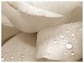
| 11/08/2005 07:24:36 AM | Untitledby bernmayComment: Hello from the Critique Club!
I have studied your image and have the following to offer:
Composition/perspective - this is a well done macro shot with just the right amoung of flower to keep it from being too busy, but not too little that it is unidentifiable. The DoF is very well controlled and almost the entire shot is in focus. The detail that can be seen in the petals is great and the water drops are a nice touch that add an even more delicate aspect. I think it is stronger as a side shot and not a top down shot. There is more depth to it. Well done!
Color - being a white rose there is not much color. The subtle variations in the petals can be seen which add a sort of flow to the overall view.
Lighting - another strong aspect of this shot. The shadows are not overbearing and nothing is blown out. The reflections on the drops are not too bright to be a distraction, but bright enough to let them stand out and be well defined with a nice contrast between the bright and dark sides of them.
Challenge requirements - this meets the requirements very well. I think without the water it would lose some of the delicate impression. There are just enough to help with the effect and not too many to be overwhelming.
Overal/my opinion - this image is very appealing. Your choice of white was a good one. A darker color such as red may not have had the same effect and the red may have been overbearing. Technically is it well done and demonstrates good control with the combined elements - camera, subject, etc. Well done! | | Photographer found comment helpful. |
| 11/07/2005 11:42:21 PM | handled delicatelyby TOYComment: Hello from the Critique Club!
I have studied your image and have the following to offer:
Composition/perspective - this is a strong image with a good overall composition. The subject is pretty much the whole image. For the challenge this may be where it fell a bit short. Your perspective is good and captured the essence of the activity quite well without any added distractions. The detail and focus is well done as well as the placement of the subject within the frame.
Color - the colors in this image are fairly strong and well defined. The palette does not have a lot of gradients. Although it covers a broad spectrum from the deep reds and browns to the bright yellows and whites, it is contained so that the bleed between these colors is minimal - hard edges. This may add to the overall crispness of the image. But the exposure time works against that.
Lighting - appears to be nautural light with reliance on the sparks as the main source. This may have influenced your exposure time but hurt in the overall image. The sparks as well as portions of the hands appear blown out which is a contradiction to the overall dark appearance of the scene. Some of the deifnition of the fingers is lost as well as a blending of the streaks of the sparks. Kind of like taking a picture of moving water - a fine balance needs to be applied. The center of the streaks appears blown out/over bright.
Challenge requirements - without the title I would not associate this with Delicate at all. It is a very hard scene with an extremely hard selection of subject matter to view. The sparks are the only delicate aspect and they are bled together to appear as streaks which removes any delicate apsect. There is nothing to suggest delicate handling as your title suggests other than an individual viewpoint.
Overall/my opinion - this could have been a much stronger image with better control over shutter speed and lighting. The scene being so dark, except for the streaks, needed something to boost it up. The longer exposure time failed to do that although I think that is what you were going for. The hands are a bit of a distraction since some of the surfaces are blown out and lacking any definition.
| | Photographer found comment helpful. |
| 11/07/2005 08:35:05 PM | | | Photographer found comment helpful. |
| 11/07/2005 07:44:59 PM | So young and delicate...by moonjeongComment: Hello from the Critique Club!
I have studied your image and have thew following to offer:
Composition/perspective - your use of negative space the having your subject fill the entire bottom half of the photo work real nice together. The synergy makes the photo real and not just another 'baby' shot. The focus is a little soft but it does not hurt the image much. The DoF is well controlled as the forground, although a but fuzzy, is not so far out that it becomes a distraction. Taking the shot at her level really works as well. A top down shot would not be as good and would appear flat in my opinion.
Color - this is where the image falls short I think. It has a distinct yellow tinge to the whole image. Perhaps a white balance adjustment in post processing or a levels/color/hue adjustment would have helped. The small splash of red is ok, the hair is ok, it is the skin tones and general background that give it a distinct yeollow tint. This may have been due to lighting in which an adjustment to the white balance in camera would have eliminated that.
Lighting - this appears to have been shot with just the ambient lighting and no flash. On camera flash may have helped this some along with white balance (see above). There are no blown out areas or really dark shadows which also leads me to believe it was simply camera settings that let this down.
Challenge requirements - the expression of being completely at ease in this shot is one of the strongest aspects. It is also his/her (?) expression that lends itself to the theme of 'delicate.' In my opinion if she was awake it would not have that same feeling. Nice capture of the mood to express the theme.
Overall/my opinion - the lighting was the biggest detractor in this image. Although the subtle lighting makes it work on some levels, the overall yellow tint to the image hurt it. It is a beautiful capture that some processing could probably make even stronger. I would not can the photo, but I would work on it in an editor for sure. Your perspective and eye for the moment are clearly demonstrated here. I am sure we will all be graced with more images of this child as it grows. | | Photographer found comment helpful. |
| 11/07/2005 03:51:43 PM | veiledby irish_eyesComment: Hello from the Critique Club!
I have studied your image and have the following to offer:
Composition/perspective - this is an interesting shot and took some time to figure. At first it almost appears as a poor choice in crop or a mistake by the photographer. Everything is cut off. There is no real center of focus or subject to grasp your attention. Only part of the back shows, only part of the arm shows, no real background except in the upper left and only part of the hair shows - nothing to attach it to, it just hangs there. At first the veil is kind of lost and I am assuming the veil is your 'delicate' aspect. Once I realized that the image took on a new feel. I just wish it was a more prominent element.
Color - well, this is b/w so color is not a factor. However, your control of the heavy shadows that hurt the white in a b/w image such as this is very good - they don't exist.
Lighting - for most of the image the lighting is very good. No real harsh areas except for the lowqer right corner where it appears a bit blown out and you lose the detail of the dress. You didn't list any processing steps so it is hard to tell if this may have been contributed to with processing. But overall, the lighting is fairly well done. The detail in the veil is clear (except in the lower right) and the beaded detail of the dress is clear - except as noted above.
Challenge requirements - if the veil was a more prominent feature in the shot it would have helped. As it is, it meets the challenge, but there are other distractions that take away from that. The small portion of background that shows is a bit of a distraction as well. Your overall focus is good which helps a lot.
Overall/my opinion - this is a little hard to look at due to the angle and items mentioned in the first section. The dark spotted portion of background I find distracting a bit as well. I think your perspective would have worked and been a much stronger element if the image contained more of the person and eliminated the out of focus backgrgound. |
| 11/07/2005 02:32:03 PM | Cool Breezeby ncfellerComment: Hello from the Critique Club!
I have studied your image and have the following to offer:
Composition/perspective - taking a quick glance as voters may have, at first it looks a little awkward. It takes a good look to appreciate the composition of this image. The angle is nice and creates an interesting perspective. It does make me feel as though I am looking up at the ceiling which is a very nice effect. It almost appears as though the fan is hanging on a wall instead of from a ceiling. The center of the fan being slightly off center is perfect while keeping the whole fan in the shot. As a whole I think this combination works quite well. Nice job!
Color - obviously in light on white I do not expect to see a lot of color. In this shot you have managed to keep the shades of gray very narrow in spectrum, keeping a lot of them just off white shades as opposed to light gray shades. Not sure if this was done in processing or in camera, but it is a nice effect.
Lighting - this appears as though only natural light was used based on the reflections in the center of the motor housing...the shadows are minimal and there are no real glares or flares except in the upper left of the shot. This area appears blown out and you lose definition of the fan blade into the background. This is the weakest part of the image. The rest appears well controlled. The lower right starts to get a bit bright, but all the detail is still present. Some of this may have been processing. The small dark ovals on the housing are a nice offset to the rest of the image while not hurting it in the least.
Challenge requirements - this certainly meets the challenge requirements quite well. I think this may have not done as well as it could have because of the perspective. As stated above, at first glance it is a hard angle to look at and a bit disorienting. After that I think most people probably looked at the blown out area and moved on. The subject matter is not very interesting, so adding something as one commentor sugggested may have worked better - slow rotate and perhaps some motion blur; perhaps get the pull chain swinging so it is at an angle as well...give the impression of a tilted ceinling and not just an angled shot.
Overall/my opinion - this could have been a much stronger image with a little less brighness/contrast applied. The natural light itself would have left the image white. Perhaps the shadows would have been a bit darker, but I don't think that would have hurt it too much. It is also very static. Something to bring a motion element may have helped. | | Photographer found comment helpful. |
| 11/07/2005 12:29:45 PM | fragile worldby francis1426Comment: Hello from the Critique Club!
I have studied your image and have the following to offer:
Composition/perspective - I think this is the strongest element of this image. Rule of thirds is applied well with the main subject even though the table and chairs are centered. The subject weights it to one side offsetting this nicely. Being on his eye level really makes a strong impression. This is amplified by his gaze appearng to be off to one side. The shot is not too busy and the subject is strong enough to have been placed alone in the shot (minus the extra chair and table).
Color - The colors seem very saturated. Your processing steps don't list use of this so I have to assume it is from the dodging. Possibly a bit much. There exists a nice contrast between the yellow and blue that is emphasized by the changing of the background colors.
Lighting - This looks to be natural indoor light which also appears very bright. The reflection off the table is a distraction and there appears to be some specks floating around the table/walls with some distracting flares of reflection. Again, not sure if this is caused by natural relfection or processing, but they add to the overall overbright feeling in the shot. The base stem of the table is slightly blown out as well as the yellow of the shirt, the hand on his leg.
Challenge requirements - I do not immediately get delicate from this photograph without the title. This may be one area where it failed with the viewers/voters. The subject's expression is good and perhaps a tighter zoom on the subject with a tighter crop would have helped this apsect.
Processing - this does appear to be over-processed. The disparity in the facial tones, the blown out yellow of the shirt, the artificial color of the skin in the face and legs. A little less would have made it stronger. The focus seems to be off a bit as well in the subject. This fuzzy appearance may be due to the processing as the rest of the image does not appear to be as fuzzy. This was a basic editing challenge and as such, selective editing is not allowed.
Overall/my opinion - with less processing and more atention to the lighting this would have been a stronger challenge entry. Although far away and fuzzy, his expression really makes the shot. A closer/tighter image may have helped some. Message edited by author 2005-11-07 22:09:22. | | Photographer found comment helpful. |
|
Showing 1041 - 1050 of ~2097 |
Home -
Challenges -
Community -
League -
Photos -
Cameras -
Lenses -
Learn -
Help -
Terms of Use -
Privacy -
Top ^
DPChallenge, and website content and design, Copyright © 2001-2026 Challenging Technologies, LLC.
All digital photo copyrights belong to the photographers and may not be used without permission.
Current Server Time: 07/24/2026 07:25:07 PM EDT.
|