|
|
|
Showing 1031 - 1040 of ~2097 |
| Image |
Comment |
| 11/09/2005 10:25:03 AM | Golden Raysby SteveinnzComment: Hello from the Critique Club!
I have studied your image and have the following to offer:
Composition/perspective - the subject to negative space ratio is really good here. Application of the rule of thirds is very well done. The relationship between the shadow and the subject is a very nice aspect - one does not overwhelm or take away from the other. The focus is crisp and both subject and shadow are well defined. Your camera angle to the subject is perfect - really makes your effect stand out.
Color - very rich color in this shot. Being on a white background really lets it stand out and gives it a lot of strength. The colors that are transferred to the shadow are just enough to give it its own character while not being to dark to fail. The subtle gradients in the subject are clear and displayed nicely (a tribute to the lighting).
Lighting - very interesting use of lighting in this image. It is just enough to make everything clear while not being too strong to cause flares/glares. The refracted light is a real nice touch and really helps make the shot. These are not overbearing either, so they don't appear as a distraction at all. Well done!
Challenge requirements - definitely meets the challenge requirements. While your subject is transparent, it is dark enough to give it depth and character. The shadow is clearly evident through the subject so transparency is obvious and the color in the shadow with the refracted light works well.
Overall/my opinion - technically this a very well done image. A strong subject with a unique effect are elements that should have helped this to stand out. Originality and a well executed creative concept are clearly evident. Very well done! |  Photographer found comment helpful. Photographer found comment helpful. |
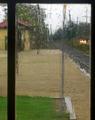
| 11/09/2005 08:36:06 AM | The Train Doesn't Stop Here Anymoreby jrjrComment: Hello from the Critique Club!
I have studied your image and have the following to offer:
Composition/perspective - There is so much to see in this image and yet it is not too busy. The position of the tracks coming out of the right in the middle is a very nice element - gives the viewer even more of a sense of position in the image and helps to make you feel you - the viewer - is actually looking out the window. The rain/water is excellent! Really adds a sense of mood. The crop could be a little different - the left has just a bit too much space. A little more attention to the timing would have made it even stronger as I find the lights from the cars on the right a bit of a distraction.
Color - this has a very rich palette of colors that have been rendered quite well. Even through the window and the rain they are not muted at all. The two areas of contrast adds a nice aspect that draws you through the shot - the green of the grass against the tan of the gravel (?) as well as the red and yellow of the building in the back of the shot. Well done!
Lighting - appears to be all natural which is perfect for this shot. No flares or annoying glares on the glass. Bright enough to let everything stand out without any dark or heavy shadows.
Challenge requirements - no doubt this meets the challenge requirements. Your choice of locations and use of the rain as a supporting element demonstrates a very creative mind at work.
Overall/my opinion - I really relate to this shot in so many ways. Around here there are a lot of empty/disused little train stations I have tried to get interesting shots of. So far none. The mood here is very well portrayed - empty, yet not abandoned; quiet yet not sad. As stated above I think the only weak spot is the crop. Other than that, very well done! | | Photographer found comment helpful. |
| 11/09/2005 08:19:57 AM | Lubberclean.jpgby rox_roxComment: I can't believe I missed this one before. I love your Lubber shots. This one is exceptional! Incredible detail and focus. The colors are great. So how do you get them to sit still for you? The water really adds a great element to this as well. Very well done! | | Photographer found comment helpful. |
| 11/09/2005 08:17:06 AM | Seb-River-Orange.jpgby rox_roxComment: I have one word for this - beautiful! Ok, maybe more...I think the composition here is very well done. The effect of the reflection without the same amount of sky is really good. The colors in this are excellent! Very nice pastel shades that I bet were there one minute and shortly after, gone. Good eye and timing for getting just the right image! | | Photographer found comment helpful. |
| 11/09/2005 08:14:34 AM | IMG_1183water-fern.jpgby rox_roxComment: Very cool reflection! I think the dark of the fern makes the clouds and sky snap right out at you. That is a fantastic shade of blue. My reflections never show color like that unless I put it there. The fern has a really cool look as well - full of intrigue and mystery. Nice shot! | | Photographer found comment helpful. |
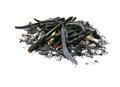
| 11/08/2005 06:17:52 PM | Light my fire!by GiorgioComment: Hello from the Critique Club!
I have studied your image and have the following to offer:
Composition/perspective - your subject to negative ratio in this shot is good. The problem is that it is very centered in the shot. Application of the rule of thirds would have helped this in that area. Being a low camera angle to the subject is a good technique applied well here. Your focus is sharp and the amount of detail is real nice.
Color - the white certainly is white. No disruptions in that. Nice choice of backgrounds/processing to keep it clean looking without any reflections or flares/glares. It is not blown out either. The subject matter shows a nice tonal range through the grays to black. This may be part of why the image fell short in the challenge (see below).
Lighting - very well done! No harsh shadows, no blown out areas and no sharp reflections. The detail in the subject is very nicely shown which I attribute to the lighting.
Challenge requirements - this is where this image fell short in the voting I think. The challenge was light on white. Your subject is anything but light. The main elements are black. If there was more ash or just ash this would have helped. But the black pieces take it out of the acceptable zone.
Overall/my opinion - in another challenge, with application of the rule of thirds, this would have been a strong entyr. Your command of the camera is clearly shown here. I like the image and think it is a good image. Just not for this challenge. | | Photographer found comment helpful. |
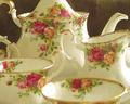
| 11/08/2005 06:00:10 PM | Porcelain Seaby racwComment: Hello from the Critique Club!
I have studied your image and have the following to offer:
Composition/perspective - the shot is very busy with all four pieces in the frame. The camera seems a bit close and the DoF seems off a bit. Focus isn't clear until you reach the inside of the cup on the left. Every piece is cut off somewhere, positioning farther back from the subject would have helped both the focus/DoF as well as removing some of the distraction created by the front cup being out of focus. Would have been stronger with only one or perhaps the two middle pices only in the shot with a different angle to the subjects.
Color - the colors, although a nice palette, seem a little flat. Perhaps this is caused by it being china, not sure. A boost in contrast and adjustment to the white balance may have helped this. There is a slight tint to the whole scene that just doesn't fit. None of the china appears white until you reach the very back where the light and focus seem to be the strongest.
Lighting - in some areas the lighting seems too bright - you have flares and washed out areas o the inside of the front cup, the rim and inside of the left cup in the middle, the whole side of the right cup, the top and side of the pitcher as well as in your black background. Trying a different light that is not so hard or using something as a diffuser may have helped this.
Challenge requirements - yes, china is delicate, but your placement and number of objects in this image do not convey that as well as a single cup may have. What makes china delicate is not only the material, but the subtle curves and bends that are associated with it. You don't show any of those here except in the handles and those are either cut off or interrupted by something else.
Overall/my opinion - this could have been a much stronger shot with less going on - fewer objects, a little more attention to the lighting and the post processing. Try using a non reflective background as well. You have glare on the black that just doesn't fit and becomes a distraction. | | Photographer found comment helpful. |
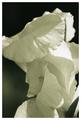
| 11/08/2005 03:22:22 PM | unfolding beautyby slonkoComment: Hello from the Critique Club!
I have studied your image and have the following to offer:
Composition/perspective - the slight angle to the flower is an excellent position for this capture. The subject to frame size ratio also works very well with this image. Since the right hand side of the flower is cut off, perhaps a slightly different crop to remove the negative space on the left would have made an even stronger impression as it would have allowed a larger overall image (closer to 640 on both sides). This would not have hurt your application of the rule of thirds either, which is also well done. Focus is clear throughout the image with a few fuzzy areas in the foregounrd. But nothing I find a distraction.
Color - well...b/w white so no color. However, the shadows and shades of gray present provide an overall rich tonal quality to the image. A lot to capture interest and keep you looking. B/W also adds to the impression of depth between the petals. In my opinion, if in color you would have lost this quality which would be a shame. It works very well with this image. Well done!
Lighting - the lighting appears as though one source from the right top direction (based on the highlights). Just enough to give the overall appeal with the shadows, not too much to give a lot of flares/glares/blown out white spots. A few of the highlights on the edges of the petals appear slightly blown out, but overall the b/w processing keeps this from being a real distraction. The balance between light and dark is well controlled overall.
Challenge requirements - the subtle folds and curves in the flower, nicely accentuated by the other qualities and processing, definitely convey a sense of delicateness. It is good that there are no other elements in the image to change that (stem, leaf, etc.)
Overall/my opinion - as stated above the negative space on the left...I think, although a strong image now, it would have been even stronger if this was cropped out and the flower held the whole frame. Very well done photograph that does not appear over-processed in the least and the composition works very well as a black and white image. Very well done! | | Photographer found comment helpful. |
| 11/08/2005 03:06:03 PM | Do Not Touchby joezlComment: Hello from the Critique Club!
I have studied your image and have the following to offer:
Composition/perspective - the composition here is very interesting. There are many 'layers' of depth to the phtotgraph which adds an element of interest. The ratio of subject to frame size is very well done. As a macro, the lack of negative space works here quite nicely. The DoF seems to be a little off - only the very center of the image is crisp and clearly in focus. However, with the subject size, it does not hurt the images strength. The profile aspect also adds to the interest element. It is nice to see a shot like this and not have it be straight on. Well done!
Color - although basically a white subject on a dark background, the background really allows the flower to stand out and there is no blending or losing it. Nice combination. The shadows are not overwhelming and the subtle differences in the coloration being emphasized by the veins in the petals works well.
Lighting - for most of the image the lighting is nicely controlled. There is one area, just above and to the right of center, that appears much brighter than the rest of the image and slightly blown out. I find this to be a bit of a distraction since the focus is just to the left of this area. I am drawn there and then led to the back where the DoF has the image very out of focus. The shadows are not heavy and add a nice fluid looking touch to the shot accentuating the natural curves and bends in the petals.
Challenge requirements - having a lack of major distractions really helps this image meet the challenge requirements. If the DoF was a bit different I feel it would be a stronger image. But the concept of delicate is captured well.
Overall/my opinion - a slightly different positioning may have helped to give a better depth of field. A tighter crop to remove some of the black would allow the top of the image to not be so heavy looking. Perhaps even a crop to remove the severly out of focus petal in the top right. There would still have been a lot of image and may have allowed for a larger overall image when resized (closer to 640 on both sides). |
| 11/08/2005 01:17:49 PM | Wedding day!by letuananhComment: Hello from the Critique Club!
I have studied your image and have the following to offer:
Composition/perspective - placement of the subject within the frame is very well done. I am a bit distracted by the elbows being cut off, but at least that is consistent. There is a lot going on which makes it a bit busy - flowers, the bride, the rose petals and all the wrinkles in the background. Most of this is offset by the overall beauty of the shot.
Color - there is a lot of colors in this image and all have been very richly developed. This shows a good command of your camera and capturing the reality of the surroundings. There appears to be a slight off hue to the skin tone, but it is not a distraction nor does it impact the image too much.
Lighting - very nice lighting control. I cannot discern if flash was used or if it is ambient. Again, a credit to your command of the camera There are no harsh areas in the photo - no glares, flares, or wash outs. The veil gets lost in the sheet but it appears they really are very close to the same shade of white.
Challenge requirements - first, as stated above, this is an extremely pleasing photograph. But to me, for the challenge, there is just too much color and dark shades to be a good fit for a light on white. The veil being lost leaves the hair against the white sheet, the skin is too dark to be 'light' and the only real area where the dress meets the sheet is disrupted by the dark ribbon.
Overall/my opinion - very well shot photograph that demonstrates an excellent eye composition, a good ability to grasp the moment and get the right capture, and overall control of the situation with your lense. Very well done! |
|
Showing 1031 - 1040 of ~2097 |
Home -
Challenges -
Community -
League -
Photos -
Cameras -
Lenses -
Learn -
Help -
Terms of Use -
Privacy -
Top ^
DPChallenge, and website content and design, Copyright © 2001-2026 Challenging Technologies, LLC.
All digital photo copyrights belong to the photographers and may not be used without permission.
Current Server Time: 07/24/2026 06:24:23 PM EDT.
|