| Image |
Comment |
| 11/15/2005 10:34:28 PM |
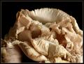
Oyster Mushrooms — Cluster 1by Bear_MusicComment: Looking over images taken with the same lense and cam across this...voted high in the challenge, liked the image. There is a lot of depth with real nice flow in this image. The subtle variations in color are very nicely portrayed. Very nice image! |
 Photographer found comment helpful. Photographer found comment helpful. |
| 11/15/2005 09:58:46 AM |
Up the Creekby rox_roxComment: Interesting location...lots of great reflection possibilities. This is a little bright but I like the composition. Very deserted island looking. I expect to see Gilligan on the shore. |
| Photographer found comment helpful. |
| 11/15/2005 09:57:08 AM |
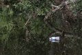
Some People Really Suck!by rox_roxComment: Now this really ticks me off! Some people just don't care about anything. Excluding the bottle, the reflections in this shot are very interesting. |
| Photographer found comment helpful. |
| 11/15/2005 09:56:19 AM |
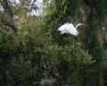
White Egretby rox_roxComment: For being taken from a moving boat this is an excellent image. Placement of the egret is perfect, it is clear, and only alittle bright on the back. Nice shot! |
| Photographer found comment helpful. |
| 11/15/2005 09:52:38 AM |
Studying for SATby alihComment: Hello from the Critique Club!
I have studied your image and have the following to offer:
Composition/perspective - the subject to space ratio in this image is very good. This keeps the books on the shelves in the background from becomming a distraction. The crop also is well done. Tight around the face really emphasizes the element of concentration. Not seeing the words on the page helps as well. Nice control of the depth of field. Everything is geared towards keeping the focus strictly on the subject - well done.
Color - the black and white processing in this shot leaves it a little flat. Perhaps a boost in levels and contrast would have helped to separate all the shades of gray. The forearm blends with the shirt which is only a bit lighter than the face. Color may have helped instead of b/w.
Lighting - The book edge/table in the front is a little bright, but the detail is not lost. There are no flares or glares. The image is well lit and has a fairly even cast across the whole image. The lack of shadow on the face demonstrates good control. Well done!
Challenge requirements - with the close crop and strong focus on the subject, the concept of busy is certainly portrayed. The lack of expression is key for this though. With any other expression on your subject's face this would not work.
Overall/my opinion - The composition is done very well, but it lacks in any wow factor of any kind. Slightly different processing to bring out more of the contrast and variations would have helped a bit. There are a lot of areas that the b/w processing could be developed more. |
| 11/15/2005 09:19:21 AM |
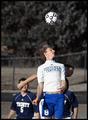
Heads Upby jiggsComment: Hello from the Critique Club!
I have studied your image and have the following to offer:
Composition/perspective - For a sports shot - taken at the moment - overall, this is not bad. Your subject(s) are clear and in focus. Your timing was good as you appear to have caught the main subject at the height of his jump. The fence in the background is a major distraction and appears to cut your subject off at the neck. Also, below the knees is cut off. You didn't list the lense you used, so hard to tell, but if you were not zoomed/positioned so close you could have made the same capture and then cropped to get the final result. This would have shown more 'action.'
Color - you listed 'partial desat' as one of your processing steps. I think this leaves the background a little flat instead of letting your foreground stand out. The colors of the subjects are strong enough to offer a nice contrast to the browns/greens of the background.
Lighting - very nice control of natural light. The jersey is not blown out at all although in direct sunlight. The skin tones look natural and not washed out or ghostly at all. The shadow on the second jumper makes him a little dark, but this is not a distraction.
Challenge requirements - without following a few sure bets, shutter speed is not necessarily a key element in an image. Your timing of capture - getting the jumper at his highest, also captures the hair in the movement which really gives the strongest element of action in this shot. It is this action that relays your shutter speed aspect. Well done.
Overall/my opinion - a different crop or zoom to allow more of the subject would have been a stronger image. Different location on the field to get better control over the background would have also helped with this image. Nice capture that demonstrates an eye for the shot and good timing. |
| Photographer found comment helpful. |
| 11/14/2005 05:48:58 PM |
|
| Photographer found comment helpful. |
| 11/12/2005 09:30:51 AM |
Looking through Rain Dropsby bobdaveantComment: Hello from the Critique Club!
I have studied your image and have the following to offer:
Composition/perspective - the two dark green leaves in the upper right really help to keep this from appearing flat. The number of leaves allows for good variation in color and texture while not becoming busy. It comes across as a strong image through clear focus and sharp edges with well defined lines and textural elements. Well done!
Color - there is a multitude of colors here through solid presence and gradients. None come across as overbearing and the mix is a very pleasing blend of fall tones. The brightness of the water drops offsets and acentuates these colors nicely since overall they are on the darker side.
Lighting - this appears as though natural. The overall image comes across a little dark/muted. This helps to set a mood in concert with the color and the water. It could be a little brighter though. Not sure if processing darkened it or could have lightened it.
Challenge requirements - I think this is the weakest element of the image. Although some of the water drops are clearly transparent, a lot show just reflection. Overall, the element of transparency was not the strongest element of the composition although it is a beautiful and very emotive image.
Overall/my opinion - this image stands out as a strong, emotive image that is well composed and very well presented. But falls short just a bit as representative of 'transparency.' It should have been a stronger element in the image. |
| Photographer found comment helpful. |
| 11/12/2005 07:54:58 AM |
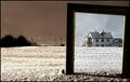
Choosing a frameby TUBORGComment: Hello from the Critique Club!
I have studied your image and have the following to offer:
Composition/perspective - coming at this house from a distance, being at ground level is a nice technique and works quite well here. The processing makes it look as though it is a mirror rather than a window which adds to the overall composition - an element that keeps you looking to see the rest. The slightly angled placement gives it an old picture feel. Many things on many levels working here. It works rather well too that the house is not exactly in focus/soft focus. Well done!
Color - the processing here puts this into two categories: the color portion has just enough color coming through to keep it color - the hint of red on the house, the soft blue/gray of the sky and the white of the snow. The duotone portion gives the image a stark and empty feel which is a nice contrast to the house. Really gives it a lonely and desolate overall feel.
Lighting - obviously natural - well controled. The white is not blown out at all and the detail/texture of the snow comes through nicely on both halves. No glares or odd reflections in the glass shows attention and detail to placement.
Challenge requirements - this has met the challenge requirements in every fashion. Your element of transparency is obvious and certainly is the strongest element of the overall composition.
Overall/my opinion - this is an image that demonstrates a very nice blend of the natual and the processed where the synergy between them is very strong and dynamic. It also demonstrates a strong ability to take an idea/concept and execute it to perfection. Very well done and pleasing image. |
| Photographer found comment helpful. |
| 11/11/2005 07:12:28 AM |
|
| Photographer found comment helpful. |
Home -
Challenges -
Community -
League -
Photos -
Cameras -
Lenses -
Learn -
Help -
Terms of Use -
Privacy -
Top ^
DPChallenge, and website content and design, Copyright © 2001-2026 Challenging Technologies, LLC.
All digital photo copyrights belong to the photographers and may not be used without permission.
Current Server Time: 07/26/2026 12:23:47 AM EDT.