| Image |
Comment |
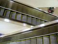
| 06/23/2005 11:42:10 PM |
"Escalator"by BarryComment: I love the concept. Perhaps crop to remove the distracting yucky wall and rotational display? |
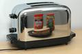
| 06/23/2005 11:40:34 PM |
Breakfastby eugeneComment: The reflection is perfect. I'm not sure about the composition or the lack of an interesting background - could you have positioned the toaster at an angle, or further from the background, and still gotten as good a reflection? Bumping to a 7. |
 Photographer found comment helpful. Photographer found comment helpful. |
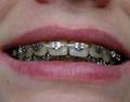
| 06/23/2005 11:39:05 PM |
say cheese!by ageszComment: Thank you for no saliva! I love the concept. just wondering if it wouldn't be slightly nicer if cropped for a) showing the full lips, and b) showing no nostrils. |
| Photographer found comment helpful. |
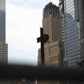
| 06/23/2005 12:45:24 PM |
Liberty Resurrectedby zoolanderComment: I think you would have been much better off cropping out the bar (or whatever it is) at the bottom. Although there is metal in this shot, it looks (maybe my monitor?) like the cross is wooden, and since that's the focus of the image I'm having a hard time relating this to the challenge. The sky seems a little blown out as well. |
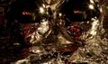
| 06/23/2005 12:42:59 PM |
Metallicby MichaelsComment: I'm afraid that this (and the other tinfoil entries) diesn't work well for me. I like the idea & the reflections, but the wrinkly tin foil is distracting & unattractive to me. |
| Photographer found comment helpful. |
| 06/23/2005 12:42:06 PM |
|
| 06/23/2005 12:41:23 PM |
metalwoodby MotzerelaComment: I like the tones and the shallow DOF. I wish it were larger (which I'm sure you've heard!) and had a little more contrast. |
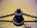
| 06/23/2005 10:43:21 AM |
Sunburstby winggirlComment: I'm sure you've heard about the size of the photo. Also, I would have preferred to have seen ideally a larger crop, so that the entire sculpture were included, or a smaller one, so that it looks less accidental. |
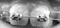
| 06/23/2005 10:42:11 AM |
Tinsel Teeth!by buzzmomComment: Sorry, good idea but the saliva is grossing me out. I would have liked to have seen it either straighter horizontally, or a bigger angle if that's what you were going for. |
| Photographer found comment helpful. |
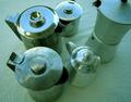
| 06/23/2005 10:41:17 AM |
Coffee pots of metalby AntoninoComment: There seems to be a green-blueish tint here that, deliberate or accidental, isn't helping the photo for me. I like the reflections in the items. It seems too staged because of the carpet. |
Home -
Challenges -
Community -
League -
Photos -
Cameras -
Lenses -
Learn -
Help -
Terms of Use -
Privacy -
Top ^
DPChallenge, and website content and design, Copyright © 2001-2026 Challenging Technologies, LLC.
All digital photo copyrights belong to the photographers and may not be used without permission.
Current Server Time: 06/24/2026 09:54:26 AM EDT.