| Image |
Comment |
| 04/28/2003 01:02:33 AM |
I Love you... this much!!!by kosmikkreeperComment: Nicely done!! Very unique and well put together. I really like the colors. Appears to be a nicely done front to a greating card. Congrads on a nice submission. Good luck in the challenge. |
 Photographer found comment helpful. Photographer found comment helpful. |
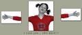
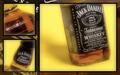
| 04/28/2003 12:57:26 AM |
Southern Traditionby bamasterComment: This is a REALLY nice triptych. It is well put together and framed nicely. I like the pattern of the background that the idividual photos are lying on. My only complaint is the yellow backgound behind the whiskey bottle. To me, it doesn't really seem to go well since it's such an extreme color in comparison to the earthtone hues of the whisky. It really fights for attention. |
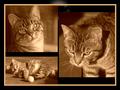
| 04/28/2003 12:50:33 AM |
thrice a catby justineComment: Oh ahgg! You gots an oops! Anyway, I love the different takes of the kitty, especially the look on his face in the top left pictures and him playing in the bottom left. The sepia tone that you used is great and fits for this pictures. I'm not sure as I like the border around only the outer edges of the individual photos. Perhaps using it around the background would have been better. I tell you what...since I like this picture I'm going to ignore the oops at the top of the triptych because I know you didn't mean to submit it like that. Good luck in the challenge and I hope you aren't going to be inundated with "hundreds" of comments about your oops. |
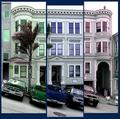
| 04/28/2003 12:42:07 AM |
What color do you like?by Pep VentosaComment: I really like your take on the challenge. The only thing that I think would be better is to have the seperate pictures put together in a way where the building is it's actual size. Because of the tree and the vehicles parked in front, it becomes distorted. If they were not there, you wouldn't be able to tell a difference. Otherwise, this was a very good idea. I like the differing colors. |
| Photographer found comment helpful. |
| 04/28/2003 12:36:00 AM |
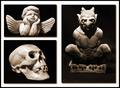
Mortal Coilby moodvilleComment: I really like your set of pictures, especially the smaller ones. The larger photo isn't cropped as close and is also a little fuzzy and grainy. Alone, it would be okay, but since the other two are nearly perfect, it's imperfections really stand out. I like how you grouped your pictures together. |
| Photographer found comment helpful. |
| 04/28/2003 12:30:06 AM |
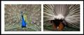
Front and backby robbiehComment: LOL...love the humor and your take on the challenge. There is quite a difference between the front and back of a peacock...that I didn't realize. Anyway, I think I would have liked to see the front of the bird as close up as the back of it. I think you still could have gotten in plenty of the lovely feathers. Plus, the colors don't seem to stand out as well. I really like your idea, though. Nice set. |
| Photographer found comment helpful. |
| 04/28/2003 12:25:50 AM |
Hibiscusby DennisFComment: I really like the progression of the flower from further away to close-up. The colors are nice and the lighting seems to be equal and even with each picture. ...And all three of them are well focused. Since I haven't voted and critiqued on photos like this before, I hope I'm doing it right. Anyway, the only thing that bothers me about your triptych is that the top flower is taken at a different angle then the bottom two. I'm thinking that if it were at the same angle, it would progress a little smoother. I also might have left out the highlighted border around the individual photos. Other than those two things, it is a beautiful set. Congrats. 8 Good luck in the challenge. |
| 04/25/2003 02:21:56 AM |
Slaveby svitalComment: Just my opinion, but I think I would have like to have seen a side angle view to this horse and carriage. We could see more of his harness get-up and part of the carriage that he is hitched to. From what I can see, he may be fairly thin and a side view would be disturbing if that were true, but would definately hit home the slave part. I do like the fact that we only see the feet of the owner. Technically, I find nothing wrong...it is well focused and lighting is appropriate. |
| 04/25/2003 02:13:00 AM |
Fish In Wrong Environmentby togtogComment: To be brutally honest, I'm not sure what the purpose of this picture is except maybe to be gross. You were brave in submitting a photo like this in the challenge if you were serious in photography. To be fair, I strive to comment on the positive aspects of a photo as well as the negitive. However, I really can't find anything positive. Lighting seems to be off and it's just a slightly blurred image of a dead fish. |
| 04/25/2003 02:08:06 AM |
They are so tiny they look like antsby BeckyComment: You know, this photo really needs a bigger subject. It's pretty blurry and my eyes really can't find anything to identify. I make every attempt to comment positive as well as negitive when I do, but to be brutally honest, I can't find anything postive. Sorry. |
Home -
Challenges -
Community -
League -
Photos -
Cameras -
Lenses -
Learn -
Help -
Terms of Use -
Privacy -
Top ^
DPChallenge, and website content and design, Copyright © 2001-2026 Challenging Technologies, LLC.
All digital photo copyrights belong to the photographers and may not be used without permission.
Current Server Time: 07/18/2026 09:25:04 PM EDT.