DPChallenge: A Digital Photography Contest You are not logged in. (log in or register
 
Browse Settings
Currently viewing:
Registered UserCLarson557

Show comments:

Per page:

Order:

Comments:


Comments Made by CLarson557
Pages:   ... [217] [218] [219] [220] [221] [222] [223] ... [257]
Showing 2191 - 2200 of ~2566
Image Comment
Stolen Kiss
05/20/2003 01:56:27 PM
Stolen Kiss2nd Place
by dsidwell

Comment:
Very unique set up and composition. The green and red colors are vivid and do well to meet the challenge. Green lipstick seems to be a little bit of a turn-off, but the symbolism is too stronge to ignore. Great Job 10...one of my favorites. Good luck in the challenge.
Photographer found comment helpful.
tomato
05/20/2003 01:49:13 PM
tomato
by jimmyn4

Comment:
The shot as a whole seems a bit dark and the colors came out a bit dull. You did do a good job of portraying the texture of the tomato stem.
Photographer found comment helpful.
Uh-Oh...
05/20/2003 01:40:02 PM
Uh-Oh...
by GeneralE

Comment:
Well, this would be bad news to those who are color blind. Very interesting take on the challenge. My only thought would be to crop out the top part of the picture or at least have shot it a little higher to get in the words that were chopped off. 5 Good luck in the challenge.
Photographer found comment helpful.
Strawberry Fields........Forever?
05/20/2003 01:33:53 PM
Strawberry Fields........Forever?
by autool

Comment:
In my opinion, I think this picutre would have been more effective for the challenge had it been shot closer onto the strawberries. My eyes immediately went to the woman and her interesting array of clothing. From baby Mickey Mouse to plaid to paisley...LOL Sorry, but the complementry colors (red & green) of the strawberries and field are lost and forgotten. I do like the photo as a whole, though. Although hazy, the neighborhood with the mountains in the background provide a nice backdrop to the strawberry field. 7
Photographer found comment helpful.
Reflections
05/20/2003 01:23:28 PM
Reflections
by mbardeen

Comment:
The blue refection in the windows of an orange colored building is a great use of the challenge. The windows have a nice shape and makes the photo interesting. The only drawback is the washed out sky in the photo. In my opinion, I believe that it would have been better to crop out the sky portion more to fill the picture with the vivid colors of the building. 7
Photographer found comment helpful.
Orange saver at the blue lake
05/20/2003 01:16:57 PM
Orange saver at the blue lake
by tyrkinn

Comment:
The mountains and how the sun shines on the water is absolutely beautiful. However, the lifesaver stand (I don't know what else to call it) is backlit against the sky which is kind of washed out. The orange color doesn't really stand out very well. However, I like the idea behind the shot and the composition. 8
Photographer found comment helpful.
submerged blue and orange
05/20/2003 01:11:34 PM
submerged blue and orange
by deceptive

Comment:
Good use of complementry colors. I really like the water ripple effect. It makes the picture interesting. At first, I didn't like the shadow, but as I study it further, I change my mind. It add dimension to it. The colors are vivid. Good job! 10
Photographer found comment helpful.
Old Mill Inn
05/16/2003 04:02:48 PM
Old Mill Inn
by TerryGee

Comment:
Critique Club

Hi Terry,

Before I get started on this particular picture, I must admit that I enjoyed studying your work as a whole. When I critique for the club, I like to take a look at everything I can to get a feel for the photographer before I start writing. I found myself to be impressed by your artistic eye. You are able to try new techniques and style to each photo with amazing results to make you a well rounded photographer. You inspire me. I am especially drawn to how you are able to capture color so well. The flower pictures in your portfolio are perfect examples. The colors are so vivid and rich, they literal pop out of the screen at me.

Now onto the task at hand...your beautiful postcard! During the challenge, I scored this a 9.

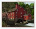
Composition: I really like the way the building is centered in the photograph. Yes, it would be nice to see more of the waterfall, but the building is the main subject and there is enough of the water to complete the picture. If you would have moved the shot a bit to the right, I'm thinking that it may not have been as nice. It doesn't really look like there is anything interesting to the right of the building. Of course, not knowing the area, I don't know that for sure...just guessing.

Technical: Once again, I'm impressed by the way you are able to bring out the colors in your photography. As with your other photos, the colors are vivid. The lighting seems nice, however, I would have liked to see the water wheel better. It is in the shadow of the building and doesn't stand out very well. Judging from the position of the sun and what appears to be moss on the rock around the wheel, that part of the building may not get the sunshine and good lighting in that area may not be possible for it to show up well in a photograph.

The reason why I voted a 9 instead of a 10 is the lack of clarity. The building seems just a tad blurred. When looking at the windows, my eyes tend to ache wanting to focus them in. Perhaps just sharpening the edges just a little would give them more clarity. Just because my curosity got the best of me, I did take your photo and simply sharpened it just a little in my program and it did work. It even managed to bring out details in the water wheel to make it stand out better. Try it and see what you think.

Challenge: This is definately a nice postcard subject. The photo is well framed in the postcard size and the border is appropriate. Not only was the subject the reason why I voted this as high I did, but also the way you used it in the postcard. You chose an excellent font for the text and provided the necessary information on your card to let the recipient know what they are seeing.

Congrats on personal high score for you on DPC. Well deserved.

I hope you found this critique helpful. Please feel free to notify me if you would like to discuss anything further.

Connie
Photographer found comment helpful.
"Cahoots"
05/16/2003 05:29:23 AM
"Cahoots"
by casualguy

Comment:
Oh, I bet this was messy! I really like your take on the challenge by using the spilled jars of paint. Although the blue is not represented as much as the yellow and red, the pattern it left is very effective. I might have left the lids out of the picture. They don't really add anything positive to the photo. The lighting seems a little uneven, but other than those two things, this is a very nice portrayal of the primary colors. 8 Good luck in the challenge!
Primary Glass
05/16/2003 05:24:55 AM
Primary Glass1st Place
by Jacko

Comment:
This is really nice. I really like how you portrayed the primary colors for this challenge. Turned out to be a cool effect. The colors are vivid and literally pop out of the screen. I can't help but wonder, though, how it would look if the glasses had been placed on a mirrored tile so that the strips of color would have extended down through the whole picture. I don't particulairly like how the color abrubtly ends. Since it wouldn't be wise, in this case, to crop out the bottom of the glasses, there should be some way to extend the color down to your surface. 9 Good luck in the challenge
Photographer found comment helpful.
Pages:   ... [217] [218] [219] [220] [221] [222] [223] ... [257]
Showing 2191 - 2200 of ~2566


Home - Challenges - Community - League - Photos - Cameras - Lenses - Learn - Help - Terms of Use - Privacy - Top ^
DPChallenge, and website content and design, Copyright © 2001-2025 Challenging Technologies, LLC.
All digital photo copyrights belong to the photographers and may not be used without permission.
Current Server Time: 09/10/2025 04:44:32 PM EDT.