| Image |
Comment |
| 06/30/2005 11:58:37 PM |
Nothing Regular Hereby figmentComment: Wow! Those are obsolete! Gosh...regular gas. B&W is very fitting here. I wish I could see what it says the gas prices are. Perhaps you could have stepped to your right just a little bit to catch that sign. It looks like 11cents. Wouldn't that be nice? |
 Photographer found comment helpful. Photographer found comment helpful. |
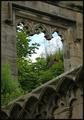
| 06/30/2005 11:54:58 PM |
When Nature Conquers Allby muggle_girlComment: I really like the looks of this picture. It's weird seeing what looks like a dandilion coming out of the wall at the top right. I really like the angles and the ornate edges. The overgrown foilage gives the feeling of obsolete. The sky could look a little better, but that's minor. 9 |
| Photographer found comment helpful. |
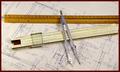
| 06/30/2005 11:50:11 PM |
Before Auto Cad and Calculators, (Yes, I actually used these...)by BMacDComment: Very nice! Yes, this method is obsolete. I remember as a girl watching my dad draft with these instrument not the many years ago ;-) I'm not sure I like the dark border...I think it would have been better to have it the color of the paper and maybe a very thin dark line if you had to have it in there. The rest is great IMO 9 |
| Photographer found comment helpful. |
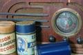
| 06/30/2005 11:46:53 PM |
Memories of soundsby VanGoghComment: Very nice antique photo. I think it's cropped a little too much though. You could avoid the shadow from the tube by placing another light to the right. Try placing it a little further back to avoid the glare on the radio. |
| 06/30/2005 11:42:37 PM |
Four Centuries of Abandonmentby SCI 009Comment: This really looks like a neat and interesting place to visit. The blurred background looks out of place though ...like it was done in post-processing because the top of the peak on the right is blurred on the edges. The thick black border also is a little distracting...kind of boxing in a vast area. Hope that make sense. Good luck in the challenge :-) |
| Photographer found comment helpful. |
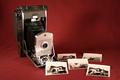
| 06/30/2005 11:36:15 PM |
What's a megapixel anyway?by javamooseComment: Hi! This kind of camera is cool but definately obsolete. Putting the pictures in the photo really added to the composition. Given the "oldie" theme, the maroon background seems a little out of place. I bet that desaturating the whole picture a little would really make it pop. 8 |
| Photographer found comment helpful. |
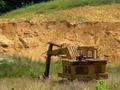
| 06/30/2005 08:06:58 PM |
Not Mike Mulligan's Steam Shovelby twm122Comment: Nice snapshot. I think it would be more effective to get closer to your subject or crop tighter. To tell you the truth, picture seems flat and uninteresting 4 |
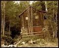
| 06/30/2005 08:05:15 PM |
The Neglected Refugeby CutterComment: Is is just me or is the house leaning to the left....or rather everything on the right is leaning to the left? It still looks lived in because it's still connected to electricity, but definately doesn't look safe. Technically, the picture looks rather flat (no shadows) and maybe a little over sharpened. 5 |
| Photographer found comment helpful. |
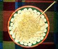
| 06/30/2005 08:01:17 PM |
Thanks to Dr. Atkinsby nbagirl72Comment: I think this would have looked better at an angle. It is very centered and too much light on the noodles and crackers. Kind of washed them out to make them look rather unappealing. |
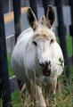
| 06/30/2005 07:58:59 PM |
RETIRED and HAPPY!by novaComment: How's fat and happy. I think a more flattering shot of him would be from the side. Although it looks like he needs grooming, I do believe that he is smiling for the camera. I hope he doesn't know you are considering him obsolete. |
| Photographer found comment helpful. |
Home -
Challenges -
Community -
League -
Photos -
Cameras -
Lenses -
Learn -
Help -
Terms of Use -
Privacy -
Top ^
DPChallenge, and website content and design, Copyright © 2001-2026 Challenging Technologies, LLC.
All digital photo copyrights belong to the photographers and may not be used without permission.
Current Server Time: 07/24/2026 06:26:26 PM EDT.