| Image |
Comment |
| 04/27/2005 03:14:27 AM |
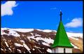
Guardian Angelby eyjoComment: An interesting concept, if there were something to draw the eye to the bird. As it is, the eye is drawn just about everywhere else. Also, the highlights on the snow are badly blown, making them unrealistic.
If this had been a bright red bird, such as a cardinal, or a larger one, such as a hawk, and the rest of the image were mostly desaturated and correctly exposed, that would have been much better. |
| 04/27/2005 03:12:53 AM |
|
 Photographer found comment helpful. Photographer found comment helpful. |
| 04/27/2005 03:12:10 AM |
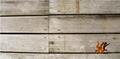
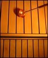
The Herald of Winterby julieparsonsComment: An interesting concept. The color of the leaf immediately draws the eye, and the background avoids being tedious. My only objection is that the joining of the boards at the center draws the eye away from the subject, and the lighter boards on the left are a bit harsh. Cropping or reframing just shy of the seam would have improved the image, even if the subject took up a little more space as a result. |
| Photographer found comment helpful. |
| 04/27/2005 03:09:04 AM |
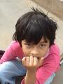
Gotta Do a Lot of Things!!by AndzComment: I have no idea what's supposed to be minimalistic about this photograph. It meets neither the contest definition nor the classic definition. Cute kid, though the image could use some mild sharpening. |
| 04/27/2005 03:06:25 AM |
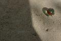
Crystal, stone and lightby rbennyComment: If that's supposed to be a crystal marble, I think you got ripped off. The light from it is dull, making it look like tarnished glass, plastic, or resin. The texture of the stone is nice, as is the shadow, and the red... something... adds an interesting note to the subject. |
| Photographer found comment helpful. |
| 04/27/2005 03:04:59 AM |
Old Manby H R VerryComment: Nice background color. The silhouette works, but isn't really evocative. |
| Photographer found comment helpful. |
| 04/27/2005 03:04:26 AM |
Kiss!by kbhatia1967Comment: Cute, and almost funny. The bright white backdrop hurts my eyes, though, and the tedium is broken only by the upper left hand corner. Adding something to break up the background (even blue lines from school paper) would have helped. |
| Photographer found comment helpful. |
| 04/27/2005 03:03:01 AM |
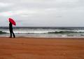
a grey day in montereyby kmbr2001Comment: Nice use of color. The bright red umbrella against the desaturated sky and ocean really catches the eye, and the red sands break the tedium. |
| Photographer found comment helpful. |
| 04/27/2005 03:01:59 AM |
|
| Photographer found comment helpful. |
| 04/27/2005 03:01:15 AM |
Want to go back to my place?by ladpupmoeComment: The title and the necking birds make a cute combination. The tree breaks up the monotony without drawing the eye too much or being too distracting, which is good. The overall effect is good, but not really spectacular, though there's nothing technically wrong that I can point to. 8. |
| Photographer found comment helpful. |
Home -
Challenges -
Community -
League -
Photos -
Cameras -
Lenses -
Learn -
Help -
Terms of Use -
Privacy -
Top ^
DPChallenge, and website content and design, Copyright © 2001-2026 Challenging Technologies, LLC.
All digital photo copyrights belong to the photographers and may not be used without permission.
Current Server Time: 07/16/2026 06:24:36 PM EDT.