| Image |
Comment |
| 04/08/2003 10:18:46 AM |
Wash Colors Separatelyby scab-labComment: nice. you might consider lowering the gamma (light) a little and boosting the color (saturation) a bit to increase the intensity and contrast of the colors. |
 Photographer found comment helpful. Photographer found comment helpful. |
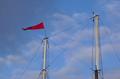
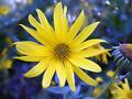
| 04/08/2003 10:17:21 AM |
Let's sailby johnmkComment: where are the sails? clearly you have red against blue, but neither leap out at me. maybe if you and tightened a bit on those two elements. . . (and increased the saturation to bring them both out a little more) |
| 04/08/2003 10:16:04 AM |
Mom's gift Quilt handquilted by Momby Crafty SueComment: i think these are actually quite challenging pictures to take because its hard to give the photo a professional look versus just a snapshot. i think the symmetry actually hurts the photo, and maybe choosing a lower angle would have given some more depth of field and made the photo more interesting (and i always love increased saturation to bring the colors out). |
| Photographer found comment helpful. |
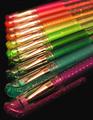
| 04/08/2003 10:13:50 AM |
Writing Rainbowby WILDBLUEComment: good focus and dof. i like stronger colors (saturation), which could have been done in post processing, or simply by reversing the order and bringing the brighter colors up to the front. |
| Photographer found comment helpful. |
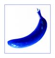
| 04/08/2003 10:12:32 AM |
Banana Blueby GotchyaComment: props you can eat. well done, i like the blue, but overall its a little over exposed - like the soft edge on the lower left end of the banana. a yellow background might have been a neat twist. |
| Photographer found comment helpful. |
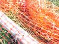
| 04/08/2003 10:10:58 AM |
Colorby AllenComment: a little too bright. i think neither the orange and green are really allowed to add as much color punch to the photo as they could have - and more green could have been added by pulling back a bit or coming in and showing the green through the net in greater detail. |
| 04/08/2003 10:09:21 AM |
Duoby lionelmComment: very nice. only improvement i might suggest is that the picture is a little tight, especially for the background image. |
| Photographer found comment helpful. |
| 04/08/2003 10:08:03 AM |
Colours of love.by derekComment: nicely done. i hope nobody misses the heart. not much to suggest for improvements except the lower left corner isn't as blacked out as the rest of the background and i wonder how it would have looked with the saturation pumped up a bit. |
| Photographer found comment helpful. |
| 04/08/2003 10:05:25 AM |
Naturaly Boldby HoogieComment: nicely done, good dof. i generally like more saturation, but i know that's a personal thing. |
| Photographer found comment helpful. |
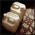
| 04/07/2003 06:35:34 PM |
Heating Fuel on Tilesby jjbeguinComment: i saw the symmetry but just didn't find the picture very compelling (which is just a way of me saying i can't tell you why i didn't like it). did you consider submitting it in b&W? i just took a look at it that way and thought that it captured your lighting much better, and it removes the distraction of the brown floor tiles by turning them into a complimentary dark/light pattern to the side. |
| Photographer found comment helpful. |
Home -
Challenges -
Community -
League -
Photos -
Cameras -
Lenses -
Learn -
Help -
Terms of Use -
Privacy -
Top ^
DPChallenge, and website content and design, Copyright © 2001-2026 Challenging Technologies, LLC.
All digital photo copyrights belong to the photographers and may not be used without permission.
Current Server Time: 07/17/2026 05:40:25 PM EDT.