| Image |
Comment |
| 05/15/2003 02:41:11 PM |
Not Nikeby eikidigiComment: interesting composition and choice of setup. i wonder about your light choice, however, which makes the subject almost too dark to really appreciate its green-ness. |
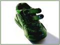
| 05/15/2003 02:40:07 PM |
|
 Photographer found comment helpful. Photographer found comment helpful. |
| 05/15/2003 02:39:33 PM |
Green Livingby GinaRothfelsComment: the rotation seems a bit off, but the larger issue is that the way the light falls its hard to discern the green color of the clothing and i have no idea what color the roof is, the plants and most of the trees aren't showing much green either (unless of course you are indicating that this is an energy efficient house and therefore 'green') |
| Photographer found comment helpful. |
| 05/15/2003 02:37:51 PM |
Flower of Secondary Colorby kaysrivComment: nice detail and color. interesting crop, i'm not sure why you cropped it so tight, esp. at the bottom (i understand that you might not want to hve any non-flower/background in the photo, but i loks like you had room at the bottom - unless you were working on a sunrise/set type of image). |
| 05/15/2003 02:36:29 PM |
Poinsettia Inversionby peter_kComment: nice composition and interesting choice of frame. the focus seems a little soft, which might have more to do with the way you lit it/post processed it to erase the background. i think you are allowed to submit a bigger picture and you would have benefited from doing that. |
| Photographer found comment helpful. |
| 05/13/2003 01:06:49 AM |
code orangeby tomzinhoComment: cristo -
thanks for your critique of my 'code orange' photo. i thought the photo was fun but just okay and it came out a little better than i expected in the voting (and i agree - getting the right perspective was the challenge, which i don't know if i did as effectively as i could have).
i have to say that i strongly disagree w/the meet the challenge comment. 30% of the top 20 entries were stationary (more or less) objects and i don't believe in general that issue hurt me too much (ie: i didn't get hurt because i took a photo of parked cars, i got hurt because i took a unique but not terribly interesting photo of parked cars).
in general i think that 'fit the challenge' attitude is the biggest problem with this site and i've chosen to totally ignore such comments (see my fauna entry) and hopefully little by little more people will see the light and open up their minds to good photography that is creative and interpretive as well.
cheers, tomzinho Message edited by author 2003-05-13 01:20:06. |
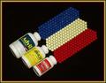
| 05/12/2003 10:52:16 AM |
Confusion. Which Shall I Choose?by RefocusedComment: just don't do them all at once. very creative idea and nice frame. the lighting is just okay and the colors look a little dull, however, and could have benefitted from a boost in saturation to give them more zing. a lower angle might have made the perspective more interesting as well. |
| Photographer found comment helpful. |
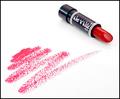
| 05/12/2003 10:51:02 AM |
Cinnamon Redby StevePaxComment: nicely composed and executed, although i think the lipstick marks look more like (red) charcol/pencil rubbings than lipstick (might have considered a real kiss imprint). good lighting. |
| Photographer found comment helpful. |
| 05/12/2003 10:49:35 AM |
Transporterby pitsamanComment: a little soft in focus and i think a plainer background would have helped out as well. i think the cropping and perspective could have been less tight which would have allowed the object to add more as the current photo doesn't allow us all to fully identify what it is. |
| Photographer found comment helpful. |
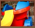
| 05/12/2003 10:47:02 AM |
Early Primary Colorsby ploogieaComment: nice find, i like the framing of the other playground in the background. lighting is just okay - i wish you could have found an angle that didn't have some shadows crossing the lit parts. overall, however, its very fun (but no kids?) |
| Photographer found comment helpful. |
Home -
Challenges -
Community -
League -
Photos -
Cameras -
Lenses -
Learn -
Help -
Terms of Use -
Privacy -
Top ^
DPChallenge, and website content and design, Copyright © 2001-2026 Challenging Technologies, LLC.
All digital photo copyrights belong to the photographers and may not be used without permission.
Current Server Time: 07/16/2026 10:00:59 AM EDT.