|
|
|
Showing 771 - 780 of ~1251 |
| Image |
Comment |
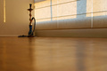
| 06/12/2006 04:29:13 AM | Abandoned Smokingby talikfComment: Hey there from the Critique Club
Camera Work/Technical: I like the crisp focus on the lamp. It works well to pull the eye right into the image. I would like to see a bit deeper depth of filed to include some of the floor detail in the foreground.
Lighting: I also like the lighting. I do find the lone highlight on the left side of the image a bit distracting. The rest of the image is nicely lit.
Composition/Content: Nice composition. The lines of the blinds as well as your shadows work well with the focus to pull the viewer's eye into the frame.
My Opinion: I think that you met the challenge well, but you were lacking the needed pop to separate this image from the rest. I believe that the voters found that the challenge was met, but the content was a bit too commonplace.
Eric
|  Photographer found comment helpful. Photographer found comment helpful. |
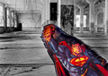
| 06/12/2006 04:21:42 AM | This is a job for... Indestructable-Mylar-Baloonby justamistereComment: Hey there from the Critique Club
First of all, congrats on your second highest scoring entry to date.
Camera Work/Technical: Great focus and nice depth if field use. You also did a very nice job with selective desaturation to yield a very interesting image.
Lighting: Very nice and very even. There are no areas that were lit to the point of distraction, nor are there any harsh shadows that are overly distracting.
Composition/Content: I do like the composition that you chose, but I don't see how the elements play together. Your positioning of the balloon is positioned well to draw the viewer into the frame, but the coloring is a bit overpowering, thus competing for the eye's full attention.
My Opinion: Nice job meeting the challenge, and I think that this one scored pretty close to its potential. With a different foreground subject, this one might have done a bit better. You have a great empty room there for a great start.
Eric
|
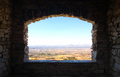
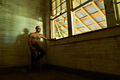
| 06/12/2006 04:16:05 AM | Room with a Viewby jerseyjimComment: Hey there from the Critique Club
Camera Work/Technical: Very, very nice. Looking through your past challenges, I think that this is one of your nicest images. Your focus is spot on and your depth of field works very well to show the distance of the capture. Make sure that you always try to use the full size parameters that DPC offers. Voters like larger images.
Lighting: You did a really nice job with harsh lighting conditions. The distant sky is nicely exposed and you still maintained details in the walls of the foreground,
Composition/Content: The walls, and the detail capture withing, serve the image very well to pull the viewer into the distant horizon. I also think that the centered composition works very well for framing the distant mountains and horizon.
My Opinion: You have one of your best images to date here, but it missed the challenge. Voters will hammer you if they feel that you didn't meet the challenge. Even with that, there is no way that this is a sub-5 scoring image. I think that it would make a fine wall hanger.
Eric
| | Photographer found comment helpful. |
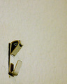
| 06/12/2006 04:06:55 AM | Where Have All The Pictures Goneby jerryc12Comment: Hey there from the Critique Club
First of all, welcome to DPC. I'm always glad to offer critiques and opinions, especially when it's a first entry. Again, welcome.
Camera Work/Technical: One of the biggest voter peeves is image size. Looking through, I see that no one mentioned it, but always try to use the full size parameters that DPC allows. Other than that, there does seem to be a focus issue. It could also be the grain of ISO 1600, but voters like crisp focus and vivid colors.
Lighting: Your lighting is a strength. There are no overexposed areas, and your shadows work well to contrast your subject nicely.
Composition/Content: Your use of empty space also adds strength to the image. You captured very nice detail on the hanger and the wall.
My Opinion: I do get a feeling of emptiness, but I think it could have been amplified by including a bit more of the empty wall. Don't be discouraged, amandalore is right. Voters are sometime hard to figure out. Keep shooting and keep entering. That's the nest way to figure them out.
Eric
|
| 06/12/2006 03:49:20 AM | ..., 15,16,17, ... by SherwinJamesComment: Hey there from the Critique Club
I am deviating from my normal critique style a bit because you pleased the voters enough to score a ribbon. It looks like you are on a roll here lately, and the ribbons keep coming. The only thing I'd like to see different in this image would be a little less exposure. It provides a nice high-key feel, but it is just a little to strong for my personal taste. You did a great job in meeting the challenge. Congrats on another ribbon. Very nice work.
Eric
| | Photographer found comment helpful. |
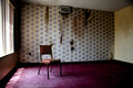
| 06/12/2006 03:43:59 AM | Desolated Roomby funny pieComment: Hey there from the Critique Club
First of all, congrats on your highest scoring image to date.
Camera Work/Technical: I like it. Your focus is very nice and your depth of field captures all the elements that this image needs. Your tones and coloring are very nice for this find.
Lighting: I do like the lighting, but the side window is just a bit distracting. I think shooting this one at a different time of day would have made this image even better. I think that the window needs to be included, but with lighting that is a little less harsh.
Composition/Content: Again, great find. The chair is placed very well, and the messy room really helps make this one strong. All elements keep the eye moving in and around the frame looking for a new stain or rip somewhere in the shot.
My Opinion: Very nice job meeting the challenge. I think that you made the right decision on your submission for this challenge.
Eric
| | Photographer found comment helpful. |
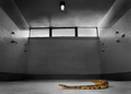
| 06/12/2006 03:35:06 AM | Disturbance in the Shower Roomby bvoiComment: Hey there from the Critique Club
First off, congrats on a well-deserved top 10 finish.
Camera Work/Technical: Well set up and well captured. Your focus is very crisp and your depth of field is terrific. It looks like the shower was desaturated, which also adds to the moodiness of the capture.
Lighting: Near flawless. There is just a touch of overexposure up by the left window, but it's not even enough to be distracting.
Composition/Content: I like the leading line that you created with the shake It really works well to pull the viewer into the image and explore what else is there.
My Opinion: Great work meeting the challenge in a very creative manner. I think that your placement was well deserved.
Eric
| | Photographer found comment helpful. |
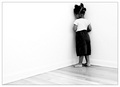
| 06/12/2006 03:25:10 AM | Solitary Manby swallaceComment: Hey there from the Critique Club
Camera Work/Technical: Great focus, especially considering that this was a self-portrait AND was done with a 2.5 second shutter. Everything came out very crisp. The depth of field works very well for this image.
Lighting: Excellent lighting that produces a very lonely mood. I got an old barn and hard work feeling even before reading the comments. You did a nice job using light to direct the viewer into the frame and over to your subject.
Composition/Content: Great composition and very strong leading lines that also work to keep the eye moving around to the important elements. I think your capture would have been stronger with a more timeless feel if you had left the sunglasses off.
My Opinion: I guess that the voters subtracted points for there being two objects in the room, you and the stool. In my opinion, you met the challenge well, and did so with an image that is much higher quality than 5.58.
Eric
| | Photographer found comment helpful. |
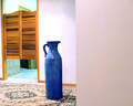
| 06/12/2006 03:17:35 AM | VACANTby coolblueComment: Hey there from the Critique Club
Camera Work/Technical: Everything looks nicely focused, and your coloring works well for this image.
Lighting: I think that this one is a bit overexposed. The bright wall behind the jug seems blown out, as does the detail in the rug underneath.
Composition/Content: I think that the wall taking up over 1/3 of frame hurt the scoring. It adds a very crowded feeling to the image and adds a great distraction to the eye.
My Opinion: I don't get an empty room feeling from this particular image. I think it scored pretty close to its potential as it is, but with some small adjustments in several areas, it could have done much better.
Eric
|
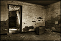
| 06/12/2006 03:08:00 AM | Abandoned Luggageby artvetComment: Hey there from the Critique Club
First of all, congrats on yet another top 10 finish. Your placement is well-deserved, and probably should have been even better.
Camera Work/Technical: Very, very nice! I like everything about this image. Your focus is very crisp and your tonal range is terrific. Wonderful depth of field use to keep all elements in focus.
Lighting: While there are many strengths in this image, the lighting is one of the greatest strengths. Your lighting adds well to the overall flow if the image.
Composition/Content: Again, terrific. The textures and moodiness created by this image are great. Everything in the image works well to keep the eye moving and wondering what happened.
My Opinion: This was one of the best images in the challenge, and the voters appeared to have shared the same thought. I think it should have done even a little better.
Eric
| | Photographer found comment helpful. |
|
Showing 771 - 780 of ~1251 |
Home -
Challenges -
Community -
League -
Photos -
Cameras -
Lenses -
Learn -
Help -
Terms of Use -
Privacy -
Top ^
DPChallenge, and website content and design, Copyright © 2001-2026 Challenging Technologies, LLC.
All digital photo copyrights belong to the photographers and may not be used without permission.
Current Server Time: 06/17/2026 07:35:08 PM EDT.
|