| Image |
Comment |
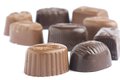
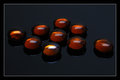
| 09/16/2009 04:57:17 AM |
9 pralinesby hajekaComment: A different and composition would serve this capture a good deal better. The high key background works with the subject(s), but the shallow depth of field detracts from the overall appeal of the image. I feel like the subject is 9 little candies, so there should be 9 little candies in crisp focus. Also, the chopping crop on the right hand side seems more accidental than composed. I'd like to see this one executed better. 3. |
 Photographer found comment helpful. Photographer found comment helpful. |
| 09/16/2009 04:54:07 AM |
Corner Marketby ChadHComment: A seemingly common subject for this challenge. It took some time of searching through the busy frame to find the actual subject of the challenge. While the idea works for the challenge, this one needs to be tighter on the subject. 4. |
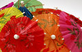
| 09/16/2009 04:52:59 AM |
I'm still standingby snafflesComment: I definitely do not understand your title. The colors you captured are true and appealing to my eye, but the frame feels very, very jumbled. 3. |
| Photographer found comment helpful. |
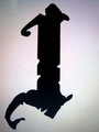
| 09/16/2009 04:51:51 AM |
The 9th Letterby jaeckel46Comment: Without the title, this one would have been completely lost on me. The uneven crop feels awkward and there are some odd color casts and gradients all around the letter. 2. |
| 09/16/2009 04:50:04 AM |
|
| Photographer found comment helpful. |
| 09/16/2009 04:33:30 AM |
Passersbyby MelethiaComment: While a good foundation for a street photography entry, I am missing the relation to the Nine challenge. I do like your contrast and tonal range, but this one misses the boat to me. 3. |
| Photographer found comment helpful. |
| 09/16/2009 04:32:05 AM |
Ninth month and waiting....by StephenGComment: The white shirt is far too harsh for the somewhat muted tones in the rest of the image. The tonal range of the image seems to be missing both whites and blacks aside from the overexposure on the shirt itself. Even adding contrast with a curves layer would still leave the white shirt there to grab my eye and prevent it from exploring the entirety of the frame. Aside from the shirt, here is the edit I would have offered to offer more depth to the viwer.
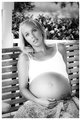
Her pose also seems a bit uncomfortable. Placing that left arm behind her almost makes her look like an amputee or that she is struggling just to sit in that position...not that being 9 months pregnant isn't a struggle within itself. I like the belly and the content look you captured on her face. I think with a different shirt color and a slight pose adjustment your score would grow considerably. This one gets a 5 from me. |
| Photographer found comment helpful. |
| 09/16/2009 04:21:31 AM |
Gold Dropsby CheerzComment: For this one to draw high numbers, I think you'd need crisp focus throughout the entire image. The objects in the back of the image seem to fade into softness and loss of detail. Interesting subjects, but I thin a little more exposure would help give this one some pop as well. 5. |
| Photographer found comment helpful. |
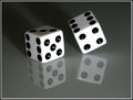
| 09/16/2009 04:19:35 AM |
Ninesby JCrest01Comment: Nice composition, but it is a far too common subject to draw a high score. The reflection and angles in your subject absolutely serve well to add interest, but it is still just dice on a dull, reflective surface. 4. |
| Photographer found comment helpful. |
| 09/16/2009 04:17:27 AM |
Nine Rollsby cbondarComment: Not a bad plan, but the lighting is far too harsh, uneven and unbalanced for this one. My eye is immediately drawn to the several hot spots in the image and captured there. 4. |
| Photographer found comment helpful. |
Home -
Challenges -
Community -
League -
Photos -
Cameras -
Lenses -
Learn -
Help -
Terms of Use -
Privacy -
Top ^
DPChallenge, and website content and design, Copyright © 2001-2026 Challenging Technologies, LLC.
All digital photo copyrights belong to the photographers and may not be used without permission.
Current Server Time: 06/10/2026 05:11:54 PM EDT.