|
|
|
Showing 91 - 100 of ~1251 |
| Image |
Comment |
| 09/24/2009 01:07:02 AM | Le Vieux Moulinby AmeedEl-GhoulComment: Hey there from the Critique Club
Camera Work/Technical: Nicely focused and pleasantly crisp.
Lighting: The sunrise is unbelievable. Wonderful colors and well captured. I'd like to see the tower exposed a little more, but not enough to take away from the score.
Composition/Content: Nice composition. The tree touching the mill is a slight bit distracting. Perhaps a slight change in your point of view would have remedied that.
My Opinion: As a general rule, I hate HDR. However, you pulled it off well which is especially evident with the glow of the sunrise. This image is nicely captured and well placed in the challenge. Your score reflects that perfectly.
Thank you for the opportunity to provide a critique on your entry,
Eric
|  Photographer found comment helpful. Photographer found comment helpful. |
| 09/24/2009 12:45:57 AM | Dynamic Spiderby alpharichComment: Hey there from the Critique Club
Camera Work/Technical: Its really hard to differentiate yous technical strengths from the weaknesses with this particular HDR image. The center of the image appears in focus, as does the top portion just above center. It looks like the wind, as well as the tremendous amount of post-processing played a large role in losing a good deal of your web detail. I see a lot of softness and pixelation from the various post-processing steps you used.
Lighting: Even with the HDR rendering, the center of the image feels a bit too bright.
Composition/Content: Centered composition works well is many instances. I think that it fits your image well. Unfortunately, this was a free study. Those are always judged especially harshly.
My Opinion: I am not an HDR fan as a general rule. The various effects used and the obvious difficulty obtaining good starting images have definitely detracted from your score's potential. As is, I think this one scored accordingly.
Thank you for the opportunity to provide a critique on your entry,
Eric
|
| 09/23/2009 09:17:37 PM | The Rails at Duskby bcrantsComment: Always, always, always use the full size allowances that DPC gives you. 640px is already a ridiculously small size to see on most modern monitors, but this is even more difficult. I like the image, but much of the detail is lost due to the small size. | | Photographer found comment helpful. |
| 09/23/2009 09:14:24 PM | Securing 165M flyerby soonComment: No way this misses a ribbon. Amazing composition and perfect for the challenge. This one pulls a 10 from me. Awesome. | | Photographer found comment helpful. |
| 09/23/2009 04:17:02 PM | [ S MO K E D ]by ericwooComment: You haven't made a comment in 4 months, very nice.
Originally posted by essay:
"I like the composition and the minimalistic image you have presented here, but the subject matter suffers from commonality here on DPC. There are a lot of dandelions MATCHES & SMOKE on DPC. In fact, I think I've even seen a few with the same type of blown SWIRLING SMOKE technique. Something seems off to me with the lighting. The highlights seem a little too harsh AS I CANNOT REALLY SEE MUCH OF THE DETAILED GRAINS IN THE WOOD AS I WOULD LIKE, AND THE SMOKE CLOUD ON THE RIGHT IS NOT PARTICULARLY APPEALING." ;)
Sound vaguely familiar? They say "our sins look especially bad when we see them in someone else."
 
-Seriously, I do like your composition, and congrats on the nice finish. Thanks for taking the time to comment on my entry (thumbnail below), but please realize, there are few original ideas each week on DPC (and I do put THE TWO OF US at the top of the list that are NOT particularly original).
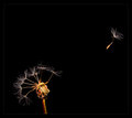
When I do mimic something, I TRY to make some element(s) of it unique or at least execute it better than has been done before, as I'd like to think I have done in my entry this week, and as you have in yours.
I'm sure I could point to numerous similar examples of each photo of page one that have been entered before.
Good luck on future challenges.
Stan |
Message edited by author 2009-09-23 17:16:49. |
| 09/23/2009 07:01:40 AM | Well, there were 9.by essayComment: Originally posted by essay:
When I do mimic something, I TRY to make some element(s) of it unique or at least execute it better than has been done before, as I'd like to think I have done in my entry this week, and as you have in yours.
Stan |
Well, you didn't. It scored in the top 5 because this is DPC. Your lighting is off and nothing is original. If you can't handle honest critiques on your images, perhaps a public challenge forum isn't for you. Your retaliation was very, very unnecessary. Message edited by author 2009-09-23 17:17:32. |
| 09/19/2009 10:55:26 AM | One lifeby TOM32Comment: You have definitely captured an interesting subject here, but I think that the depth of field detracts from the overall image. While some have successfully escaped the thought in my mind, I still believe that a challenge titled Nine with nine individual subjects in the image should keep those subjects in crisp focus throughout. Of course that is not a hard, fast rule, rather a thought inside my mind's eye. I think that crisp focus would have helped your image more. As I move my eye through the frame and to the right, it becomes more difficult to look at due to the loss of focus. Sure, the blurring does force my eye to stay on a certain portion of the image, but I'd rather it be free to wander within the constraints of the frame. Interesting image, but I think more focal clarity would have served well to grow your score. From me, a score of 6. | | Photographer found comment helpful. |
| 09/17/2009 06:18:14 AM | Wapitiby hahn23Comment: Great title. How many have you lost with it thus far? I like the bull overlooking his harem, but the image seems a little flat overall. The composition is right where it needs to be. I like the flow from the 'king' up top there down through and across his ladies and kids. Well seen, but I'd like to see a little more contrast and pop to the image. A simple yet subtle adjustment I would have made would look like this.

From me, a 6. | | Photographer found comment helpful. |
| 09/17/2009 06:10:08 AM | Nine O'Clockby ErichNComment: The centered composition works very well for this particular image, but creativity and interest are both severely lacking. There is some interest in the clock face itself, but it is only a clock face with centered composition. Not my preference for subject matter in this particular challenge. 4. | | Photographer found comment helpful. |
| 09/17/2009 06:08:11 AM | Well, there were 9.by essayComment: I like the composition and the minimalistic image you have presented here, but the subject matter suffers from commonality here on DPC. There are a lot of dandelions on DPC. In fact, I think I've even seen a few with the same type of blown technique. Something seems off to me with the lighting. The highlights seem a little too harsh. 5. | | Photographer found comment helpful. |
|
Showing 91 - 100 of ~1251 |
Home -
Challenges -
Community -
League -
Photos -
Cameras -
Lenses -
Learn -
Help -
Terms of Use -
Privacy -
Top ^
DPChallenge, and website content and design, Copyright © 2001-2026 Challenging Technologies, LLC.
All digital photo copyrights belong to the photographers and may not be used without permission.
Current Server Time: 06/09/2026 11:13:51 PM EDT.
|


![[ S MO K E D ]](https://images.dpchallenge.com/images_challenge/1000-1999/1093/120/Copyrighted_Image_Reuse_Prohibited_821391.jpg)