|
|
|
Showing 3611 - 3620 of ~4921 |
| Image |
Comment |
| 11/07/2005 09:00:43 AM | In da pubby neehaiComment: Lensbabie? I gotta get me one of those...I really like the effect it has on this subject, I love the deep rich warm tones...nice lighting too |
| 11/07/2005 08:58:16 AM | |  Photographer found comment helpful. Photographer found comment helpful. |
| 11/04/2005 10:26:57 AM | Life is fragile: like a house of cardsby amanComment: ********Hi there Amara, greeting from the " Critique Club "********
First, let me welcome you to DPC! I see this is your first challenge, I hope you weren't too let down by your score, the DPC voting community can be rough, particularly in the open challenges.
Ok...lets get started here. When I first saw this image, I must admit I was a bit surprised to see it was an entry in the delicate challenge. To me this image seems more "bold" than delicate...I think perhaps this is because of the strong and vibrant colors, particuilarly the bright gold background. The color seems to overwhelm the delicacy of the situation you have created here. I also noticed you put this image in the "action" gallery...a proper place because this is quite action packed!
Technically speaking I see a few issues...the first being the uber saturated colors, perhaps a black and white conversion would have connected with the "delicate" theme a bit more? I am so wowed by these vibrant colors it find it difficult to get past them. Another issue is the lighting...am I to assume that you used a flash? Lighting from a camera mounted flash tends to flatten thing out a bit, it can take away "depth", but I also see that you had a 1 second exposure so maybe you didn't use a flash. Perhaps you could try this set up again with different lighting? You can get very inexpensive "lighting" set-ups from you local hardware store, try placing them at different angles, high, low, above, below, off to the sides, and see how the light moves and changes...it's fun, I urge you to give it a try! Speaking for myself, I must say I do love doing a good still life. Another issue I see is the composition/cropping...I would actually like to have seen more of this house of cards, what an effort you put forth building this house, so why not show is more of it...the UNO cards were an interesting idea, but then again then are so bold, perhaps just a "regular" deck may have been more effective. I like the tranparency of the doll and I also find that reflection just above it quite intriguing...it almost makes it seem as if this were underwater, very interesting.
If you have any more questions or have anything else you'd like to discuss, please do not hesitate to drop me a note. Again, welcome to DPC and I hope you stick around...there is so much to be learned here! Be sure to check out the tutorials...there is a lot of good avdice to be found there.
|
| 11/04/2005 09:31:04 AM | A Fallen Leaderby TransitComment: ********Hi there Mike and greetings from the "Critique Club"********
The first thing that imediately came to mind when I first saw this was Texas, rodeos...then Georgia O'Keefe was a close third.
6.0585...pretty nice score you got for this one. For me...I would actually like to see this without the grain or the sepia...but alas this was the "grain" challenge : } The image does have a slight "vintage" feel about, though old photographs tended to have absolutely no grain at all or that much sepia toning. What the grain does do nicely for this image is enhance the "gritty-ness"...I can feel that dust in my teeth, feel it hitting my dirty dryed out face...The image does lack a bit of clarity, perhaps due to the slightly longer exposure, and on my monitor it seems a bit flat, like it needs just a slight levels adjustment to give a little more punch. And personally, I think it would interesting to see a different crop, I keep wanting to see more of what is going on around the skull, even if it is just more sand storm.
But enough about that...all in all this image was quite good in bringing about a "mood", which I really think was the main objective of this particular challenge. | | Photographer found comment helpful. |
| 11/03/2005 04:23:45 PM | Silver Riderby Pug-HComment: Oh my goodness this is fabulous! I thought your challenge entry was great, this is equally so. He's looks so cool poised on that bike contrasted against that golden amber background...wow, bam, impact...I love it! | | Photographer found comment helpful. |
| 11/03/2005 02:10:50 PM | Metroplexby crabappl3Comment: Big D...I always thought it was so cool how so many buildings in Dallas and Fort Worth are outlined in lights somehow...I guess ya have to have something pretty to look at while stuck in all that gawd awful traffic right? | | Photographer found comment helpful. |
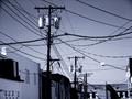
| 11/03/2005 02:05:00 PM | A Tangled Webby esdarbyComment: Wow...now that's an electrical nightmare! Nice tones and choice to go B & W was right on...very nice. | | Photographer found comment helpful. |
| 11/03/2005 02:02:15 PM | | | Photographer found comment helpful. |
| 11/03/2005 01:12:12 PM | Safe in my fathers armsby TUBORGComment: Hello Arnthor and greetings from the "Critique Club"
Let me first start by saying what a lovely moment you have captured here...the chipper young fellow entangled within his father's loving and protective arms. I find the composition very pleasing, my eyes moves about the image with ease yet never leaves it.
I do find some things a bit problematic with the processing, which apparently many others did not, please remember everyone has different tastes, it really insn't a question of right or wrong. : }
For an entry in the "Image Grain" challenge, I do not see very much grain, hardly any at all...just an almost overwhelming softness. I find myself wanting to see a little more detail in the darks, just a smidge more, particularly right next to the youngster's head...he seems to be sinking into this great and dark abyss that could almost be seen as a little bit scary/forboding if we let our imaginations roam. To me this looks like an image that was run through a noise reduction program before a very subtle grain was added, I could be wrong, but since no processing notes were left, I can only guess.
I took a look through your portfolio, to see if this "softness/glow" is something you use alot, and I must say your work is very intriguing. Perhaps I am wrong in calling it a "softness"...I think what I really yearn to see in this image is just a little more detail that I know must be there but is being swallowed up by the darkness...regardless, this is still a pleasing image, and as I mentioned before and from your comments below, many people agree. | | Photographer found comment helpful. |
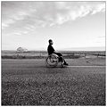
| 11/03/2005 11:59:59 AM | bro3.jpgby PedroComment: oh...this I love...and I really loved " A Long Road to Here", I just find this particular image so moving...here we are simply presented with the man and his "situation"...nothing hidden, simple and true...what a powerful series of images you have made here...emotional yet not "sappy"...there is this overwhelming majesty and power. | | Photographer found comment helpful. |
|
Showing 3611 - 3620 of ~4921 |
Home -
Challenges -
Community -
League -
Photos -
Cameras -
Lenses -
Learn -
Help -
Terms of Use -
Privacy -
Top ^
DPChallenge, and website content and design, Copyright © 2001-2026 Challenging Technologies, LLC.
All digital photo copyrights belong to the photographers and may not be used without permission.
Current Server Time: 07/26/2026 10:29:26 PM EDT.
|