DPChallenge: A Digital Photography Contest You are not logged in. (log in or register
 
Browse Settings
Currently viewing:
Registered UseroOWonderBreadOo

Show comments:

Per page:

Order:

Comments:


Comments Made by oOWonderBreadOo
Pages:   ... ... [60]
Showing 231 - 240 of ~597
Image Comment
Made in the Philippines
12/12/2005 12:25:49 AM
Made in the Philippines
by davidus428

Comment:
nice colors & texture, I just don't think the tilt is working here. not enough to be a good angle and too much to be not on purpose. very cool other than that :0) 6 for now...
Sunset
12/09/2005 07:59:42 PM
Sunset
by Oddfrog

Comment:
**Critique Club**

Wow what a great image- I love it!

The color is superb as well as the lighting. The contrast seems perfect- you can see all the holes and even some nicks quite clearly.
The composition is wonderful- the title says it all and you do a great job at mimicking the sunset.
The only thing that’s killing this image you probably already know. The focus! It’s not just a small depth of field; there is no focal point to speak of. It’s hard with low lit situations but maybe going to a manual focus will help.

I can’t wait to see what other great ideas you come up with, very creative of you. Good luck with your future challenges!

Photographer found comment helpful.
At the Docks
12/09/2005 05:20:10 PM
At the Docks
by kaidaehnke

Comment:
**Critique Club**

I find this image very interesting and different than any usual photo I would see around DPC.

The composition and depth of field are lacking. The lines all are leading me out of the image and it is quite busy. Some people have commented on the focus and it seems off to me too. Perhaps an Unsharp Mask would have helped with this. I cannot be sure since I don’t have the original but when downsizing you always loose clarity. An idea might have been to set focus on the lifesaver and foreground, letting the logs blend into a blur.
Your lighting looks great and the exposure too. Looks like a nice overcast day, perfect for this kind of shot.
The colors I really love- the whitewash look of everything with the red lifesaver punctuates the shot beautifully. The red straw is a bit of a distraction.

Good luck with your future challenges!
Photographer found comment helpful.
need for speed
12/08/2005 08:14:18 PM
need for speed
by cwt26

Comment:
**Critique Club**

Well, this is your first entry so I’m giving you a few tips you might not know until you’ve been here a while.
-Go for the biggest size possible. 640 is the max allowable and some will vote down for a simple thing like a small image.
-When you resize smaller you lose detail. You should always run an USM or Unsharp Mask (or equivalent if not using Photoshop) to bring back that definition. This image looks like it could have especially used it. Nothing seems out of focus, it’s just not as sharp as I’d like to see.

On to the image!

Compositionally, I personally like the angle but am not sure about cutting off the front of the car. Seeing that this is advanced editing I might have even cloned out the crack in the cement but that honestly would have changed the photo. My eye is more drawn to the car with it there.

Color and Lighting- While there are some blown out highlights the USM would have dampened it with the door handle becoming sharper. The sky seems very bleak to me and I would suggest you add some blue to it. You can do this under selective color by adding black or decreasing magenta in the blue and cyan channels. This is legal under basic and advanced editing.

It’s a great image for the challenge and I think you did incredibly well for your first entry. I can’t wait to see what you’ve got coming & good luck in future challenges!
Photographer found comment helpful.
Frozen in Time
12/05/2005 05:55:01 PM
Frozen in Time
by Riponlady

Comment:
might have liked it if you cropped in so the center leaf was the subject, the composition seems off to me
Photographer found comment helpful.
Dreamy Angel
12/05/2005 05:53:32 PM
Dreamy Angel
by xlr8tn

Comment:
I think this would be better if you had cropped out the jeans- a bit of a distraction
Winter Skin
12/05/2005 05:52:23 PM
Winter Skin
by pikaboo

Comment:
this image seems to need a boost in levels- it's just too flat
The Pout - Works Every Time
12/05/2005 05:50:31 PM
The Pout - Works Every Time
by notesinstones

Comment:
the background is a little distracting... cute kid :0)
Photographer found comment helpful.
Advanced Editing
12/03/2005 05:50:40 PM
Advanced Editing
by idnic

Comment:
**Critique Club**

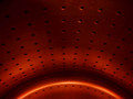
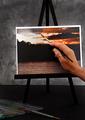
Well, first thing I have to say is I really like this image. It is clever, artistic and a very unique idea for the challenge.

Some questions come to mind when I am studying this image. Is the background desaturated? The brush? The paint colors in the foreground are very muddy. Was this intentional?

That being said, I love the paints in the corner and think it was a great finishing touch. I also like the mottled colors and although they do not match the “painting” it is a minor distraction.

The composition is fair but seems very static. While I know this is hardly an action shot, my eyes are continually being pulled up and out of the image. This might have benefited from being horizontal.

The colors in the image are wonderful. They really do the job of drawing the viewer into the painting. Others have mentioned the ring being distracting and I do think it is a little. The curve of the ring is what makes it less so- it keeps the eye moving! I asked the question of the background being desaturated and I know from your comments it isn’t but still I believe it would have been better with color to help the image look more dimensional. (Albeit a muted color!)

The lighting is superb!

Your post processing techniques look good but I think you went a little overboard with sharpening. This is only evident in the haloing effect around the easel. A tip: if the rest of a photo really needs the sharpening I will go back over the haloed areas with the history brush. (Which is only allowed in advanced editing of course!)

Well, congrats on your great score with this excellent photograph!

Message edited by author 2005-12-03 17:52:03.
Photographer found comment helpful.
The Maestro and his Zither
12/03/2005 03:01:33 PM
The Maestro and his Zither
by viljoendale

Comment:
try diffusing your flash- you can bounce it off the ceiling or if you are looking for a cheap route you can rubber band a plastic spoon over the on board flash :0)
Photographer found comment helpful.
Pages:   ... ... [60]
Showing 231 - 240 of ~597


Home - Challenges - Community - League - Photos - Cameras - Lenses - Learn - Help - Terms of Use - Privacy - Top ^
DPChallenge, and website content and design, Copyright © 2001-2025 Challenging Technologies, LLC.
All digital photo copyrights belong to the photographers and may not be used without permission.
Current Server Time: 09/09/2025 02:30:09 AM EDT.