| Image |
Comment |
| 10/19/2005 12:23:30 PM |
|
 Photographer found comment helpful. Photographer found comment helpful. |
| 09/28/2005 07:56:35 PM |
Markssaxsmall.jpgby MarkComment: Definately creative! Only thing I see at first glance is that the skin tones are so different...you'd probably have to correct that before merging the 2 pics, though (I'm not the good at PS, so I don't know!). Otherwise...It's a really neat picture. |
| Photographer found comment helpful. |
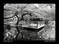
| 09/28/2005 07:47:31 PM |
Reflecting Poolby faidoiComment: This is very nice to look at. Very tranquil. A suggestion: if those are flowering trees, maybe go back (if possible) and do a selective desat keeping the color of the flowers? I would love to see that.
As it stands, though, still a very nice photo. |
| Photographer found comment helpful. |
| 09/28/2005 07:44:43 PM |
Rose.jpgby faidoiComment: This is the type of photo that I really aspire to be able to make. Thank you for the wonderful example. This is beautiful. |
| Photographer found comment helpful. |
| 09/28/2005 07:32:23 PM |
almost.jpgby trobergeComment: I think you got the focus (and the lighting) just right for this one. I do, however, agree with saintaugust about the crop and the angle of the body. Maybe if you crop to just the face? I know it's an almost 'milestone moment', but as a picture it might 'work' a little better for the general population. She's a cutie, by the way - her expression is just perfect. Reminds me of when mine were this young. |
| Photographer found comment helpful. |
| 09/26/2005 04:21:27 PM |
Good Evening Chicagoby beatles1-1Comment: Not sure that the title is a category of greeting card, but not taking off for that. The silhouette is nice (if a little fuzzy), but the sun is WAAAAYYYYY blown out (I know it's a difficult subject). This photo would probably work a little better and be more visually appealing if you were to crop out the sun and perhaps include a little more of the skyline to the left. Your horizon is tilted. On a good note, the colors in the sky (other than the sun) are beautiful, and I like having the sailboat in the foreground. The placement of your horizon is also good. |
| 09/26/2005 04:17:23 PM |
Get Well Soonby jtf6agentComment: I understand the concept of giving flowers (even on a card) as a get-well-gift, but these flowers look like they've gone a few rounds with my four-year-old. On a technical note, the light from the on-camera flash is very harsh; perhaps you could soften it a bit next time by taping tissue paper or a plastic spoon over the flash. The background is very distracting - I keep trying to figure out what it is rather than simply taking in the photo. |
| 09/26/2005 04:14:01 PM |
Inspire & Encourageby pedrofotoComment: I like the concept. Unfortunately, the small size of the entry makes it very difficult to see what is going on. |
| 09/26/2005 04:11:59 PM |
Thinking of Youby pelfComment: I apologize ahead of time, but I am going to be blunt. This photo shows great potential on your part toward becoming a good photographer (or better). The composition is nice, and is definately something I would expect to see on a greeting card. However... (and I know others are going to say this) I would like to SEE the photo - this one is too small! Your horizon is slightly off (by a couple of degrees). The purply-pink cast to the photo adds nothing; it simply looks as though it's been over-processed, possibly to hide other technical flaws. There seems to be a lot of detail lost in the shadow of the rocks, and there's something lurking in the water on the left side of the photo that I can't make out (and is therefore distracting). This shot could be so much better, and I think you probably have the ability to make it so - you certainly seem to have an 'eye' for what looks good. |
| 09/26/2005 12:33:25 PM |
Thinking of Youby sherComment: Composition of this is excellent and the whole feeling I get off of the pic fits in very well with the type of card it's supposed to be. |
| Photographer found comment helpful. |
Home -
Challenges -
Community -
League -
Photos -
Cameras -
Lenses -
Learn -
Help -
Terms of Use -
Privacy -
Top ^
DPChallenge, and website content and design, Copyright © 2001-2026 Challenging Technologies, LLC.
All digital photo copyrights belong to the photographers and may not be used without permission.
Current Server Time: 06/11/2026 05:40:30 PM EDT.