|
|
|
Showing 301 - 310 of ~1042 |
| Image |
Comment |
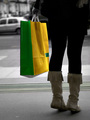
| 02/24/2006 05:50:52 PM | Shopping Done - Taxi !by Mr_PantsComment: I thik what bothers me about this pic is the tilted horizon. I _know_ it's supposed to be tilted. I guess it's just that the amount of tilt is in that gray area where I'm not *quite* sure whether or not is _is_ on purpose.
I do like the bright colors of the bag, and aside from the tilt, I like the composition. |  Photographer found comment helpful. Photographer found comment helpful. |
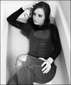
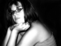
| 02/24/2006 05:38:49 PM | American Grungeby adamwebComment: This is different and interesting. I like the concept, but I think that the camera angle makes her hips and thighs look larger than they really are. The B&W gives this a stark in-your-face look that is very 'fashion'. I can't help but wonder, though, if this wouldn't have more impact if you used less light, oversaturated the color, and ran a grunge filter on it. I know - not legal in basic, but I still wonder.
As it stands, it's unique in the challenge, and I think it could hold its own in a magazine. Well done. | | Photographer found comment helpful. |
| 02/24/2006 05:32:37 PM | Anna Loraby sabphotoComment: I like the composition of this, and I like the pose, but her skin tones need some work (unless she is indeed sunburned!). | | Photographer found comment helpful. |
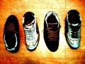
| 02/24/2006 04:33:53 PM | Shoes for 2by leavingmyselfComment: This would be a more aesthetically pleasing photo if _either_ you lined up the shoes with the lines on the floor _or_ you laid them out so that it looks as though you _deliberately_ did not line them up. This looks like they were tossed out there and photo'd at the last minute. Also, you have a lot of glare from your lighting (flash?) and it looks like you played with the color and saturation a little too much - or perhaps not enough! Another angle might have made this a little more visually appealing - they look a little like they're in a police line-up at the moment. Not a very positive critique, I know, but hopefully I've given you some things to think about and maybe try the next time you shoot something like this. |
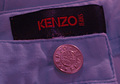
| 02/24/2006 04:29:33 PM | Designer Detailby tembaComment: I'm not sure that this meets the 'spirit' of the challenge, but since it technically does, I'll let that pass without marking off for it. However, if I were a fashion magazine editor, I would have to take a 'pass' on using this photo for a couple of reasons. 1- While close-ups or macros do indeed appear in some designer ads, they are always crisp and clear throughout the entire picture. 2 - When these close-ups appear, they are usually shown 'in context' (a cuff on a model's arm, for example). 3 - The composition is visually boring. There is nothing that leads the eye from one spot to another in the photo; the eye simply jumps around trying to make sense of it.
Also, I don't know if this is the actual color of the item. It _looks_ like it was added in post processing. So, again, if the color was added after the fact, this would be another cause to not use the photo.
I know that this isn't a very positive critique, but I hope at least some of it will be helpful to you. | | Photographer found comment helpful. |
| 02/24/2006 04:23:00 PM | eau de cologneby charlievComment: Hmm. Very dark photo - except for the lighting glare. Also somewhat out of focus. This perhaps would have turned out better had the bottle been in front of a lighter colored background and if the light were behind a baffle or screen. | | Photographer found comment helpful. |
| 02/24/2006 04:21:42 PM | Simply Glowing!by Spartan151Comment: I don't really care for the post processing done to this photo. It's simply not very flattering to the model. The pose isn't particularly flattering, either. |
| 02/24/2006 04:20:21 PM | Eclecticby debapakaComment: I really don't like the background in this photo. And there's a lot going on in the immediate foreground that seems unnecessary. I think that if these items were arranged a little differently in front of a new background, this photo would be much more pleaseing to the eye. As it stands now, it really just looks like a bunch of 'stuff' thrown at the mannequin - there is no order to it, no sequence for the eye to follow. And the background just clashes with everything else. |
| 02/24/2006 04:16:02 PM | Wrapped in glowing lustby shadeeuaComment: This is a very interesting abstract image. For me, however, it has only a tenuous hold on the 'fashion' aspect of the challenge. Does it meet the challenge, IMO? Yes, barely. Do I like it? Yes. Does it say to me 'I'm a fashion photo'? No.
Also, there appears to be a slight amout of 'bleedover' between the white and black in some areas. |
| 02/24/2006 12:34:12 PM | Next time I'll use Maybellineby MichaelCComment: Definately a cutie! I'm not sure I care for the overall brightness - in this case I don't think it really 'fits' with the subject being all 'dressed up'. I think this treament would work better with her dressed up as, say, an angel, or perhaps a flower girl or something. Here it just washes out the 'painting' she's been doing. | | Photographer found comment helpful. |
|
Showing 301 - 310 of ~1042 |
Home -
Challenges -
Community -
League -
Photos -
Cameras -
Lenses -
Learn -
Help -
Terms of Use -
Privacy -
Top ^
DPChallenge, and website content and design, Copyright © 2001-2026 Challenging Technologies, LLC.
All digital photo copyrights belong to the photographers and may not be used without permission.
Current Server Time: 06/11/2026 08:09:05 AM EDT.
|