| Image |
Comment |
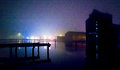
| 07/02/2009 01:10:53 PM |
Hey Jewby OdedComment: Wow, gutsy title. Nice street scene capture of the moment. |
 Photographer found comment helpful. Photographer found comment helpful. |
| 07/02/2009 01:10:05 PM |
fogby idpComment: I know the challenge is image grain, but the horrible colors created are definitely at odds in this picture. Sometimes doing a partial desat to tone down the worse of the color (maybe the green/yellow and the purple) will create a more pleasing image. |
| Photographer found comment helpful. |
| 07/02/2009 01:08:30 PM |
|
| Photographer found comment helpful. |
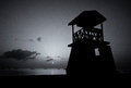
| 07/02/2009 01:07:55 PM |
Lifeguard Centralby MsAmbrosiaComment: I think that you must have used a very high iso to get the grain on this. Not sure it worked to the advantage of the photo, though as I look that lifeguard stand is very defined in comparison to the background. I think the difference between the grainy background and the sharp lifeguard stand creates a mismatch in the picture. It seems to definitely be distracting compositionally. |
| Photographer found comment helpful. |
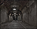
| 07/02/2009 01:05:21 PM |
Old cogsby kerrangComment: Nice use of light to show the shape of the gears. |
| Photographer found comment helpful. |
| 07/02/2009 12:59:31 PM |
Other Spaceby jaysonmcComment: I love reflected buildings, but using grain for the challenge does not suit this subject at all. I know it is beautiful without the grain. Need to think a bit harder when taking your shots. |
| 07/02/2009 12:58:11 PM |
|
| Photographer found comment helpful. |
| 07/02/2009 12:57:20 PM |
|
| Photographer found comment helpful. |
| 07/02/2009 12:56:18 PM |
Forgotten Homeby SEGComment: I am not seeing enough tonal ranges for a black and white. Image is very low key and low contrast, and also very fuzzy. I wonder what the color version looks like. The foreground looks like it could be a beautiful wild garden, but can't tell in this image. |
| Photographer found comment helpful. |
| 07/02/2009 12:54:31 PM |
|
| Photographer found comment helpful. |
Home -
Challenges -
Community -
League -
Photos -
Cameras -
Lenses -
Learn -
Help -
Terms of Use -
Privacy -
Top ^
DPChallenge, and website content and design, Copyright © 2001-2026 Challenging Technologies, LLC.
All digital photo copyrights belong to the photographers and may not be used without permission.
Current Server Time: 07/17/2026 01:37:28 AM EDT.