| Image |
Comment |
| 09/15/2005 04:14:14 PM |
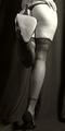
Leggyby parrotheadComment: The triangle on the left of the body seems odd. Not sure what it is or why it is there, but it doesn't add anything to the photo. |
 Photographer found comment helpful. Photographer found comment helpful. |
| 09/15/2005 02:34:29 PM |
yellow greenby luciophotoComment: Glare in background is too intense. Needed to find a way to equalize light and darks. Perhaps a different angle would have focused more on the fruit and cut out some of the glaring background. |
| 09/15/2005 02:32:21 PM |
|
| 09/15/2005 02:31:36 PM |
|
| 09/14/2005 11:21:55 AM |
Illusionby brizmamaComment: The angle is not slanted enough. The cut off top really causes a flat image which really doesn't depict perspective strongly enough. |
| Photographer found comment helpful. |
| 09/14/2005 11:05:33 AM |
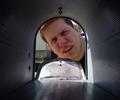
Still Waitingby theskitch6Comment: Great depiction of perspective. Nice detail on the inside of the mailbox. Good light in the open end. Didn't like the dof, though. I would have liked to see more shallowness regarding the house in the background. Also, with a picture like this, for my personal preference, I would have liked maybe a dog or cat looking in rather than a person, but I am not marking down for that, The exposure on his face is good given the light requirements. |
| Photographer found comment helpful. |
| 09/14/2005 11:02:44 AM |
Ozymandiasby trtfeasorComment: My favorite poem of all time. What happened near the bottom of the picture? There is a ridge that cuts the image. Anyway, image has strong lines in the foreground, which I like, but the colors are a bit flat. Would have liked more brightness and contrast. 7 |
| Photographer found comment helpful. |
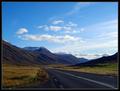
| 09/14/2005 10:59:04 AM |
Highway #1by marvinComment: Strong image, well composed. Exposure could have been better. |
| Photographer found comment helpful. |
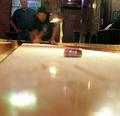
| 09/14/2005 10:58:11 AM |
Shuffle Boardby Man_Called_HorseComment: Nice idea. I would have liked a cleaner focus. If you had focused on the point in advance, then taken the picture, the disc would have been clearer and added a really nice perspective to the photo. I don't have as much of an issue with the out of focus person as I do with the disc. |
| 09/14/2005 10:56:15 AM |
Long Way Downby rodehiComment: I know what you were trying to do, but I don't think the actual perspective of the height comes across. |
| Photographer found comment helpful. |
Home -
Challenges -
Community -
League -
Photos -
Cameras -
Lenses -
Learn -
Help -
Terms of Use -
Privacy -
Top ^
DPChallenge, and website content and design, Copyright © 2001-2026 Challenging Technologies, LLC.
All digital photo copyrights belong to the photographers and may not be used without permission.
Current Server Time: 07/23/2026 10:03:06 AM EDT.