| Image |
Comment |
| 09/20/2005 09:18:22 PM |
|
 Photographer found comment helpful. Photographer found comment helpful. |
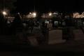
| 09/20/2005 09:16:54 PM |
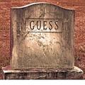
Guess The Final Destination......by JOHNBOY1970Comment: I immediately noticed the white area near the bottom. It should have been cropped out. One of those details that you have to be aware of. I did like the tonal treatment you did on the image, and the detail of the stone is really nice. |
| Photographer found comment helpful. |
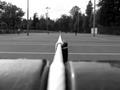
| 09/20/2005 09:12:57 PM |
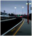
Platform 4 (the way home)by redmoonComment: Too much blur. If you were trying to depict motion, it is always a good idea to have some part of the image sharper. |
| Photographer found comment helpful. |
| 09/20/2005 09:11:38 PM |
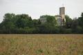
To be Accept Aboveby JEFFJSBComment: Colors need to be more contrasty and saturated. Also, it is best not to divide a composition in half, as was done here. A lower angle to get more of the field or higher to get more of the church might have kept that cut in half look away. |
| Photographer found comment helpful. |
| 09/20/2005 04:26:54 PM |
Then the Judgmentby M.O.C.Comment: It is too dark (at least on my moniter.) I think you could have taken a few of the spikes away when you used the star filter, too. Light needed a lot of adjustments. |
| Photographer found comment helpful. |
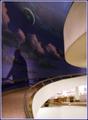
| 09/20/2005 04:25:09 PM |
Christ's Shadowby rjksteschComment: My favorite part of the photo was the upper right, with the beautiul cream white rounded object contrasting with the blue background. The lighting was lovely and subdued. Your sentiment was also lovely in your title. I thought it could have been clearer, though, and some of the noise could have been cleaned up in the white areas of the photo. |
| Photographer found comment helpful. |
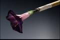
| 09/20/2005 04:20:55 PM |
Six Feet Underby soupComment: Such a paradox in this photo. I liked what you did with the combination. Just a little more focused and a little dodging around the purple petals would have added a few points to the score. |
| Photographer found comment helpful. |
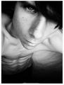
| 09/16/2005 08:20:58 AM |
The New Meby RegoComment: I was saddened by such a photo. I hope you are truly not serious about being the new you. As a photo for an article regarding the ravages of anorexia, this is so compelling. I feel it fits better into a photojournalism theme, not perspective. |
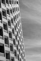
| 09/15/2005 04:21:44 PM |
A perspectiveby AntoninoComment: I like the image, but I would have liked to see it tilted diagonally when it was taken to show the way the windows form a nice pattern. Possibly even filling up more of the frame, or cropping it a little. |
| 09/15/2005 04:17:38 PM |
Playing with Perspectiveby tubamanComment: This could have been a really terrific image if the focus was better. Your dof was probably too shallow, and you needed to crop more of the left and right out to get a nice shot. I think that a portrait rotation would have also made the image better. |
| Photographer found comment helpful. |
Home -
Challenges -
Community -
League -
Photos -
Cameras -
Lenses -
Learn -
Help -
Terms of Use -
Privacy -
Top ^
DPChallenge, and website content and design, Copyright © 2001-2026 Challenging Technologies, LLC.
All digital photo copyrights belong to the photographers and may not be used without permission.
Current Server Time: 07/23/2026 02:05:45 PM EDT.