| Image |
Comment |
| 02/12/2006 06:12:55 PM |
|
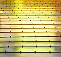
| 02/12/2006 06:10:30 PM |
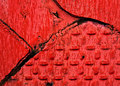
Goldby manic35Comment: Nice tones on this one. I love the yellow gold. Your capture of the pattern of dots was also quite good. The interest factor was what was lacking for me in this one. Well executed, technically correct, but I found it did not hold my interest. |
 Photographer found comment helpful. Photographer found comment helpful. |
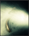
| 02/12/2006 06:08:39 PM |
The Wandererby KivetComment: I think the subject does not lend itself well to abstract. It is too defined and recognizable. |
| Photographer found comment helpful. |
| 02/12/2006 06:07:46 PM |
|
| 02/12/2006 06:07:22 PM |
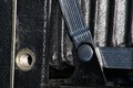
Kryptoniteby fas917Comment: The composition seems too loosely executed. Cropping out more of the left side to focus the eye on the play of tones and patterns on the right would have made a stronger image. |
| 02/12/2006 06:05:47 PM |
Kodak Momentsby nemesise1977Comment: Very well executed. Your focus is really clear and your exposure is also very good. Overall, the composition seemed lacking. There are two subjects of interest, the screw hole on the left and the tilted L on the right. Perhaps a better crop to get rid of one of the elements would have made a better abstract. I would say to crop out the left part of the image, and increase the amount of the right of the image to show more of the lines. |
| 02/12/2006 06:03:08 PM |
For Jby bobdaveantComment: Didn't think the subject created a great abstract. The soft focus on the right takes away from the entire image. |
| Photographer found comment helpful. |
| 02/12/2006 06:01:32 PM |
|
| Photographer found comment helpful. |
| 02/12/2006 06:00:24 PM |
|
| Photographer found comment helpful. |
| 02/12/2006 05:59:39 PM |
Billy Jeanby thorgilsComment: Needed to make the image more focused. The dull colors, though, would probably not have made much better an abstract. The subject didn't lend itself well to an abstract. |
Home -
Challenges -
Community -
League -
Photos -
Cameras -
Lenses -
Learn -
Help -
Terms of Use -
Privacy -
Top ^
DPChallenge, and website content and design, Copyright © 2001-2026 Challenging Technologies, LLC.
All digital photo copyrights belong to the photographers and may not be used without permission.
Current Server Time: 07/26/2026 05:58:51 AM EDT.