| Image |
Comment |
| 05/01/2006 07:15:26 AM |
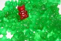
Victory !by ReM_FrComment: Need to reduce your grain. If you haven't got a noise reducing program there are a few that are free on the internet. I downloaded neat image which works okay, but others have programs they have purchased. Ask the question in the boards about it and you will get plenty of help on programs that are available. |
 Photographer found comment helpful. Photographer found comment helpful. |
| 05/01/2006 07:13:56 AM |
|
| Photographer found comment helpful. |
| 05/01/2006 07:12:25 AM |
Yellow/Purpleby jbsmithanaComment: Wonderful play of light and dark on the petals. you really get the sense of texture of the petals on this one. Very "touchable" photo. |
| Photographer found comment helpful. |
| 05/01/2006 07:11:29 AM |
|
| 05/01/2006 07:10:27 AM |
|
| 05/01/2006 07:09:45 AM |
Imposterby lkpackardComment: Very creative concept. Very out of focus, though, and I find the dropped paint may have been better if you used less on the white background. |
| Photographer found comment helpful. |
| 05/01/2006 07:07:26 AM |
|
| Photographer found comment helpful. |
| 05/01/2006 07:07:11 AM |
Break awayby scarbrdComment: Nice composition. Needs to be sharper, though your colors work well together. |
| Photographer found comment helpful. |
| 05/01/2006 07:06:14 AM |
Strawbby redmoonComment: Great detail. Your dof was used well also. Looks delicious. |
| Photographer found comment helpful. |
| 05/01/2006 07:00:58 AM |
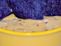
Queso con azulby shamrockComment: Not my cup of tea. Thought it was not the most pleasing image, though your detail was quite good overall. |
| Photographer found comment helpful. |
Home -
Challenges -
Community -
League -
Photos -
Cameras -
Lenses -
Learn -
Help -
Terms of Use -
Privacy -
Top ^
DPChallenge, and website content and design, Copyright © 2001-2026 Challenging Technologies, LLC.
All digital photo copyrights belong to the photographers and may not be used without permission.
Current Server Time: 07/26/2026 05:39:28 PM EDT.