| Image |
Comment |
| 08/21/2006 07:01:43 AM |
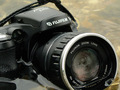
Camera and Water Do Not mix!by sandabellaComment: Okay, so why did you wreck a camera? Image is really clear, and your water is very well defined with lots of tonal quality, but why did you wreck the camera? It hurts to look at this picture. |
 Photographer found comment helpful. Photographer found comment helpful. |
| 08/09/2006 12:12:11 PM |
|
| Photographer found comment helpful. |
| 08/02/2006 10:36:55 AM |
evening blue[s]by yianisnComment: I was curious when you posted to the Sony Alpha thread about using the camera for this challenge. I am in the market to get one of these cameras, and the last thing to sell me on it is the images that are produced with it.
Your color is wonderful on this one, but I would like to see better focus. The fact that you used iso 400 gives me a good idea of noise with this camera. I don't see any discernable noise, and given the exposure of the bridge, that is a good thing. I do like the image, but I agree with the comments that the lower left is distracting, and I would have liked to see more of the bridge if possible. Could you clone out the spire on the left? |
| 08/02/2006 10:24:45 AM |
Clean and Sober after Supperby albc28Comment: As promised in the black in white thread last week, I said I would make a comment if I did not during the challenge. You did a well composed shot, but I think that the material may have kept your score down. I am sorry to say I gave this one a 4, only because I did comparisons to other shots and felt this one left a bit to be desired.
Your detail on the washcloth is very good, and your exposure seems just fine. It is a bit soft in focus, though, and the color did not depict black and white very well. The best part of the black and white idea is actually the background. As to the image itself, the color balance appears to be too green, which made the cloth and dish look a bit grimy. |
| Photographer found comment helpful. |
| 08/01/2006 01:10:17 PM |
|
| Photographer found comment helpful. |
| 08/01/2006 01:04:10 PM |
Lost in wordsby fantacComment: I like the concept, but the background newspapers make this image look very messy. They are distracting, and I think they add overkill to an otherwise wonderful shot. Simplify, and you will have a much better image. |
| 08/01/2006 01:00:45 PM |
Mists of Timeby FalcComment: Lovely tonal quality on this one. It is very pleasing to the eye, and the varying grays make this image. |
| Photographer found comment helpful. |
| 07/31/2006 09:51:56 PM |
|
| Photographer found comment helpful. |
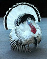
| 07/31/2006 09:50:34 PM |
Eat Beefby notbiscuitComment: So funny. Yeh, save the turkeys. This is a beautiful bird. Very nice shot. I didn't know that there were turkeys with such beautiful markings. |
| Photographer found comment helpful. |
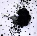
| 07/31/2006 09:24:32 PM |
Once upon a time... by Jaded_HousewifeComment: This is really awesome. Very creative. The only thing I might change is the placement of the subject. Less centered, leaving the middle of the image as just spots, might make for a stronger composition. 8 |
| Photographer found comment helpful. |
Home -
Challenges -
Community -
League -
Photos -
Cameras -
Lenses -
Learn -
Help -
Terms of Use -
Privacy -
Top ^
DPChallenge, and website content and design, Copyright © 2001-2026 Challenging Technologies, LLC.
All digital photo copyrights belong to the photographers and may not be used without permission.
Current Server Time: 05/20/2026 08:35:48 AM EDT.


![evening blue[s]](https://images.dpchallenge.com/images_challenge/0-999/528/120/Copyrighted_Image_Reuse_Prohibited_369407.jpg)