| Image |
Comment |
| 10/06/2006 06:55:32 AM |
Michael 18by DrKDBComment: Very good tonal quality and the detail of the skin on the neck is really fabulous. I don't care for the pose, though. NOt sure how to get the best of the subject on this one. I think for this subject, more relaxed would work. I am thinking the arms might be better not so stretched over the head. It looks uncomfortable. I see in his face a bit of a rebelious burning. That hard look could be used to your advantage. |
| 10/03/2006 06:15:39 AM |
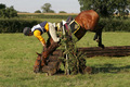
The Fallby longshipsComment: I hope the horse is alright. That looked like a nasty fall. It hurts to look at it. |
| 10/03/2006 06:14:52 AM |
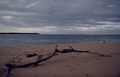
There's a Storm a Brewin'by Mr_BondComment: Love the mood of the dark sky. It would have been great if the lighting on the branch was better, to make it stand out almost in relief against the dark background. |
 Photographer found comment helpful. Photographer found comment helpful. |
| 10/02/2006 07:23:26 AM |
|
| Photographer found comment helpful. |
| 10/02/2006 07:21:21 AM |
|
| 10/02/2006 07:19:05 AM |
Blue jeansby alpharichComment: You are getting better. Higher score than the last one. Great show of fabric grain on this one, and the color is right on. |
| Photographer found comment helpful. |
| 10/02/2006 07:04:55 AM |
Awakeningby ElaineComment: Love the smooth milky look. Composition is well placed too. Very nice appealing flower shot. |
| Photographer found comment helpful. |
| 10/01/2006 07:32:50 PM |
joyby sigrun_thComment: Hee Haw. Love the black clothes against the pastel sky. |
| Photographer found comment helpful. |
| 10/01/2006 06:40:09 PM |
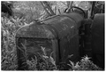
Retired and Rustedby JEFFJSBComment: All your tones on the background came out very nice. The tractor came out a bit muddy, though. Perhaps more use of curves or tone mapping would have given it more contrast and detail. |
| Photographer found comment helpful. |
| 10/01/2006 06:23:25 PM |
|
| Photographer found comment helpful. |
Home -
Challenges -
Community -
League -
Photos -
Cameras -
Lenses -
Learn -
Help -
Terms of Use -
Privacy -
Top ^
DPChallenge, and website content and design, Copyright © 2001-2026 Challenging Technologies, LLC.
All digital photo copyrights belong to the photographers and may not be used without permission.
Current Server Time: 07/28/2026 10:56:50 AM EDT.