| Image |
Comment |
| 10/06/2006 07:27:04 AM |
Sunset in Country Victoriaby mandypComment: I really think there is too much sky on this one. When you have this much sky, it works best if there is a lot of varying tones and cloudy detail. Plain as it is, it causes the photo to appear very uninteresting. |
 Photographer found comment helpful. Photographer found comment helpful. |
| 10/06/2006 07:14:15 AM |
Mellow Yellow!!by wingyisleedsComment: I like the way you left the flowers yellow against the b&w background. However, they do appear extremely grainy. The background could have just a bit more contrast as well. It suffers from too much midtone and not enough highlights and darks. |
| Photographer found comment helpful. |
| 10/06/2006 07:12:58 AM |
Stupid Human Tricksby lynnesiteComment: Perfect print stock on this one. I can definitely see this image as a poster with some kicky quote on it. Very nicely done. |
| Photographer found comment helpful. |
| 10/06/2006 07:11:10 AM |
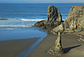
Smooth and Raggedby talmyComment: I love the contrast of the smooth sand against the jagged rocks. Your title definitely supports what you were trying to convey with this image. |
| Photographer found comment helpful. |
| 10/06/2006 07:07:03 AM |
The Brideby oOWonderBreadOoComment: I think that the image would have placed it as a bride if the dress was much more in focus. It is important when you choose a direction for the viewer, that the image supports it. It was more important to show a clear dress detail, and this image didn't do that. |
| Photographer found comment helpful. |
| 10/06/2006 07:04:08 AM |
|
| Photographer found comment helpful. |
| 10/06/2006 07:03:42 AM |
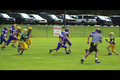
One Man to Beatby RockBruiseComment: Wow, what saturation on this one. Nice stop action. The black border on the top and botton seems to distract the eye from the image, though. |
| Photographer found comment helpful. |
| 10/06/2006 07:02:36 AM |
|
| Photographer found comment helpful. |
| 10/06/2006 07:01:03 AM |
Jimmy Wields the Torchby NikonJebComment: Interesting post processing on this one. It creates a very graphic tone to the image. Very good as a clip in graphics programs for people working, but as an image on dp, I think it will suffer badly in the scoring. |
| Photographer found comment helpful. |
| 10/06/2006 06:59:08 AM |
Sunsetby dwterryComment: I think you may have adjusted contrast too much on this one. It really made the sun and trail on the water way overexposed. If you have a way of extracting that portion of it while adjusting the brightness and contrast of the rest of the image, it might have made a better, less glary image. Your rock detail is very clear and well lit, but the rest of the image doesn't really support the rocks. |
| Photographer found comment helpful. |
Home -
Challenges -
Community -
League -
Photos -
Cameras -
Lenses -
Learn -
Help -
Terms of Use -
Privacy -
Top ^
DPChallenge, and website content and design, Copyright © 2001-2026 Challenging Technologies, LLC.
All digital photo copyrights belong to the photographers and may not be used without permission.
Current Server Time: 07/28/2026 12:07:12 PM EDT.