| Image |
Comment |
| 10/06/2006 08:53:03 AM |
|
 Photographer found comment helpful. Photographer found comment helpful. |
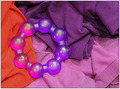
| 10/06/2006 08:46:11 AM |
Laundry Basketby Bear_MusicComment: I like the orange contrast on this one. It made an interesting reflection in the plastic beads. The overall effect is lacking in contrast, though. The orange gave it some zip, but not enough. |
| Photographer found comment helpful. |
| 10/06/2006 07:33:27 AM |
|
| Photographer found comment helpful. |
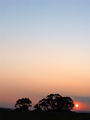
| 10/06/2006 07:27:04 AM |
Sunset in Country Victoriaby mandypComment: I really think there is too much sky on this one. When you have this much sky, it works best if there is a lot of varying tones and cloudy detail. Plain as it is, it causes the photo to appear very uninteresting. |
| Photographer found comment helpful. |
| 10/06/2006 07:14:15 AM |
Mellow Yellow!!by wingyisleedsComment: I like the way you left the flowers yellow against the b&w background. However, they do appear extremely grainy. The background could have just a bit more contrast as well. It suffers from too much midtone and not enough highlights and darks. |
| Photographer found comment helpful. |
| 10/06/2006 07:12:58 AM |
Stupid Human Tricksby lynnesiteComment: Perfect print stock on this one. I can definitely see this image as a poster with some kicky quote on it. Very nicely done. |
| Photographer found comment helpful. |
| 10/06/2006 07:11:10 AM |
Smooth and Raggedby talmyComment: I love the contrast of the smooth sand against the jagged rocks. Your title definitely supports what you were trying to convey with this image. |
| Photographer found comment helpful. |
| 10/06/2006 07:07:03 AM |
The Brideby oOWonderBreadOoComment: I think that the image would have placed it as a bride if the dress was much more in focus. It is important when you choose a direction for the viewer, that the image supports it. It was more important to show a clear dress detail, and this image didn't do that. |
| Photographer found comment helpful. |
| 10/06/2006 07:04:08 AM |
|
| Photographer found comment helpful. |
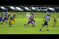
| 10/06/2006 07:03:42 AM |
One Man to Beatby RockBruiseComment: Wow, what saturation on this one. Nice stop action. The black border on the top and botton seems to distract the eye from the image, though. |
| Photographer found comment helpful. |
Home -
Challenges -
Community -
League -
Photos -
Cameras -
Lenses -
Learn -
Help -
Terms of Use -
Privacy -
Top ^
DPChallenge, and website content and design, Copyright © 2001-2026 Challenging Technologies, LLC.
All digital photo copyrights belong to the photographers and may not be used without permission.
Current Server Time: 07/28/2026 06:05:00 AM EDT.