| Image |
Comment |
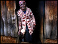
| 10/12/2006 03:51:53 PM |
Kenyan Great Grandmotherby hotpastaComment: Full of personality. I love the pattern on her sweater. It contrast wonderfully with the aged barnwood. You probably picked the best one for your Best of 2002. Still, I think this one would have done pretty well, too. |
 Photographer found comment helpful. Photographer found comment helpful. |
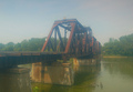
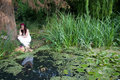
| 10/12/2006 03:42:33 PM |
Into the pastby bmartuchComment: Looks like you used a fog filter on this one. I know that telltale cast it leaves, because I use one all the time. I think that it could have had a bit more color correction to brighten it a little, and just a slight contrast adjustment. Not enough to take away the soft focus, but enough to give it a bit more zip. I will share with you, though, that generally the folks at dp really tear apart images taken with a fogmaker filter. They honestly don't like them. Even so, you did much better with your score than I did for my soft focus. |
| Photographer found comment helpful. |
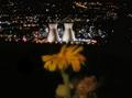
| 10/12/2006 03:39:28 PM |
Brightby bmartuchComment: I love the green contrasting background with the bright red orange of the flower. I think the dof is just fine. The only thing that might make the image stronger is if the flower is not so centered. Alot of times I will also tilt the camera in such a way that the stem or a leaf is coming in from the corner to lead the eye to the subject of the flower. You really did a great job on the color balance on this one. Got the color nearly perfect for the type of flower it is. |
| Photographer found comment helpful. |
| 10/11/2006 02:50:48 PM |
|
| Photographer found comment helpful. |
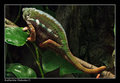
| 10/11/2006 09:48:38 AM |
chameleonby ArpeggioAngelComment: Love the greens on this one. I think the border really frames the image well. Your leaf texture is so smooth. Looks very lush. |
| Photographer found comment helpful. |
| 10/09/2006 08:49:46 PM |
Industrial Flowerby s4nd3r99Comment: Interesting idea. I definitely love the lighting of the industrial aspect of the image. Not sure I like the use of the flower, though it seems to have something important to say with this combination. |
| Photographer found comment helpful. |
| 10/09/2006 08:47:46 PM |
Urban Bird Lifeby s4nd3r99Comment: This is a really wonderful abstract. Did you use negative image in your post processing? I love the white silhouette of the flying bird. Nicely composed and just a delightful image. The only thing I would change is the style. I think it might have more impact if it was done in landscape style rather than portrait. More dramatic that way and gives the bird more room to fly. |
| Photographer found comment helpful. |
| 10/09/2006 08:45:06 PM |
|
| Photographer found comment helpful. |
| 10/09/2006 08:44:14 PM |
Fishermenby s4nd3r99Comment: What a beautiful image. It is so much a statement of the early rising that goes on when you fish. This photo would be great if you could take it again for the morning challenge. Hmm, gives me an idea. |
| Photographer found comment helpful. |
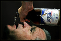
| 10/09/2006 08:22:06 PM |
Bush Beer: Less Taste, More Fillingby muur88Comment: I cracked up on this one. Oh my God, what a great job you did. Don't know how great an ad it makes, but it is definitely very politically charged, and I love it. |
| Photographer found comment helpful. |
Home -
Challenges -
Community -
League -
Photos -
Cameras -
Lenses -
Learn -
Help -
Terms of Use -
Privacy -
Top ^
DPChallenge, and website content and design, Copyright © 2001-2026 Challenging Technologies, LLC.
All digital photo copyrights belong to the photographers and may not be used without permission.
Current Server Time: 07/28/2026 04:49:30 AM EDT.