| Image |
Comment |
| 11/13/2006 10:28:30 AM |
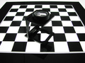
Study in Black and Lightby GeneralEComment: Very snappy and contrasty, but the subject in the middle seems kind of off. I don't know what it is and I think that something else might have worked better. As a sharp image you get high marks, but not enough midtones to make this a great black and white, and subject is uninteresting. |
 Photographer found comment helpful. Photographer found comment helpful. |
| 11/13/2006 10:17:56 AM |
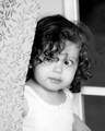
Peek-A-Booby twm122Comment: What a sweet image. Love the curl around the eye. You capture the innocence of childhood with this one. |
| Photographer found comment helpful. |
| 11/13/2006 10:16:10 AM |
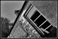
A Simple Doorby BrookiedComment: Subject doesn't do much for me. I know you were trying to make it have some interest by angling it oddly, but it still doesn't seem all that interesting.
If textures were the key to this image, I think a cleaner image would be better. |
| Photographer found comment helpful. |
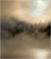
| 11/13/2006 10:13:25 AM |
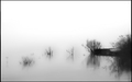
Novemberby notesinstonesComment: I really love what you tried to do here. The minimalist landscape is wonderful. The image seems very rough and very pixelated, though, where the dark detail is. Kind of wrecked what could have been a beautiful photo. Not sure why it did this. Did you have a tele zoom on when you took it? Sometimes the higher zooms make it really rough when you get the picture back. Without the pixelization I would have given this one an 8. I will give it a 6 for its beauty and simplicity. |
| Photographer found comment helpful. |
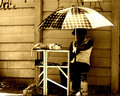
| 11/07/2006 06:24:17 AM |
Miseryby GinaRothfelsComment: Very nice composition. This would have been really great if there had been more highlight on the person. The grain treatment really works on this, and I like the black and white with the brownish toning. |
| Photographer found comment helpful. |
| 11/06/2006 08:29:27 PM |
|
| Photographer found comment helpful. |
| 11/04/2006 08:18:47 AM |
|
| Photographer found comment helpful. |
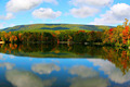
| 11/04/2006 08:18:05 AM |
Changing of Seasonsby rebelgirlComment: Found the image lacked punch. I think it is the color balance that bothers me, but it also seems to be an uninteresting landscape. Clouds seem a bit painted looking. Perhaps it is the cyan balance that was used, or maybe a noise reducer was applied to make it look a bit unreal. You have a decent eye, but this particular image does not do much for me. |
| Photographer found comment helpful. |
| 11/02/2006 07:25:15 PM |
Petropavlovsky Reflectionby AzrifelComment: Very cool affect. It looks like frost on a window with the church framed by it. Love the entire composition. It is artistic and post processing is also well done. |
| Photographer found comment helpful. |
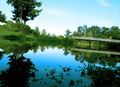
| 11/02/2006 07:24:02 PM |
The Bridgeby bcobleComment: I think if the tilt of the camera was something you wanted to do, it didn't really work well as a photo. It is so tilted that it appears you wished it to be that way. Anyway, I think straighter would be better, though your saturation and processing looks good. |
| Photographer found comment helpful. |
Home -
Challenges -
Community -
League -
Photos -
Cameras -
Lenses -
Learn -
Help -
Terms of Use -
Privacy -
Top ^
DPChallenge, and website content and design, Copyright © 2001-2026 Challenging Technologies, LLC.
All digital photo copyrights belong to the photographers and may not be used without permission.
Current Server Time: 07/28/2026 01:54:38 AM EDT.