| Image |
Comment |
| 10/04/2005 01:22:02 AM |
|
 Photographer found comment helpful. Photographer found comment helpful. |
| 10/03/2005 03:33:57 PM |
|
| Photographer found comment helpful. |
| 09/30/2005 11:55:27 PM |
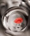
Birthdayby karmatComment: Pretty colors, but are those marbles or pieces of colored glass? They don't look like they'd be good to bite into. |
| Photographer found comment helpful. |
| 09/30/2005 11:53:50 PM |
Friendshipby twm122Comment: I think the pink tone is going a bit too far. This would have been fine in plain B&W. Good picture which depicts the thought. |
| 09/30/2005 11:52:24 PM |
|
| Photographer found comment helpful. |
| 09/30/2005 11:44:36 PM |
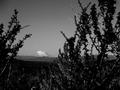
Inspirationalby ZoomdakComment: Good idea, but I really dn't like the out of focus shrubbery in the foreground. |
| Photographer found comment helpful. |
| 09/30/2005 11:43:06 PM |
|
| Photographer found comment helpful. |
| 09/30/2005 11:42:46 PM |
Anniversaryby smilebig4me1xComment: I think this would have been better with another color background. I'd get rid of the pink border. It doesn't need it. |
| Photographer found comment helpful. |
| 09/30/2005 11:41:32 PM |
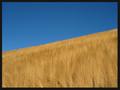
Memorial dayby jonasvalComment: Not what I usually associate with Memorial Day, but a beautiful picture. |
| 09/30/2005 11:41:01 PM |
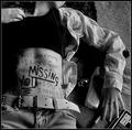
Miss Youby annahComment: This is a great b&w picture, but I'm not sure what I would think if I got this in the mail. |
| Photographer found comment helpful. |
Home -
Challenges -
Community -
League -
Photos -
Cameras -
Lenses -
Learn -
Help -
Terms of Use -
Privacy -
Top ^
DPChallenge, and website content and design, Copyright © 2001-2026 Challenging Technologies, LLC.
All digital photo copyrights belong to the photographers and may not be used without permission.
Current Server Time: 06/18/2026 09:39:38 PM EDT.