| Image |
Comment |
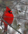
| 12/31/2005 09:04:57 PM |
IMG_3662.jpgby Rando D300Comment: I really love the color on this guy. I've got mixed feelings about the blurry branch across his chest, but overall I think this is a neat picture. Thanks. |
 Photographer found comment helpful. Photographer found comment helpful. |
| 12/31/2005 02:27:02 PM |
IMG_0018.jpgby ApertureComment: I really like your perspective -- the way the buildings come down the hill. I think you went a little overboard with the blur on the lighthouse and the main building. My eyes don't like it. 8( Other than that, you have captured the feeling of a sunny day at the shore. I like it. |
| Photographer found comment helpful. |
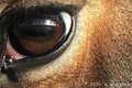
| 12/30/2005 11:04:02 AM |
Horseby polkopComment: I'd like to see the entire lid surrounding the eye. You've cut off something on the left. I'm turning into the cropping Nazi. Neat picture |
| Photographer found comment helpful. |
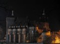
| 12/30/2005 09:30:28 AM |
Vajdahunyad Castleby gazdiComment: It looks to me as if everything is tilting to the right. If you have a program that corrects perspective, you might try using that. Personally, I'd crop out the light part at the lower right, and I'd try to dodge in some detail on the roof.
This is a nice, moody picture. You're off to a good start. |
| Photographer found comment helpful. |
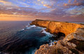
| 12/30/2005 09:24:41 AM |
Sheringa Cliffsby John WhiteComment: Wow! What depth of field!! Love the colors. Great "new" take on "the lonely sea and the sky". |
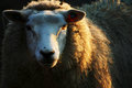
| 12/29/2005 08:52:09 PM |
Eweby MudHutComment: Great light in the fur and eye. |
| Photographer found comment helpful. |
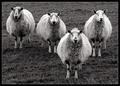
| 12/29/2005 03:19:40 PM |
Four of a Kind by KonadorComment: In a parallel life, I'm a hand spinner. Therefore, I love pictures of sheep. This is great. 8) |
| Photographer found comment helpful. |
| 12/29/2005 11:19:42 AM |
|
| Photographer found comment helpful. |
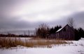
| 12/29/2005 09:57:48 AM |
Barn@Merrickville_1 (Small).JPGby RayEthierComment: Brrrr. I'm cold just looking at this picture. This is just me, but I might try dodging the trees around the barn a little to give some definition. They are kind of black. 8) That's a minor quibble. I really like this picture. |
| Photographer found comment helpful. |
| 12/29/2005 02:18:15 AM |
Antigua1by GBrummettComment: Nice and moody. For purposes of viewing it on a monitor, I might cut some of the bottom off. I had to scroll to see the whole picture. That's just me. It's a great picture. |
| Photographer found comment helpful. |
Home -
Challenges -
Community -
League -
Photos -
Cameras -
Lenses -
Learn -
Help -
Terms of Use -
Privacy -
Top ^
DPChallenge, and website content and design, Copyright © 2001-2026 Challenging Technologies, LLC.
All digital photo copyrights belong to the photographers and may not be used without permission.
Current Server Time: 06/20/2026 02:52:03 AM EDT.