| Image |
Comment |
| 01/31/2006 02:05:01 AM |
|
 Photographer found comment helpful. Photographer found comment helpful. |
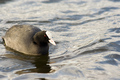
| 01/31/2006 02:03:53 AM |
Joyby jsolsonaComment: Yes, the subject is off-center, but I can't see that being off-center enhances the subject. It just looks contrived. |
| 01/30/2006 09:54:50 PM |
Roadside Beautyby Baron152Comment: I think you could have more impact and still have your subject off-center if you chopped off a lot of the top. |
| Photographer found comment helpful. |
| 01/30/2006 09:36:31 PM |
Me and Maggieby Rae-AnnComment: Good shot of both of you. You look like my kind of people! 8) I might clone out that green thingy at the far right. |
| Photographer found comment helpful. |
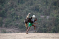
| 01/30/2006 09:33:47 PM |
Soccer in Kenyaby hotpastaComment: GReat stop-action. It reminds me of some of the pick-up games we used to see in Brasil. The kid without shoes reminds me of the young Pele. |
| Photographer found comment helpful. |
| 01/30/2006 10:06:51 AM |
|
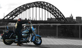
| 01/30/2006 10:04:44 AM |
Bikerby fredandaudComment: Need to make the buy and his bike stand out more from the background. Not sure that this was a good choice for selective de-sat. |
| 01/30/2006 10:04:00 AM |
|
| Photographer found comment helpful. |
| 01/30/2006 10:02:04 AM |
loose cannonby melodeeComment: I wish you hadn't cut off the top of his head. Could use some more light on his face. |
| Photographer found comment helpful. |
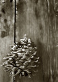
| 01/30/2006 10:00:36 AM |
Board and coneby BrennanOBComment: I don't think the vertical orientation helps this picture. I'd go with a square-ish format. Good use of monochrome. |
| Photographer found comment helpful. |
Home -
Challenges -
Community -
League -
Photos -
Cameras -
Lenses -
Learn -
Help -
Terms of Use -
Privacy -
Top ^
DPChallenge, and website content and design, Copyright © 2001-2026 Challenging Technologies, LLC.
All digital photo copyrights belong to the photographers and may not be used without permission.
Current Server Time: 06/21/2026 03:17:10 AM EDT.