| Image |
Comment |
| 01/27/2007 04:20:50 PM |
|
 Photographer found comment helpful. Photographer found comment helpful. |
| 01/27/2007 04:19:34 PM |
Twigsby kawesttexComment: Good idea, but the portrait orientation is very awkward. To my eye, there's too much space at the top. |
| Photographer found comment helpful. |
| 01/27/2007 04:16:21 PM |
SandScapeby wildirisComment: Good idea, but the whole picture needs more contrast and needs to be sharper. |
| Photographer found comment helpful. |
| 01/27/2007 04:09:49 PM |
Barnby Elvis_LComment: This is just me, but there's too much stuff at the bottom to be a really minimalist composition. Also, the portrait orientation feels very awkward. |
| Photographer found comment helpful. |
| 01/27/2007 04:07:05 PM |
Cherry Ripeby xianartComment: This definitely meets the challenge criteria, but that branch is awkwardly placed. |
| Photographer found comment helpful. |
| 01/27/2007 03:56:04 AM |
|
| 01/27/2007 03:49:02 AM |
|
| Photographer found comment helpful. |
| 01/26/2007 09:16:08 PM |
Unicycling in the Snowby waydeComment: This seems to be one of those love it or hate it shots. I'm firmly in the "love it" camp. To me, it's the perfect combination of art and the absurd. Keep up the good work. |
| 01/26/2007 11:29:47 AM |
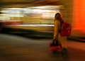
Redby MelethiaComment: Great stuff!!!! Who says things have to be "tack sharp"!!!!!! |
| Photographer found comment helpful. |
| 01/26/2007 09:40:20 AM |
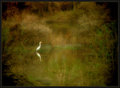
Seclusionby sherComment: OOOOh. I want to take pictures like this when I grow up! I love the contrast of the white heron against the green/gold background. His reflection in the water is an extra treat. |
| Photographer found comment helpful. |
Home -
Challenges -
Community -
League -
Photos -
Cameras -
Lenses -
Learn -
Help -
Terms of Use -
Privacy -
Top ^
DPChallenge, and website content and design, Copyright © 2001-2026 Challenging Technologies, LLC.
All digital photo copyrights belong to the photographers and may not be used without permission.
Current Server Time: 06/26/2026 12:59:36 PM EDT.