| Image |
Comment |
| 04/01/2005 06:10:59 AM |
Tribute to 'Creation of Adam'by SimonkasprzakComment: Maybe not enough "beginning" without the title [EDIT: me being slow: nice replica of Michelangelo's ceiling pattern! Good idea, shame about the v slight blur.] Maybe a bit of an angle would have made this more interesting - god (if that is the intention) from the top left and Adam from the bottom right (adding a signifier). |
 Photographer found comment helpful. Photographer found comment helpful. |
| 03/31/2005 07:21:38 PM |
Nighthawkby MatthewComment: thanks - should have been, of course, a 1/6 second exposure. |
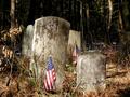
| 03/31/2005 06:40:21 PM |
Still rememberedby dragonladyComment: Have said on a couple of other flag images that "Without wishing to offend, the patriotic call implicit in the flag may switch off some non-US voters - very slightly cheapens the image for me as it feels as though the symbol is being used to evoke an emotive response that the picture would not otherwise demand." Not sure about this one - the flags do add the interest. My response would vary depending on whether I knew the flags were there before you took the shot, or whether you added them for interest (the latter would make me feel that the image was "hollow").
Nice use of light and shadow, though. good colouration.
EDIT: Glad to hear by PM that my cynical thoughts are unfounded (hope no offence caused!). Flags add the needed interest point.
|
| Photographer found comment helpful. |
| 03/31/2005 06:15:51 PM |
|
| Photographer found comment helpful. |
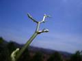
| 03/31/2005 12:36:17 PM |
Sprouting Aheadby shazlinComment: you have 640 pixels to use (though interesting looking image) - needs to be bigger |
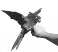
| 03/31/2005 12:35:27 PM |
Takeoff: The Beginning of a Journeyby CatbirdComment: Great pic. Love the wing blur. Clever that you managed to get the background totally white. Would colour have added something with a parrot? Maybe not enough "beginning" without the title. |
| Photographer found comment helpful. |
| 03/31/2005 12:34:21 PM |
|
| Photographer found comment helpful. |
| 03/31/2005 12:33:42 PM |
|
| Photographer found comment helpful. |
| 03/31/2005 12:32:22 PM |
|
| Photographer found comment helpful. |
| 03/31/2005 12:31:49 PM |
Webster Started Hereby sfboatrightComment: Good, relevant image. Good choice of dictionary letter "A". cannot decide whether I liek the print showing through from the reverse of the page - possibly not. |
| Photographer found comment helpful. |
Home -
Challenges -
Community -
League -
Photos -
Cameras -
Lenses -
Learn -
Help -
Terms of Use -
Privacy -
Top ^
DPChallenge, and website content and design, Copyright © 2001-2026 Challenging Technologies, LLC.
All digital photo copyrights belong to the photographers and may not be used without permission.
Current Server Time: 07/16/2026 05:38:37 PM EDT.