| Image |
Comment |
| 04/01/2005 06:37:55 AM |
Let Them Eat Cakeby TuckersmomComment: nice excution of good idea. Like the lighting and composition. Like the negative space in bottom left. Great colouration. |
 Photographer found comment helpful. Photographer found comment helpful. |
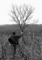
| 04/01/2005 06:36:31 AM |
In the beginning of wineyard risingby ajacoubComment: like the composition and model. good use of b&w - all shades represented, focus on the figure. slight blurring in the tree branches? Perhaps an effect of the resizing. Very nice, if not amazingly exciting image. |
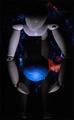
| 04/01/2005 06:34:44 AM |
The Whole Worldby RebAlComment: nice idea - well executed! Lighting looks a bit strong in blue/white tones to me, as the colour in the figurine looks fractionally washed out on my monitor. The shodow from the globe is distracting on the figure - maybe some secondary lighting required, or the main lighting slightly less head on? |
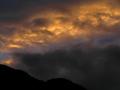
| 04/01/2005 06:32:11 AM |
Twilight Begins at Sunsetby riversongComment: gorgeous chiaroscuro. Like the hills and the good focus, coour and tonality. Lacking a bit in "x" factor - great, but maybe needs something more as a focus point to move to the next level. |
| Photographer found comment helpful. |
| 04/01/2005 06:27:30 AM |
in the beginning there was ... only the two of usby anotherdayComment: Nice idea - but hard to carry off and make link with the theme very strong. Central figures are lacking a bit in contrast. The image seems to be on a tilt - LHS down, which is a little disconcerting. Background house is in sharp focus and distracting. |
| Photographer found comment helpful. |
| 04/01/2005 06:26:02 AM |
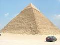
In the begining of the Egyptian historyby hossamComment: Great subject and link to the challenge. I have many photos of this pyramid (proposed to my fiancee in front of it).
The car really detracts from the scale - I know that pramid is huge, and a person on the lower tier stands would stand only a block and a half high. And you have some distracting tourists walking out of frame on the LHS. Might have been more impressive with a person or two near to the base, to show scale, rather than the car (which is not very "beginning"-y). Also, when the sun is coming around the pyramid, there is a great moment when the light is touching the tips of the stones leaving long shadows - gives a great sense of depth (you have got the sun behind you, I think). Combine this with slight underexposure and you can get the sky a deep blue and the pyramid full of contrast and looking huge! Also, there is a causeway from the sphinx to it on the other side - that makes for an interesting foreground. |
| Photographer found comment helpful. |
| 04/01/2005 06:19:47 AM |
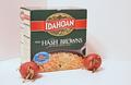
I Want to Be An Idahoan Hash Brown "When I Grow Up"by SamTComment: Idea is captured well - though not the most aesthetically pleasing subject matter in the world! Did you know that potatoes are part of the deadly nightshade family and the green-ness of a potato indicates the level of deadly toxins? Those potatoes look like they are growing and will be pretty untasty (and poisonous)!
Quite a bit of white space in the frame that could be eliminated. Focus could be brought onto the potatoes by bringing them into the foregroundand have the box as a background element (currently all in the mid-ground). Your studio set-up is showing a distracting crack on the LHS. And your prop box is showing signs of wear - only relevant because this looks a bit like like a commercial prodiuct shoot, which we are used to seeing as perfect (might be an interesting idea to make this as "imperfect" as possible in a commercial style - those potatoes are nearly there...!) |
| Photographer found comment helpful. |
| 04/01/2005 06:14:38 AM |
|
| Photographer found comment helpful. |
| 04/01/2005 06:13:26 AM |
There was chaos.by toadtheprinceComment: Nice idea - like the composition. Very slight blurriness in the bit that I think is supposedto be in focus (maybe fixable by sharpening). |
| Photographer found comment helpful. |
| 04/01/2005 06:12:20 AM |
Creationby taterbugComment: clever effect and a bold image. contrast is very high inthe hands, and highlights seem a bit strong on my monitor. Like the shot and execution, however. |
| Photographer found comment helpful. |
Home -
Challenges -
Community -
League -
Photos -
Cameras -
Lenses -
Learn -
Help -
Terms of Use -
Privacy -
Top ^
DPChallenge, and website content and design, Copyright © 2001-2026 Challenging Technologies, LLC.
All digital photo copyrights belong to the photographers and may not be used without permission.
Current Server Time: 07/16/2026 10:47:49 PM EDT.