| Image |
Comment |
| 04/13/2005 07:17:26 PM |
This place is a real zooby jjbeguinComment: This reminds me of HL2 (Ravenholm)...
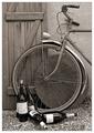
Love the image, though impact does depend in part, for me, on the title. I like the bottles - they add interest without being too dominating. Could live without border (did not add or detract from my vote, I think). |
 Photographer found comment helpful. Photographer found comment helpful. |
| 04/13/2005 07:14:10 PM |
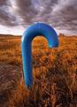
rby bruskiComment: Nick - I thought that this pic was going to beat mine for sure...! Love the colour contrast, and the sky looks amazing - esp since basic editing and no dodge/burn. The "r" is as bold as they come. No excuse for "1"s. Huge depth and great image. |
| Photographer found comment helpful. |
| 04/13/2005 07:09:59 PM |
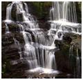
"V"by TallblokeComment: Congrats on top ten. This was not a pic that I had rated on first glance (shows what I know!) - but grows on me with reflection. Feels slightly off balance (about 3 degrees CW rotate required to even out water flow in top RHS). High contrast important for the "V", but maybe slightly too strong for the pretty picture effect.
Personally, I almost always vote a border slightly down unless it works really well (in which case no conscious improvement or deduction to my vote) - I like to judge the image and the 1 pixel black border is usually enough for me. Think that there are more voters like me - not sure if we outvote the border-lovers or not...! |
| Photographer found comment helpful. |
| 04/13/2005 07:01:24 PM |
The letter Lby trainComment: Love the detail in this "L". Congrats on finish.
Only criticism is slight over-sharpening for my taste (though I over sharpen my own images now for DPC, given the criticism applied to "soft" images). |
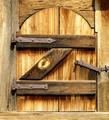
| 04/13/2005 06:58:55 PM |
Kby paynekjComment: Scored this highly, even though I did not see the "K" until after voting had closed. The "K" is worth looking for here - a deeper, more rewarding picture than many on this front (as well as technically excellent).
Why is it 550 high, and not 640 high??? Waste of 90 pixels of detail vertically, amounting to about 1500 pixels in total, that could have made a significant difference! |
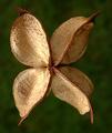
| 04/13/2005 06:54:49 PM |
Zby AlbireoComment: Great use of texture, Gyorgy. There is a feeling of new and old here, as well as the "Z". Lack of precision in the letter only makes this feel more real. Very slight softness in bolts (though any change might result in over-sharpness in remainder of image, I know).
PS the catch looks a bit broken...! ;) |
| Photographer found comment helpful. |
| 04/13/2005 06:50:44 PM |
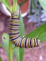
yby glodaComment: Detail in the leaf is unbelievable - amazing for that. "y" was, as you say, confused by the legs etc. However, outside the challenge, a great shot (and a good one even within!). congrats. |
| Photographer found comment helpful. |
| 04/13/2005 06:48:26 PM |
B...raby carodaniComment: Great photo - I like this shot - you must have bought black flooring especially... ! Only distractions were very shallow DoF, affecting top bra and bra strap area. Not that imperfections should matter in scoring too much (I am going to be more broadly minded on this front in the future)
Otherwise, a perfect B!! |
| Photographer found comment helpful. |
| 04/13/2005 06:43:53 PM |
Hi Everybody!by vasilkovayaComment: Olga, I thought this was an inspired capture - great light and simplicity. Understand the composition entirely. All you needed was a cloud above the second tower to provide the dot... great pic. |
| Photographer found comment helpful. |
| 04/13/2005 06:10:14 PM |
|
| Photographer found comment helpful. |
Home -
Challenges -
Community -
League -
Photos -
Cameras -
Lenses -
Learn -
Help -
Terms of Use -
Privacy -
Top ^
DPChallenge, and website content and design, Copyright © 2001-2026 Challenging Technologies, LLC.
All digital photo copyrights belong to the photographers and may not be used without permission.
Current Server Time: 07/17/2026 05:53:31 PM EDT.