|
|
|
Showing 451 - 460 of ~1203 |
| Image |
Comment |
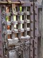
| 09/15/2005 01:02:25 PM | Speed of the Foeby JaimesonComment: Critique Club
Hello from the Critique Club.
This image is certainly high in contrast. It is an interesting image, and the story/translation in your description adds to the interest.
As several people have commented, you have an interesing grain effect, very reminiscent of b&w film. I think that this works well here (especially in the light greys).
Focussing on the detail as you have, the image takes on an abstract quality, though at the expense of the viewer's general comprehension of what they are looking at.
As you have chosen to present an abstracted image, the importance of remaining elements and in particular composition increases. The key elements in this image (to my mind) are the writing, the highlight on the barrel of the gun, and the stand (with more writing). These elements are all quite central in the composition as it stands, which leaves the eye quite static when looking at the image. It may be more satisfying if you moved everything so that the important elements were off centre, leaving the eye to move around the picture to extract the detail (and even better if you could direct the eye to a particular highlight of the image). I might have tred framing this image with the gun running along the top third line, with the stand to the left of the image.
Part of the challenge (in my opinion - there is some debate) was to find a subject matter that was naturally high in contrast. You appear to have chosen to represent high contrast by taking an image that does not appear to have been very high contrast to start with and applied a dramatic shift in brightness and contrast in post processing. The consequence of this is that you have lost a lot of detail in the barrel of the gun. While having strong whites and blacks is important in demonstrating high contrast, some grey is necessary to keep detail up. I think that finding the contrast naturally and gently enhancing it while retaining detail was likely to be a more succesful strategy for this challenge.
Feel free to pm me with any comments. Good luck with future entries!
Matthew
|  Photographer found comment helpful. Photographer found comment helpful. |
| 09/15/2005 12:10:26 PM | hot summer daysby frumoazniculComment: Originally posted by frumoaznicul:
I understand what you are saying, but this is candid. Meaning she didn't even know I was there, (camouflaged myself behind another hayestack). I like to capture raw emotion of these people, I like them to be natural how they are, to me that is so much more important than moving the lady around and telling her how to stay. If I'd do that I belive she will not behave natural anymore she will pose for the camera. Ofcourse what you say is true but it's verry hard to keep it candid and also compose it flawless. |
Agreed and understood - from your portfolio, I think that it is what you do best. I did not really think that this was posed, or that you would have the opportunity to direct the subject. You might have managed to control the scene by capturing an image at a different moment in time, or by moving yourself slightly.
Regardless, any criticism is minor - the image is great. | | Photographer found comment helpful. |
| 09/15/2005 06:38:07 AM | hot summer daysby frumoazniculComment: The diagonals in this image make the dynamic: I like the balance between the left to right diagonals in the background to the right to left diagonals in the haystack and the rake, mixing well with the angles of her arm and head. Attention is drawn to the figure very well. The (evening?) light casts a gorgeous sideways light and the slight silhouetting of the haystack picks out the detail at its edge well. The colours are well represented.
My criticism is in the positioning of the lady: the light falls in a very attractive fashion, but over too little of her. I would have liked to see the lady a step further back, and a little more light on her face. Also, her legs are completely silhouetted, and a little side lighting might add depth.
While I like the edge of the haystack, the bulk of it is relatively uninteresting. I might lose a fraction more from the RHS in a crop (though would reinstate it if the image lost its balance as a result).
There is a slight haze of blurry grass in the foreground at the bottom of the image that is marginally distracting: I don't know whether it was practical or not, but raising the camera 12 inches might have allowed you to shoot over this slight fringe, which is a (very minor) distraction. This might also have allowed us to see better the connection of the fork to the ground.
Overall, a great image. Wonderful subject matter. Captures weariness resulting from the trials of a simple rural life. | | Photographer found comment helpful. |
| 09/12/2005 03:41:41 PM | Summer's End — Sunriseby Bear_MusicComment: Bad luck Robt - your image was very impressive. The colours are sublime (I must admit, I see the colour contrast rather more than any than luminosity contrast).
Keep that 20D charged in future (how did the date get reset? My backup battery seems to keep forever).
| | Photographer found comment helpful. |
| 09/12/2005 03:35:39 AM | Cathedral of Colourby MatthewComment: I took a few pictures at this place - here is another one, and I may post some more:

Thanks! Message edited by author 2005-09-12 03:35:53. |
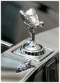
| 08/11/2005 06:21:33 PM | £256,500.00by redmoonComment: Nice photo - I nearly entered something similar (but time got away from me). Saw two of these near Bond street on the Saturday of the challenge - I note that the Spirit symbol can only be seen when the engine is on, as I took a few pics of a stationary RR and then its owner came out and turned the ignition on so that he could watch the latest football results on the dashboard television!! Had to take a few more, as the spirit's absence is quite noticeable by comparison.
V nice pic! |
| 07/27/2005 05:00:16 AM | | | Photographer found comment helpful. |
| 07/13/2005 06:29:03 AM | Simmer : Ecliptic — 2005by Bear_MusicComment: I still love this shot, but am amazed you got this clarity of bubbles on a 1/4 shutter speed. Not sure if you have the function (or the desire), but a slightly faster shutter would have stopped the motion fractionally better. In taking photos of air bubbles in water from the side on, I found that I needed shutter speeds of 1/3200 in order to stop the bubble completely. | | Photographer found comment helpful. |
| 07/13/2005 06:02:53 AM | |
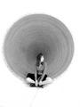
| 07/13/2005 05:55:47 AM | Two Moonsby hvauxComment: Excellent minimalist shot - recognised by some, but not enough! | | Photographer found comment helpful. |
|
Showing 451 - 460 of ~1203 |
Home -
Challenges -
Community -
League -
Photos -
Cameras -
Lenses -
Learn -
Help -
Terms of Use -
Privacy -
Top ^
DPChallenge, and website content and design, Copyright © 2001-2026 Challenging Technologies, LLC.
All digital photo copyrights belong to the photographers and may not be used without permission.
Current Server Time: 07/16/2026 03:31:53 PM EDT.
|