|
|
|
Showing 441 - 450 of ~1203 |
| Image |
Comment |
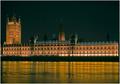
| 11/09/2005 11:08:55 AM | Velvet Flowby jseyerleComment: I am glad that your GTG picture did well! It was not until later that I realised that I posted mine up to the boards a little too quickly, forgetting that there was a shutterspeed challenge on!
Nice image - you caught the detail very well, as it was easy to blow out highlights with this subject matter, I discovered! |
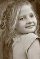
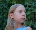
| 11/04/2005 05:52:36 AM | Old Fashioned Portraitby beautyqn25Comment: Hello from the Critique Club!
This is a nice image, with a very obvious grain. I like the look that you have chosen: the slightly sepia effect does age the image, though at the expense of achieving strong tonal range throughout the image. By this I mean that the blacks are not very black, and the whites are not very white. Having said that, the whole image is well exposed, and there are stronger blacks on some points of detail (eyes, mouth). I might be tempted to experiment with pushing the contrast a little higher.
Your subject has a very pretty expression and warmth about her. Great pose, with an obvious tension in the way you have framed her that elevates the image beyond a snap. Her t-shirt does not fit perfectly within the idea of an aged picture, as it is an anachronism! I would not recommend period dress (a little hackneyed), but perhaps something a little more timeless.
The Depth of Field that you have chosen has left your subject's left eye slightly out of focus. However, her shoulder is in focus. This makes me think that you might have needed to be a fraction further forwards at the focal length used, to move her face into focus at the expense of the less important shoulder. This is a minor criticism: you have, in any case, kept the eye nearer the viewer in focus and that is the more important of the two.
Great photo. Good luck with the next challenge!
|
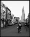
| 11/04/2005 05:39:15 AM | Cycling to Churchby marvinComment: Hello from the Critique Club!
I like this image. As another commenter said, there is a timelessness about it. Good leading lines move the eye around the image, and the composition is pleasing. Modern architecture and street furniture, unfortunately, has a slightly cluttered feel to it, and that detracts a little from the foreground, where trees, lamps, signs road markings, road textures etc compete a little for attention. Having said that, they contrast nicely with the clean lines of that fantastic church building!
The image grain is right for the image, and well applied. However, I observe that, for a challenge with image grain as the subject, you have presented a lightly grained image, which is less obviously dependent on the image grain for effect. This may be one reason for the low-ish score (I think you were a bit unlucky on the score front).
Good luck with your next challenge! |
| 11/04/2005 05:30:34 AM | at the gameby arsenalComment: Hello from the Critique Club!
This is an interesting image, and I like the colour palette that you have used: the bright reds and muted, dark tones work well together. Grain has been added well. Composition is fine, but you might be picked up on a tilted horizon and the floodlights on the RHS add little, and are a little close to the RHS to add proper balance.
Unfortunately my monitor shows up a little dark, but the subject's face is very heavily in shadow. This focusses attention on the rest of the subject, which may be your intention, but I am not sure why? There is maybe not enough of a "story" told by the image to hold attention for long, and it is not quite interesting enough to stand up as a fascinating image in its own right. While I think that you have applied the grain effect very well, I don't know why this image needs this treatment.
I think that as part of a sequence, ir with an explanation, this image could be much more powerful, but does not work so well by itself. Good technical skills though!
Good luck with the next challenge!
|  Photographer found comment helpful. Photographer found comment helpful. |
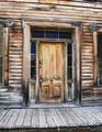
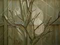
| 11/04/2005 05:20:18 AM | Doorway to the pastby bugsy55Comment: Hello from the Critique Club!
I like the composition that you have found with this image, the concentric rectangles draw the viewer into the image. You also have chosen to represent wood grain with image grain, which I quite like.
You have already received some criticism on the blurriness of the image: that is well founded. A good tip is to use a sharpening algorithm after resizing your image. That wold have sharpened your image and might have brought out more of the image grain that is hinted at, but not as strong as it might be for a challenge with that title.
While interesting, this kind of shot is going to struggle in challenges to score well: it does not have a particular point of interest, as the scene is a bit of a "background" rather than a subject in itself. It would either have to be a technically perfect photograph, perhaps delving into the abstract, or might be livened up with some action. That might be something as small as, say, a person, or a child's brightly coloured toy, sitting on the porch to add a focal point.
Good luck with your next challenge! | | Photographer found comment helpful. |
| 09/22/2005 04:55:15 PM | Oliviaby CoolsComment: Critique Club
Hello from the Critique Club.
This is a pretty subject, and the photo is pretty sharp.
My criticisms are similar to those that you have received already, an relate to lighting and post processing.
Your image is shot in the shade, which gives a very dispersed lighting effect. There are no significant shadows or areas of emphasis. This can be effective, as it is quite flattering whe your subject wants to avoid wrinkles, but your subject (hopefully) does not have that issue.
Some light shadows, or at least defined highlights, would have helped make this photo more interesting. Something from the side, or a combination of both sides (one stronger) might be interesting.
The post processing is important in improving slightly the colour saturation. Your image is slightly flat, and greater colour depth might have helped. DSLRs are set to be a little under saturate, especially compared to film (which tends to be designed to over saturate). COmbined with better lighting, this could be great.
Personally (and, in my experience, for this site), a fraction more sharpening might help the image (especially around the eyes).
Finally, composition is a little central (try having your subject looking into space (ie place the subject on the LHS looking towards the RHS). Alternatively, create a tension by placing her on one side looking out of frame. Having the eyes on a rule of thirds crossing point is the conventional method for achieving a strong image.
Good luck for the future!
Matthew
|
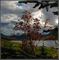
| 09/19/2005 07:09:49 AM | Autumn branchby gisliComment: Critique Club
Hello from the Critique Club!
It looks like you have inspirational scenery. Very attrractive place, and sky.
The image looks (to me) to be quite dark (though this monitor is not well calibrated). Part of the reason (I think) is because you are shooting into the light (it looks as though the sun is breaking through those clouds). There is a slightly silhouetted feel to the foreground. A powerful flash helps with some fill in light, but is often a limited solution.
The image also looks as though it has been pushed moderately hard in post processing, and has just started to lose its natural look.
As has been commented upon, your chosen Depth of Field does not isolate the subject, but leaves it to compete with the stunning scenery in the background. Reducing the Av would centre attention on the branch.
The composition is quite central, though in a square image I find this to be less critical than in a landscape or portrait image. I am unsure about the framing you have used with the branch. I try and include a frame if I think that it fits the subject matter at hand. Here, the branch would frame well the background, but I don't think that it adds anything to the branch that should be your subject.
Good luck with the next challenge!
Matthew | | Photographer found comment helpful. |
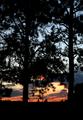
| 09/19/2005 06:50:06 AM | Through the Treesby angela_packardComment: Critique Club
Hello from the Critique Club!
I think that this is an interesting image, and I think that it has been a little under rated in this challenge. I like the idea: silhouetted tree branches against a pretty sunset are an attractive proposition.
I disagree with those commenters who suggested that you have more light on the trees: I think that you were right to go with the full silhouette.
My criticisms are as follows.
The trees are quite dense, and you might have been able to choose some trees that allowed a bit more light through so that more detail of the great sky lighting could be seen. Alternatively, you could have walked closer to the trees, and used a wider angle lens: that has the effect of making things look further apart, and might have opened up the image a little for you.
The most interesting area of sky solour gradation is in the lower half of the image, and An interesting alternative might have been to have had more trees in the frame, with a landscape orientation to maximise the amount of that area of the sky in your image.
The horizon is fractionally off - no-one commented on it, and it is marginal, but it needs a 0.5 degree clockwise rotation, I think!
In post processing, I think that you might have tried to obtain a little more sharpness in the image. This is difficult with complex and detailed subjects (such as the pine needles here), but I think that this image needs a fraction more sharpening.
For this site, given the strict limitations on image size, I must admit that I tend to avoid choosing images where the fine detail is important but simply cannot be represented clearly at the required resolution.
Good luck with the next challenge!
Matthew | | Photographer found comment helpful. |
| 09/19/2005 06:20:54 AM | Nature Garden Artby trainComment: Critique Club
Hello from the Critique Club!
This is quite a stunning subject matter. An excellent choice, with "branch" being obvious on several levels. The lighting is great, as you have taken the picture at a time with some good side lighting (early morning or evening?), which has thrown shadows of the branches onto the webs, and lines the edges of the branches very nicely (almost a sun kissed silhouette).
The trouble with subjects like this ( which are intensely interesting) is how far to document them (ie get everything in) and how far to limit the extent of the image but capture the essence of it in an image - the latter will often be a better photo, at the expense of not recording the whole moment for posterity. I think that this image records an amazing scene well, but falls down a little on recording its "essence".
Compositionally, the visually stimulating parst of the image appear (to me) to be the centre of each of the webs in strong light and the largest of the branches. I would be very tempted to move in with the camera and fill the frame with just these (probably trying to follow the Rule of Thirds rule). I would experiment with moving in much closer and filling the frame with the webs, and taking photos of just one web in focus with the others in the background. The bits of web at the side of the image and away from the tree are interesting from a documentary point of view, but less so from a strength of image perspective.
One of my main aims with this subject would be to get one or more webs into focus, some branches into focus, but to get that background out of focus (outside the Depth of Field). As others have commented, there is so much detail in the background that it detracts from the focal point of the image. It is not attractive enough or plain enough to leave in the image.
You have some technical limitations with your camera in selecting a shallower DoF, but there are ways around it. I think that any portrait mode would be one of the better modes to use, combined with getting closer to your subject. At an extreme, you could see what you could do with the macro mode.
In any case, this is a strong image that rightfully did well.
Good luck with the next challenge!
Matthew | | Photographer found comment helpful. |
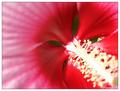
| 09/19/2005 05:59:20 AM | Heart of the Hibiscus (Branching Corolla)by SchuffComment: Critique Club
Hello from the Critique Club!
This is an interesting idea, and I like the idea behind it. One of the problems with a slightly unusual take on a challenge is that you will occasionally get marked down for it - not that it should be a reason not to post interesting takes on a challenge (sometimes you will get it just right!).
Technically, there are a few issues.
Compositionally, you have gone for an interesting composition, which I think works partially. I like the stamen from the corner: it provides a strong leading line to the detailed area of interest. However, there is no reason for the eye to travel to the LHS of the picture; I would be tempted to crop to a squarer image with lesson the left, or to include more interest on the LHS.
That brings me to the Depth of Field. You have chosen a very shallow DoF, which menas that most of the stamen, and all of the detail on the petals is out of focus. The base of the stamen is in focus, and this is the subject of your entry. On the one hand, the shallow DoF draws the attention of the viewer to the point of your image: the branch. However, it also leaves the viewers attention in the one place, which makes for a slightly unsatisfying viewing experience. I think that the image would benefit from a lot deeper DoF. You can achieve this with the same photograph by choosing a much narrower aperture. You have chosen F-4.0 - an F-16 or F-22 would bring much more of the flower into focus. It would add detail into the petal on the LHS and provide the viewer with more to look at, improving the composition of the image at the same time. You would also have more detail in the stamen, adding more interest to that area.
In order to obtain a good image using a higher F-number, you would also need to think hard about lighting. The shutter speed will be slower (the aperture is smaller, the amount of light getting through the lens smaller). You will need to make sure that the subject is bright, and that you are holding the camera steady (tripod?). If you cannot get everything bright enough, then you have the option of increasing your ISO (your camera will happily take photos at ISO 400 or 800 without noticeable degradation of quality).
Here, there is a strong shadow on the bottom RHS (careful when using flash of the shadow cast by your lens!) and the detail in the stamen is burnt out. I think that I can spot a technical problem that will have caused this.
The problem stems from the fact that you appear (from the nature of the reflections) to have used the flash. The following is only relevant if this is in fact the case (ignore if you did not!). I guess that you were using the camera in Av mode, and had set the Av to 4.0 and popped the flash manually. If I am right, I guess that the image would have been too light overall (and obscured the detail in the bright stamen), which is the reason why you had to adjust contrast and brightness.
The reason for the lightness occurring (and why this is a technical fault) is that your camera has a maximum flash synchronisation shutter speed of 1/250. That means that when using the flash, the shutter cannot travel at a speed greater than 1/250 (or it might miss the point at which the flash fires). Your shutter speed for the image is stated to be 1/500. In fact, I think that your shutter was operating at 1/250 (the technical limitation of the camera when using flash) at a time when the brightness of the image dictated that the shutter be open for half that time (1/500). It was therefore, in fact, open for twice the correct length of time, over exposing your image. This means that the highlights ghet burned out and the whole image loses out.
The way to avoid this is to make sure that the camera does not exceed a shutter speed of 1/250 when using the flash. You can do this by being careful in Av mode, or by using Tv mode and setting the shutter speed to 1/250 at the fastest.
Good luck with the next challenge!
Matthew | | Photographer found comment helpful. |
|
Showing 441 - 450 of ~1203 |
Home -
Challenges -
Community -
League -
Photos -
Cameras -
Lenses -
Learn -
Help -
Terms of Use -
Privacy -
Top ^
DPChallenge, and website content and design, Copyright © 2001-2026 Challenging Technologies, LLC.
All digital photo copyrights belong to the photographers and may not be used without permission.
Current Server Time: 07/17/2026 06:21:04 AM EDT.
|