| Image |
Comment |
| 03/31/2005 09:44:17 AM |
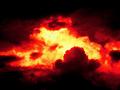
The Instant of Creation.by kiwinickComment: Wow! V dramatic, but very much a product of PS. Slightly grainy as a consequence, but I think that adds to the effect. Not sure how well this will score as a photograph, though. |
 Photographer found comment helpful. Photographer found comment helpful. |
| 03/31/2005 09:42:42 AM |
Budding Tulipby hannafateComment: V pretty image. Focal point - tip of bud, very slightly overexposed (feels as though there is room in the histogram to move the levels down by a nothch or two, or underexpose slightly, and retain a bit more detail). |
| Photographer found comment helpful. |
| 03/31/2005 09:41:30 AM |
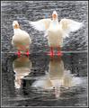
"Hey, watch the wing!"by tootsComment: Noice pic. Maybe not enough "beginning" without the title. Some slight artefacting on the left bird? |
| Photographer found comment helpful. |
| 03/31/2005 09:40:36 AM |
See_throughby atxcrisComment: there is a website of these somewhere! Funny, but no beginning. Too many underexposed areas in frame. |
| 03/31/2005 09:39:15 AM |
A tribute to Stephen Hawkingby palmfrodurComment: Nice sky. Maybe not enough "beginning" without the title (and I may not be clever enough to understand the tribute bit). Details are blown in your centre of attention are in the middle of the pic - quite distracting. |
| Photographer found comment helpful. |
| 03/31/2005 09:38:08 AM |
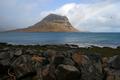
Eruptionby tyrkinnComment: great scenery. Maybe not enough "beginning" without the title, though. Love the rainbow. Pipe in left foreground dsitracting. Also bird in top right (would have been netter if he had been flying into frame, not out of it) |
| Photographer found comment helpful. |
| 03/31/2005 09:37:03 AM |
|
| Photographer found comment helpful. |
| 03/31/2005 09:36:03 AM |
Java Manby scalvertComment: funny! not a "beautiful" photo, but I don't think that is the intention. |
| Photographer found comment helpful. |
| 03/31/2005 09:35:02 AM |
The first dabby hitendraComment: wioth some yellow you would have had a primary colours stock photo... nice idea, well composed (I like the negative space). Maybe slightly over exposed and the red is not as intense as it seems that it should be (maybe something you could play with in PS under hues and saturation). Looks like you might have increased the saturation until some detail lost, when altering the hue very slightly would have given a better result. |
| 03/31/2005 09:32:33 AM |
|
| Photographer found comment helpful. |
Home -
Challenges -
Community -
League -
Photos -
Cameras -
Lenses -
Learn -
Help -
Terms of Use -
Privacy -
Top ^
DPChallenge, and website content and design, Copyright © 2001-2026 Challenging Technologies, LLC.
All digital photo copyrights belong to the photographers and may not be used without permission.
Current Server Time: 06/26/2026 01:30:08 PM EDT.