| Image |
Comment |
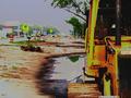
| 03/31/2005 11:07:49 AM |
Wider Road to Comeby dahvedComment: not sure about the decision to use massive saturation here - lots of artefacts and haloes. Interesting effect, but not a great photo to me. |
 Photographer found comment helpful. Photographer found comment helpful. |
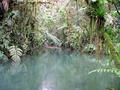
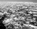
| 03/31/2005 11:06:47 AM |
In thebeginning of Creationby hcuevaComment: Beautiful location. Maybe not enough colour saturation for my taste. Gets a bit messy in the top half and too plain in the bottom half. Also consider using the rule of thirds for this type of image. |
| Photographer found comment helpful. |
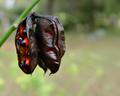
| 03/31/2005 11:05:48 AM |
|
| Photographer found comment helpful. |
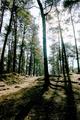
| 03/31/2005 11:05:11 AM |
The Call of Natureby LongComment: Lovely image. Maybe not enough "beginning", even with the title, though! Slightly blown highlights around tree. Would be great if you had managed to catch sunbeams in the mist (there is another pic that does this very well - would love to learn that trick myself). |
| Photographer found comment helpful. |
| 03/31/2005 11:03:57 AM |
Simple Truthby ebertdjComment: Super velvety saturation. Like the effect (though some won't). Also the over exposure works nicely, I think. |
| Photographer found comment helpful. |
| 03/31/2005 11:03:09 AM |
|
| Photographer found comment helpful. |
| 03/31/2005 11:02:26 AM |
|
| Photographer found comment helpful. |
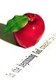
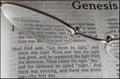
| 03/31/2005 11:01:14 AM |
In the Beginningby ResurrectedComment: with glasses, I think that there needs to be more distortion and it should focus attention on the relevant words - not sure that there is enough focus on the relevant words in this image. RHS and cropping of glasses seems a bit messy too - though I an see that at this angle you needed to do so around the "Genesis" title. So maybe a different angle of attack? Also, bible pages are quite transaparent - might have worked better with a non-tissue paper bible! |
| Photographer found comment helpful. |
| 03/31/2005 10:58:41 AM |
|
| 03/31/2005 10:57:49 AM |
Ozzy_1by andiksComment: Nice expression - Maybe not enough "beginning" even with a title... and the pic could be larger (don't be shy of 640 pixels)
|
| Photographer found comment helpful. |
Home -
Challenges -
Community -
League -
Photos -
Cameras -
Lenses -
Learn -
Help -
Terms of Use -
Privacy -
Top ^
DPChallenge, and website content and design, Copyright © 2001-2026 Challenging Technologies, LLC.
All digital photo copyrights belong to the photographers and may not be used without permission.
Current Server Time: 06/26/2026 01:21:12 PM EDT.