| Image |
Comment |
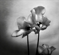
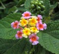
| 04/01/2007 08:04:55 AM |
Radianceby jstrongComment: I like the painted look, the tones, the use of a not so common flower, the use of lighting and the composition that keeps me off balance. Very well done. 9 |
 Photographer found comment helpful. Photographer found comment helpful. |
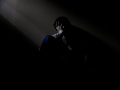
| 03/21/2007 06:42:11 AM |
the Inner Painby MuppetComment: This just goes to prove how many people out there do not calibrate their monitors. If they had, you would have added at least a point to your score. I've learned the hard way too. That said, I like the image and gave it a 7. Didn't have time to come back and bump, which I may have. I looked past the title which, I agree with Ed, is a little pretentious. The composition bothers me in that the subject is centered but I don't think cropping on either side would work well. You need all those shadows here - they work amazingly well and in fact are a subject unto themselves. Maybe pulling back a little further, giving the subjects more room, would be the way to go. Then you can pull him off the right just a tad, to add a little more tension to an already tense scene. You did well here and this is under-rated. The diagonals emphasize his 'down-ness' very well as do the tones of the image. Not sure of the color or not - that one little spot in the shirt is a little distracting but the jeans aren't. Or its just me. Anyway, good work - look past the scores - you just never know with this crowd. |
| Photographer found comment helpful. |
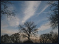
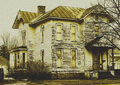
| 03/19/2007 06:38:14 AM |
Tree Grainby FujiPortalComment: I think the composition works for what you have. The ends of the side trees really help to hold my eyes in the image and on the central tree. But on the whole, the image lacks tension. I'm left thinking, why was this taken? What is the photographer trying to show me? |
| 03/19/2007 06:36:04 AM |
Still Standing; Justby GrandadComment: I like all the textures here and the processing and grain work with the image. I'm just not sure of the why. |
| Photographer found comment helpful. |
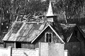
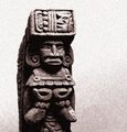
| 03/19/2007 06:33:29 AM |
Mayan de Copanby JammurComment: I like the processing here but the image otherwise isn't very interesting. |
| Photographer found comment helpful. |
| 03/19/2007 06:19:50 AM |
|
| Photographer found comment helpful. |
| 03/19/2007 06:19:25 AM |
Stand out from greensby kepotComment: The grain doesn't really enhance this image. Ideally, one would look for a subject to work with the grain. Good colors but the composition is weak. |
| 03/17/2007 08:42:21 AM |
Bad dreamby scotthadlComment: title weak but image is great. Grain really works with presentation. Tones well rendered. Composition interesting. |
| Photographer found comment helpful. |
| 03/17/2007 08:39:40 AM |
M*A*S*Hby jan_vdwComment: with studio type shots it is expected that you have control of everything. I'm suspecting you may have shot this in a museum type setting so you did not. But remember to watch for the little things - the wrinkle of the fabric on the right for one. This could be slightly brighter - the light fades off towards the top and left; with the bright, shiny things at the bottom, it throws off the balance of the image. A slightly lower point of view might work a little better also, though, since I wasn't there, I can't say. A nice presentation. |
| Photographer found comment helpful. |
| 03/17/2007 08:33:52 AM |
It still has characterby bmartuchComment: grain gives aged feel. not too sure about hue used but toning works. I'm just waiting for something to happen. There is tension here - you know, it might be due tot he use of yellow. gotta think on this one a while. |
| Photographer found comment helpful. |
Home -
Challenges -
Community -
League -
Photos -
Cameras -
Lenses -
Learn -
Help -
Terms of Use -
Privacy -
Top ^
DPChallenge, and website content and design, Copyright © 2001-2026 Challenging Technologies, LLC.
All digital photo copyrights belong to the photographers and may not be used without permission.
Current Server Time: 07/23/2026 06:37:39 PM EDT.