| Image |
Comment |
| 06/20/2007 11:01:02 AM |
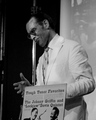
Jules Deelder's Pure passion for Jazzby DaveSMComment: In voting I gave this image a 5. This image is composed well for the most part, but would have been greatly improved had you moved to the left a few feet so the pole was not coming out of his head and so that he would be standing in front of the white background - this would have allowed him to become the focus of the image. As with your other two posted, the focus here is soft. I would bet, with the lens you used, that you really cropped this down, resulting in the softness. |
 Photographer found comment helpful. Photographer found comment helpful. |
| 06/20/2007 10:56:12 AM |
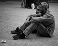
Enjoying the showby DaveSMComment: I gave this image a 5 in voting. Its great for a candid - I love the expression and emotion in the image. Unfortunately, the focus is slightly beyond him and he is slightly blurry. Also, the contrast is weak. The brightest spot in the image is the white bag in the background which draws my attention. |
| Photographer found comment helpful. |
| 06/20/2007 10:51:01 AM |
Why?by DaveSMComment: I like the lighting and the pose and the slight desat of colors. I would have given this a 6 as it is. If the face had been a little more in focus (it looks out of focus here rather than soft focus) I would have given it a 7. I think it meets the challenge. |
| Photographer found comment helpful. |
| 06/20/2007 09:41:03 AM |
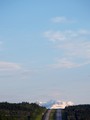
Road to the Rockiesby silverhawkComment: That much sky adds nothing to the image. I think the bottom quarter is interesting but it is completely overpowered by the sky, which is not supposed to be the subject. |
| Photographer found comment helpful. |
| 06/20/2007 09:37:43 AM |
No swim, EATby veggieComment: when you add that much negative space, there should be a reason for it. While the boy is cute and the bottom quarter of the image is well taken, the top half adds absolutely nothing. If there had been something of interest, I could understand why it wasn't cropped out. Really like the use of red on the child to make him stand out. |
| Photographer found comment helpful. |
| 06/20/2007 09:21:34 AM |
The Openingby jblaylockraynerComment: Not sure all the sky enhances the image. The title leads me over to the 'window' but its so insignificant in the entire composition that I have trouble giving it significance. Image is well taken - tones are good, focus is dead on, I'm just not too sure of the composition. |
| Photographer found comment helpful. |
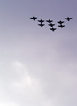
| 06/20/2007 09:03:23 AM |
RAF over Trafalgar Squareby signal2noiseComment: Too much background and not a lot of WOW. Negative space does not require huge amounts, it just requires good use. Toning and focus well done. |
| Photographer found comment helpful. |
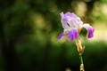
| 06/20/2007 09:01:43 AM |
Abandoned Beautyby Trumpeteer4Comment: The background/NS and bokeh is good here. Unfortunately, the flower is not in good focus. One of the better and more interesting backgrounds of the challenge though. 6 |
| Photographer found comment helpful. |
| 06/20/2007 09:00:40 AM |
|
| Photographer found comment helpful. |
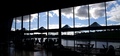
| 06/20/2007 08:59:25 AM |
,,,the lunchby dougi555Comment: For me, the subject here is the sky - it is the only thing that stands out in the photograph. Everything else is in shadow and barely discernable. On that note, the rest does not provide WOW. There is nothing I can grab on to. So, for me, in this challege, this image fails. However, outside the challenge it is an intriguing image; I just wish I could make out more of it. 5 |
Home -
Challenges -
Community -
League -
Photos -
Cameras -
Lenses -
Learn -
Help -
Terms of Use -
Privacy -
Top ^
DPChallenge, and website content and design, Copyright © 2001-2026 Challenging Technologies, LLC.
All digital photo copyrights belong to the photographers and may not be used without permission.
Current Server Time: 07/22/2026 05:03:30 AM EDT.