| Image |
Comment |
| 04/28/2005 06:01:03 AM |
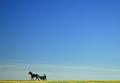
Morning Workoutby rmtm333Comment: While this image is simple and beautiful and well placed, there is something missing for me. Maybe if he was on the right side of the image, this would be resolved. I don't know. The detail at a distance is captured well. I have no emotional attachment to the image, but that is a personal thing - can't reach everyone! 9 from me! |
 Photographer found comment helpful. Photographer found comment helpful. |
| 04/28/2005 05:57:47 AM |
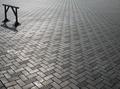
door knobby robadsyComment: Well executed. Great color juxtaposition. The only thing holding this back from a higher score is the POV. I think. Not sure if it would work better slightly lower/straight on or not. The knob has a funny tint that resembles skin - your arm perhaps? 8 from me. While I like the shot and believe its well done, its not quite there for me. |
| Photographer found comment helpful. |
| 04/28/2005 05:51:55 AM |
Where's the next hurdle?by westerComment: Wow. Excellent presentation. Great vision. The only thing holding this back is the trash, though I am sure you heard this before. 9 for having the eye to find excellent detail in the simplist of places. |
| Photographer found comment helpful. |
| 04/28/2005 05:49:52 AM |
Thicker than Waterby conglettComment: Simple. If it weren't for the blown areas in the middle row, this would have gotten a 10 from me. But the originality and execution deserve at least a 9. So here it is. |
| Photographer found comment helpful. |
| 04/28/2005 05:48:11 AM |
Last Waveby ZoomdakComment: There are probably many voters who think this should be in color. Not me. I am glad you converted it - I think the depth and tonal range you got from B&W pushes this image into the top 5 for this challenge. there is so much more detail than you would ordinarily see in the play of shadows and reflection. 10 for an excellently executed image. Good luck! |
| Photographer found comment helpful. |
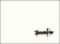
| 04/28/2005 05:44:56 AM |
The Lonely Fishermanby TiberiusComment: I think the conversion of this image is excellent. But, I hate all the white. A little more detail in the background would have gotten you a 10. 9 from me on an excellent image. Good luck! |
| Photographer found comment helpful. |
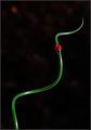
| 04/28/2005 05:43:12 AM |
A Twist of Green and a Spot of Red by FalcComment: Simple, in focus, great colors and not a flat background. I have the same plant but its still brown. and no ladybugs. sigh... The ladybug looks slightly over saturated but the lighting makes up for it. One of the top images in the challenge for me. 10 Good luck! |
| Photographer found comment helpful. |
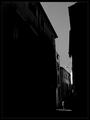
| 04/28/2005 05:40:16 AM |
Brief encounterby jjbeguinComment: I think this is one of the best in the challange but I am partial to B&W. Most voters seem not to be. Good luck with this excellent capture. 10 from me! |
| Photographer found comment helpful. |
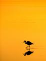
| 04/28/2005 05:38:52 AM |
Sunset Feeding by StagoleeComment: Honestly, I think the orange could be toned down just a little bit. But, I think this is the best of what I have seen in the challenge so I am bumping this to a 10. The simplicity works and I think it captures the spirit of the challenge. Good luck! |
| Photographer found comment helpful. |
| 04/23/2005 12:41:55 AM |
Orangeby bucketComment: Wow. I can't believe all the negative comments about the background. Maybe I'm weird but I thought that made the image. Imagine it on plain white like so many other images here at DPC. You would have ended up last or close to it. Excellent job and excellent choices! |
| Photographer found comment helpful. |
Home -
Challenges -
Community -
League -
Photos -
Cameras -
Lenses -
Learn -
Help -
Terms of Use -
Privacy -
Top ^
DPChallenge, and website content and design, Copyright © 2001-2026 Challenging Technologies, LLC.
All digital photo copyrights belong to the photographers and may not be used without permission.
Current Server Time: 07/20/2026 03:52:39 AM EDT.