| Image |
Comment |
| 07/25/2005 10:33:22 AM |
Woodrow Sr and Jr on the Boardwalk...by DiComment: In this challenge, "Creativity is the Key" is what I am using to score images. This is an absolute delight. I never use that word but this image is an exception. I love the positioning of the woodies. I love the background blur and think it works well. Don't mind the crop (usually I hate feet cut off). Think the tones are excellent as well as the lighting. You also made me giggle - I can see people walking around watching you set this up, wondering what strange person would do this... 9 - good luck in the challenge! |
 Photographer found comment helpful. Photographer found comment helpful. |
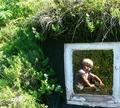
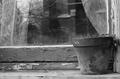
| 07/25/2005 10:30:25 AM |
My old windowby asijComment: In this challenge, "Creativity is the Key" is what I am using to score images. More like a reflection than a window but the creativity here is master! Excellently done. I love the way the white frame forces your eye to the corner. Like the look as if the child is staring at viewer as an afterthought, like the viewer is interrupting a private moment. Wish the greens were a little more subdued outside the frame - they pull my eye away from the main focus. I love that you got some flowers into the framed part. Makes that world seem more special. Excellent job, creatively out of the box/ 10 - Goodluck in the challenge! |
| Photographer found comment helpful. |
| 07/25/2005 10:26:36 AM |
Plane Shavingsby grahampComment: In this challenge, "Creativity is the Key" is what I am using to score images. Excellent use of technique. Very creative, lighting well done. There is some static-ness about the image but I cannot put my finger on why. I think it may the be the composition/crop. But I love the tones used. 7- good luck in the challenge! Thinking about it some more, I think it is the lack of balance in the image - both the subject and lighting are bottom weighted, pulling the image down. Maybe if the shaving had ended at the first complete circle or maybe if the top was cropped a little more I wouldn't feel that. Excellent out of the box image for this challenge. |
| Photographer found comment helpful. |
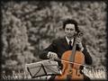
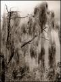
| 07/25/2005 09:56:34 AM |
Maple in Tree Minor by IvoComment: In this challenge, "Creativity is the Key" is what I am using to score images. Beautiful! From the background blur to the wind in his hair this image is great. Not too fond of the border and unsure of the crop, but as it is the composition works. Love the touch of grass in the midground. 10 - Good luck in the challenge! |
| Photographer found comment helpful. |
| 07/25/2005 09:54:39 AM |
Almost everything except Winnieby FyzarlComment: In this challenge, "Creativity is the Key" is what I am using to score images. I love the simplicity of this image, the high contrast look and feel. This the POV and DOF are excelent. Lighting works really well. 9 - Good luck in the challenge! |
| Photographer found comment helpful. |
| 07/24/2005 11:25:58 AM |
Untitled #27by smokeditorComment: Captivating shapes and lines. The simplicity of the tones balances well with the shapes. Love the DOF and the lighting - the lighting in amazing. 9 - good luck in the challenge! |
| Photographer found comment helpful. |
| 07/24/2005 11:23:35 AM |
Face in the Windowby willg133Comment: Love the tones in this image and the simple way it displays texture without beating anyone over the head with it, like so many images in the challenge including my own. Like the depth with the inside and the outside and the reflection - really adds to the image. 8 - Good luck in the challenge! |
| Photographer found comment helpful. |
| 07/24/2005 11:18:17 AM |
The Drapery Fallsby aboutimageComment: What makes this work for me is the moodiness of the tones - very well done. I would prefer a looser crop but I believe there is probably too much distracting background for that to work. Would love to find something like this out in the open! 8 good luck in the challenge! |
| Photographer found comment helpful. |
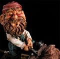
| 07/24/2005 11:16:20 AM |
Pygmyby HycindComment: Strange choice of subject. I think the background is too black - too flat for it to look anymore than cut out. However, I think you did an excellent job capturing the three dimensionality of the figure. The color is dead on and the tones are nice. Got a few hot spots with the lighting but that is to be expected with shiny objects. 6 - good luck in the challenge! |
| Photographer found comment helpful. |
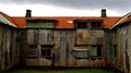
| 07/22/2005 09:46:08 AM |
L'Hôpital Françaisby russiComment: What caught my eye with this image were the tones. I think the red roof is what really makes this image work. The bottom is a little dark but I like that it was taken on an overcast day - sunlight wouldn't have given you the texture or the tones. From my view, you were standing just a little bit right of center - just barely noticible but I think it creates some tension in the image (a good thing as it helps the image not seem static). 8 - good luck in the challenge! |
| Photographer found comment helpful. |
Home -
Challenges -
Community -
League -
Photos -
Cameras -
Lenses -
Learn -
Help -
Terms of Use -
Privacy -
Top ^
DPChallenge, and website content and design, Copyright © 2001-2026 Challenging Technologies, LLC.
All digital photo copyrights belong to the photographers and may not be used without permission.
Current Server Time: 07/24/2026 07:33:25 PM EDT.