DPChallenge: A Digital Photography Contest You are not logged in. (log in or register
 
Browse Settings
Currently viewing:
Registered Userdahkota

Show comments:

Per page:

Order:

Comments:


Comments Made by dahkota
Pages:   ... [254] [255] [256] [257] [258] [259] [260] ... [350]
Showing 2561 - 2570 of ~3496
Image Comment
IMG_7675.jpg
08/10/2005 06:44:08 PM
IMG_7675.jpg
by strangeghost

Comment:
Your white sands images blow mine away. All I got was blue blue sky. Crap! Now I have to go back and wait... :) Beautiful image.
Photographer found comment helpful.
IMG_8426.jpg
08/10/2005 06:41:38 PM
IMG_8426.jpg
by strangeghost

Comment:
I wanted the exact same shot. It is beautiful isn't it. I should have stopped... Like your composition.
Photographer found comment helpful.
IMG_7793.jpg
08/10/2005 06:40:26 PM
IMG_7793.jpg
by strangeghost

Comment:
Wow! This is amazing. I cold barely find any clouds... Well taken.
Photographer found comment helpful.
Lifeline
08/10/2005 11:20:58 AM
Lifeline3rd Place
by Neil

Comment:
Great image. Didn't get a chance to vote this one but I think it is well done. Congrats on your ribbon!
Photographer found comment helpful.
just a little place for the books
08/10/2005 05:00:23 AM
just a little place for the books
by JPR

Comment:
Wow. Hard to believe we were in the same room and you got this. I didn't even think of it for the Affluence challenge. And the title is perfect. Wonderful job!
Photographer found comment helpful.
Late As Usual
08/09/2005 01:46:12 PM
Late As Usual
by Nikolai1024

Comment:
knew this one would do well. Excellent capture considering how many of us tried the same thing!
No Turn on Red
07/31/2005 11:45:37 PM
No Turn on Red
by JPR

Comment:
Okay. yours is 100X better than mine because I didn't look around beyond my immediate subject. Still teaching me things. And yes, I think you're right 71301. BTW - how in the world did you get all of that in focus?
Photographer found comment helpful.
Oyster Mushrooms — Cluster 1
07/27/2005 08:12:56 AM
Oyster Mushrooms — Cluster 1
by Bear_Music

Comment:
Robert, For what its worth, my opinion... The technicals in this image are good. What I think this image lacks is a point of focus. Not camera focus, but more of a 'where do my eyes go' focus. Since this is more of an abstract image, my eyes tend to go to the lights and darks. The lightest lights and the darkest darks have no texture. So I look at the edges, the changes in tonality. The edges fall across the image randomly with no order or pattern for me to follow. The strongest lines swoop me down to the bottom right - into a jumbled mass. This makes the entire image seem to be draining out of the bottom right. The strong black at the top left reinforces that. Hope what I stated makes some sense...
Photographer found comment helpful.
Bring the Heat
07/26/2005 01:49:28 PM
Bring the Heat
by The_Itinerant

Comment:
Greetings from the Critic Club! :)

For creativity alone, you deserve a 10 on this. However, images are not only rated on creativity but technique, presentation, and appeal/emotional response.

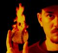
Technique - The blurring here is one of those love it or hate it propositions. Here at DPC, people usually hate it because they want their photos to look 'real.' I would argue, however, that the blur is effective here in lending the image an artistic quality (have you ever heard of LeRoy Neiman? check him out). You could go in the completely opposite direction but I am afraid it wouldn't be within the limits of this image. I think the use of the orange tones is effective but a little overdone in the skin tones as they compete with the flame that should rightly be the focus of this image. To me, the ball looks cut out. This is due to the lack of shadow and the hard edge on the right hand side. This may be fixed using a slight edge blur or some D&B to give the illusion that the light on the ball is the same as the light on the figure. See how the bottom has a slight shadow? Some of that should be echoed on the right side. An inperceptible amount would really hide the fact that the ball is not real.

Presentation/Composition:
I think the 1/2 head works really well. The viewer unconsiously fills in the rest of the face anyway, which makes the image larger than it really is. Using this was a great compositional tool. While the hat disappearing into the background is odd, the shadow left by the hat on the subjects face immediately lets the viewer know that there is indeed a baseball hat there. I think this shadowing works well and to the image's advantage. To be honest, I find the hand and arm position awkward, but that is easily overlooked as attention is drawn away from that aspect. In other words, I don't dwell on it. I think a more effective placement would be a little further from the body forward, a more natural position for a pitcher. There may be a little more room than necessary on the left side of the frame; I don't think a slight crop of a little black space would hurt.

Emotional Appeal:
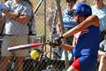
This image would appeal mostly to people into baseball. Particularly those into Art prints.

With regard to the Sports II Challenge:
Having been at DPC for a while I can often tell which images are going to 'score big' and which are going to be passed by. This image, since it bases its appeal on the artistic side, will suffer in the voting. With further instructions calling for action, the expectation of many of the voters was for specific action. Since all the action in your image is done by the flame (perception wise), most people would vote low for lack of sports action. But, that doesn't mean this is not a great image - many comments below would attest to that! It just means that, within the confines of this particular challenge, the image didn't give the voter's what they were looking for. In a challenge called flame where the description asked you show something on fire, I'm sure this would have scored in the 6's.

My personal opinion? I love it. I think it could use a little more work as noted above, but I love baseball, I love creativity, and I love outside the box thinking.

If you have any questions, please feel free to PM at your leisure.
Photographer found comment helpful.
A Swing & A Miss
07/26/2005 12:12:48 PM
A Swing & A Miss
by TommyMoe21

Comment:
Greetings from the Critique Club :)

This is a great stop action image. Your timing and shutter speed were excellent, allowing just a slight blur of the bat to show the movement taking place. The focus is razor sharp and the lighting is good to show detail. Your Point Of View, at level with the subject, is good.

Compositionally, the subject has excellent placement. Also, the triangle formed by the arms leads the viewer's eye right to the bat. The viewer then follows the bat down to the end. This is effective. The round yellow ball is in contrast to the lines of the fence and lines of the subject. This, combined with its yellowness (there is no other yellow within the image), really attracts a viewer to that spot - a very effective use of shape and color.

I would agree with the previous commentors that the background is distracting. I can see that you shot this with f4 - this wouldn't allow you to get the blur you would need without moving much closer to the subject. Also, this was a basic challenge so post processing the background with a blur was a no-no. Since you have no choice but leave the background as it is, maybe a looser crop on the top so the observers are not beheaded would be in order.

Overall, this is an excellent representation of a stop action shot.
Photographer found comment helpful.
Pages:   ... [254] [255] [256] [257] [258] [259] [260] ... [350]
Showing 2561 - 2570 of ~3496


Home - Challenges - Community - League - Photos - Cameras - Lenses - Learn - Help - Terms of Use - Privacy - Top ^
DPChallenge, and website content and design, Copyright © 2001-2025 Challenging Technologies, LLC.
All digital photo copyrights belong to the photographers and may not be used without permission.
Current Server Time: 09/17/2025 09:51:18 AM EDT.