| Image |
Comment |
| 08/19/2005 10:49:37 AM |
|
 Photographer found comment helpful. Photographer found comment helpful. |
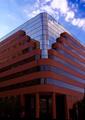
| 08/19/2005 10:46:18 AM |
Reach for the Skyby taterbugComment: The lines are excellent but I feel this is also shifted to the red a little. I would clone out the crosswalk sign to further mirroring of right to left. Good composition. |
| Photographer found comment helpful. |
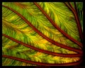
| 08/19/2005 10:29:09 AM |
Lifepulseby taterbugComment: I'm so sorry it has taken me this long to tag back...
I love this piece as an abstract. The colors play very well together and lend a fluidity to the image. The only thing I would argue, coming from personal taste I think, is that the border is too thick. Its thickness contains/restrains the free flowing image. I like the composition and think it works well for the subject. |
| Photographer found comment helpful. |
| 08/16/2005 01:00:40 PM |
|
| Photographer found comment helpful. |
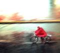
| 08/16/2005 12:39:52 PM |
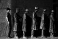
delivery boy (shot under basic editing rules)by tomzinhoComment: The image is nice but the title is REALLY unneccesary. It's irrelevent and "Delivery Boy" would have been just fine. Anyway, I like the image. I would have cropped just a little off the top as that much white space is a little over-powering. Looks like colored pencil filter was used. Whether it was or not, the feel/texture really enhances the image. I like the repetition of red here as well as the soft focus - it works with the image. 8 - good luck in the challenge! Update: In looking over the rest of the entries, I came to realize this was one of the more creative shots and so I feel compelled to bump you up to 9. |
| Photographer found comment helpful. |
| 08/12/2005 09:29:25 AM |
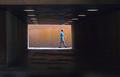
(No) Room for Movement Assignmentby KaveyComment: Kavey, I think this works. It has an odd sense of...I don't know - the only word that comes to my mind is lyrical. Not sure if this breaks the rule in the assignment but the image is compelling none the less. The lines are 'off' creating an inbalanced feeling in me, the viewer. The round lights contrast with all the straight lines (even the multi-toned paint on the background) providing another dynamic. This was timed perfectly as a row of lights leads right to the subject. I like the way the box is off center, lending more depth to the image. I am drawn to his arm and his forward leg - the angles lead me onward out of the image and I think that works. The only thing I am not crazy about is his blue shirt. No clue why. It would be interesting to see this in black and white. |
| Photographer found comment helpful. |
| 08/11/2005 11:59:25 AM |
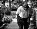
jpr_1.jpgby friscaComment: love this shot. The tones make him fit right in. |
| Photographer found comment helpful. |
| 08/11/2005 11:42:06 AM |
|
| Photographer found comment helpful. |
| 08/11/2005 11:39:16 AM |
|
| Photographer found comment helpful. |
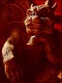
| 08/11/2005 11:32:48 AM |
dahkota.jpgby LindaLeeComment: ACK!!! My double chin shows! Very well rendered. Even if it is of me. |
| Photographer found comment helpful. |
Home -
Challenges -
Community -
League -
Photos -
Cameras -
Lenses -
Learn -
Help -
Terms of Use -
Privacy -
Top ^
DPChallenge, and website content and design, Copyright © 2001-2026 Challenging Technologies, LLC.
All digital photo copyrights belong to the photographers and may not be used without permission.
Current Server Time: 07/24/2026 06:42:00 PM EDT.