| Image |
Comment |
| 12/02/2006 07:45:10 AM |
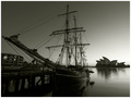
Then and Nowby FirstyComment: What makes this image for me is the duotone you used. Wouldn't work in black or brown but works perfectly with this. Excellent sharpness and detail, good composition. 8 |
 Photographer found comment helpful. Photographer found comment helpful. |
| 12/02/2006 07:44:02 AM |
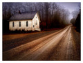
Into The Lightby BalkoComment: What I find amusing about this image is the modern steel safety rail next to a grass and gravel road in a rural seeming area. Your tones are excellent. Title a little weak. The shadow adds to the depth of the image. excellent find! 9 |
| Photographer found comment helpful. |
| 12/02/2006 07:42:05 AM |
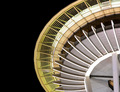
Needle Designby madcrabberComment: Excellent architecture shot - probably the best in the challenge. DOF is perfect. Love the color tones and composition. |
| Photographer found comment helpful. |
| 12/02/2006 07:41:17 AM |
Simple Faithby StuckOnTheFarmComment: Somehow I feel I've seen this before. ;) Love the color tones here - sets up the white perfectly. |
| Photographer found comment helpful. |
| 12/02/2006 07:38:09 AM |
Peace and Silenceby terjeComment: I typically don't care for hyper-saturated landscapes but this one speaks to me. You've composed perfectly - that single tall spike is perfectly placed. The repetition of color and shape really give this a sense of movement - I can almost see the wind blow. excellent work! 9 |
| Photographer found comment helpful. |
| 12/02/2006 07:34:36 AM |
eightby cheleComment: But I don't want to give you an 8. I want to give you a 9. But the power of suggestion is so strong... On my monitor the hands are slightly blown, or you intended it that way (not something I would mark down for, just an observation). I like the collage feel of this. 9 |
| Photographer found comment helpful. |
| 12/02/2006 07:31:17 AM |
escaping...by IreneMComment: Something ethereal about this. I find this image fascinating. So simple and so profound when taking the title into consideration. 10 |
| Photographer found comment helpful. |
| 12/02/2006 07:29:53 AM |
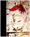
WELL WORN WORLD WEARY SCENE SHOP COUNTER TOPby grainman9Comment: I see Kandinsky, Motherwell, Pollack all combined to make a fascinating image that transcends the genre. I could hang it on my wall. For some reason I keep coming back in my head to butchershop - the red splash is probably doing it and the title reference to countertop. Beautiful find and great eye. 10 |
| Photographer found comment helpful. |
| 12/02/2006 07:27:10 AM |
Two Centsby jmsetzlerComment: Object as art - this is a beautiful piece of art. You've rendered it perfectly. 10 |
| 12/02/2006 07:25:50 AM |
|
| Photographer found comment helpful. |
Home -
Challenges -
Community -
League -
Photos -
Cameras -
Lenses -
Learn -
Help -
Terms of Use -
Privacy -
Top ^
DPChallenge, and website content and design, Copyright © 2001-2026 Challenging Technologies, LLC.
All digital photo copyrights belong to the photographers and may not be used without permission.
Current Server Time: 07/24/2026 10:19:25 AM EDT.